
Think of your online store as a physical shop. If the aisles are a mess, the signs are confusing, and the checkout line is impossibly long, shoppers are going to walk out. They probably won’t be back, either. E-commerce optimization is simply the digital version of fixing that store—it’s about making the entire shopping journey smooth, intuitive, and even enjoyable.
It’s not a one-time project. It’s an ongoing effort to tweak and improve everything from how people find you on Google to how easy it is for them to click “buy.” The real goal here is to get rid of any and all friction that might stop someone from making a purchase.
What Is E-Commerce Optimization and Why It Matters
In a nutshell, optimization is about systematically making your store better for customers, which in turn makes it more profitable for you. This isn’t just a nice-to-have; in today’s crowded market, it’s essential for survival.
Competition is absolutely relentless, and shoppers’ expectations have never been higher. The market is growing at a staggering pace, with global e-commerce sales projected to reach around $7.5 trillion by 2025. That’s a massive leap from $5.7 trillion in 2023. You can see more on what’s driving this growth in this comprehensive digital commerce statistics report. Getting your slice of that pie means having a store that outshines the rest.
A truly optimized store doesn’t just sell products; it builds relationships. It anticipates customer needs, removes obstacles before they become frustrating, and creates a sense of trust and reliability that encourages repeat business.
The Core Pillars of E-Commerce Optimization
To get a handle on such a broad topic, I find it helps to break optimization down into a few key areas. Each one addresses a different part of the customer’s journey, and you really need all of them working together for sustained growth.
Let’s look at the foundational pillars of what makes a great e-commerce experience.
Core Pillars of E Commerce Optimization
| Pillar | Primary Goal | Key Metrics |
|---|---|---|
| Visibility | Attract relevant traffic. | Organic Traffic, Keyword Rankings, Click-Through Rate (CTR) |
| User Experience (UX) | Keep visitors engaged and make browsing easy. | Bounce Rate, Pages per Session, Average Session Duration, Site Speed |
| Conversion Rate (CRO) | Turn visitors into paying customers. | Conversion Rate, Cart Abandonment Rate, Average Order Value (AOV) |
By focusing your efforts on these three distinct areas, you create a complete system for growth that brings people in, keeps them happy, and makes it easy for them to buy.
From Getting Found to Getting Paid
- Visibility (Getting Found): This is the very top of your funnel. It’s all about making sure potential customers can actually find your store and your products when they’re searching online. This is where Search Engine Optimization (SEO), smart content, and targeted ads come into play.
- User Experience (Keeping Them Engaged): The moment a visitor lands on your site, the clock starts ticking. Their experience is everything. We’re talking about lightning-fast page loads, simple navigation, and a design that works flawlessly on a phone. A great UX builds trust and invites shoppers to stick around.
- Conversion (Turning Clicks into Customers): This is the final and most critical step—getting that visitor to complete a purchase. This pillar covers everything from compelling product descriptions and high-quality photos to, most importantly, a painless checkout process.
As technology evolves, many businesses are finding that mastering AI content optimization for e-commerce gives them a serious edge across all these areas. Throughout this guide, we’ll get into the practical, actionable strategies for each pillar, giving you a clear roadmap to turn your store into a high-performing sales engine.
Boosting Visibility with E-commerce SEO

Before a customer can fall in love with your products, they have to find your store. That’s where Search Engine Optimization (SEO) comes in. Think of it as the digital breadcrumb trail that leads shoppers directly to your doorstep when they’re looking for exactly what you sell.
Solid e commerce optimization starts with getting seen. Your goal is to convince Google that when someone searches for a product, your pages are the best, most helpful, and most trustworthy answer out there.
Building Your Foundation with Keyword Research
Every solid SEO strategy begins with getting inside your customer’s head. You need to know the exact words and phrases they’re typing into that search bar. This is keyword research, and it’s the difference between blindly guessing what people want and knowing what they’re actively searching for.
The real gold is in transactional keywords. These are the phrases that scream “I’m ready to buy!” and often include words like “buy,” “deal,” or specific product models.
For example, a search for “running shoes” is broad and might just be someone browsing. But a search for “buy waterproof trail running shoes for men” shows a customer who has their wallet out and is ready to make a move.
Optimizing Your Product and Category Pages
Once you have your keywords, it’s time to put them to work on the pages that matter most: your product and category pages. These are your money-makers, and they need to be perfectly tuned for search engines and shoppers alike.
Here’s where to focus your attention for maximum impact:
- Compelling Page Titles: This is the big blue link in the search results. It has to grab attention and include your main keyword to earn that click.
- Persuasive Meta Descriptions: Think of this as your mini-ad. It’s the short snippet of text under your title that convinces a searcher to visit your site instead of the one above or below it.
- Clean and Simple URLs: A URL like
yourstore.com/mens-shoes/trail-runnersis easy for both people and search engines to understand. A messy one likeyourstore.com/prod?id=83719&cat=42is just confusing. - High-Quality Product Descriptions: Write your own descriptions. Seriously. Copying and pasting from the manufacturer is a recipe for duplicate content penalties and does nothing to sell the product in your brand’s voice.
Great e-commerce SEO isn’t about gaming the system. It’s about creating a clear, logical site structure that helps search crawlers and human visitors quickly understand what your pages are about and why they’re valuable.
Advanced Tactics for a Competitive Edge
Ready to pull ahead of the pack? It’s time to move beyond the basics. Implementing structured data (also called schema markup) is one of the most powerful things you can do. This bit of code gives search engines extra context about your page content, allowing them to show “rich snippets” right in the search results.
These eye-catching extras can make your listing pop and include things like:
- Star Ratings: Show off those fantastic customer reviews.
- Pricing and Availability: Display the price and stock status instantly.
- Product Information: Highlight key details like the brand or color.
Rich snippets make your listings more attractive and informative, which can dramatically boost the number of people who click through to your site. To really future-proof your strategy, it’s worth exploring new frontiers like this a guide to Answer Engine Optimization (AEO), which focuses on getting your content ready for AI chatbots and voice search. It’s a key part of modern e commerce optimization.
Create a User Experience That Actually Builds Trust
Getting a potential customer to your store is only half the battle. Once they land on your site, the clock is ticking. You have just a few seconds to make an impression that convinces them to stick around instead of hitting the back button. This is where a great User Experience (UX) becomes your secret weapon for e-commerce optimization. It’s what turns a casual visit into a journey that builds real, lasting trust.
Think of your website’s navigation like the layout of a physical store. If the aisles are messy, signs are confusing, and products are hard to find, people will just walk out. An intuitive, well-designed site, on the other hand, makes finding what they need feel completely effortless.
A great UX isn’t just about pretty visuals; it’s about how the site feels to use. It’s about removing roadblocks, anticipating questions, and projecting a sense of professionalism that makes people comfortable enough to pull out their wallets.
The Blueprint for Intuitive Navigation
Clear, predictable navigation is the bedrock of a good user experience. People show up to your store with a goal, and your job is to help them get there as fast as possible. That all starts with a clean menu that groups your products into categories that make immediate sense.
This isn’t the place to get clever. If someone is looking for a winter coat, they shouldn’t have to guess whether it’s filed under “Outerwear,” “Seasonal Styles,” or “Adventure Gear.” Stick with simple, descriptive labels that leave absolutely no room for confusion.
Another must-have is breadcrumbs. These are those little clickable links you often see at the top of a page (like Home > Men’s Apparel > Shirts) that show a user exactly where they are. They offer a clear path back, so shoppers never feel lost and can confidently explore different categories without worrying about losing their way.
The Power of a Flawless On-Site Search
While your menu guides explorers, a powerful on-site search is for the hunters. Shoppers who use your search bar typically know what they want and are much closer to making a purchase. A slow, clunky, or inaccurate search is one of the fastest ways to lose a sale.
Your search bar needs to feel instant and intelligent. Here’s what separates a great search from a frustrating one:
- Autocomplete Suggestions: As someone starts typing, your search should suggest popular products and terms, speeding up the whole process.
- Typo Tolerance: A simple spelling mistake should never lead to a “no results” page. Smart search knows what the user meant to type.
- Filtering and Sorting: Let users slice and dice the results by price, brand, size, color, or customer rating. This puts them in control and helps them narrow down their options in seconds.
Investing in a solid search function is a direct investment in your conversion rate. It caters to your most high-intent buyers and makes their path to purchase ridiculously easy.
Designing for a Mobile-First World
Here’s a reality check: optimizing for smartphones isn’t a “nice-to-have” anymore. It’s how the majority of your customers will experience your brand. The data is clear—a whopping 70% of online shoppers now prefer using their phones. And, as this detailed e-commerce statistics breakdown shows, nearly half of them start and finish their entire shopping journey on a mobile device.
A mobile-first design philosophy isn’t about just making your desktop site smaller. It’s about building the entire experience from the ground up for someone holding a phone—prioritizing speed, creating touch-friendly buttons, and simplifying the layout from the start.
When you take this approach, you ensure your store is fast, easy to navigate, and accessible to most of your visitors. By keeping the design clean and focused on the products, you’ll see fewer people bouncing off your site and more people sticking around to buy.
Designing Product Pages That Drive Sales
Think of your product page as the final, most important sales pitch. It’s where a casual browser becomes a committed buyer. Every single element on this page has a job to do—answering questions, building confidence, and nudging that shopper toward the “Add to Cart” button.
A well-designed product page is the heart of e commerce optimization. It’s not about aggressive sales tactics; it’s about creating an experience that makes buying feel like the obvious, easy choice. It’s a delicate balance of stunning visuals, convincing copy, and genuine trust.
Captivating Visuals Are Non-Negotiable
Long before a customer reads your product description, they see your product. In the world of e-commerce, your photos have to do the heavy lifting that a physical product does in a store. They’re the stand-in for touch and feel. Blurry, low-res, or generic images can torpedo a sale in seconds and make your entire brand feel amateur.
Your images need to tell the whole story. Show the product from every angle. Use high-resolution shots that let people zoom in on the details. Even better, show it in action—a person wearing the jacket, the blender making a smoothie. A 360-degree view or a short video can be a game-changer, closing the gap between seeing something online and knowing what it’s really like.
Writing Descriptions That Connect and Convert
Once the visuals have grabbed their attention, the product description needs to close the deal. This is your chance to go beyond a boring list of specs and speak directly to your customer’s needs. The secret is to focus on benefits, not just features.
Instead of saying a backpack has “20-liter capacity” (a feature), explain that it “comfortably fits a laptop, water bottle, and a change of clothes for a weekend getaway” (a benefit). You’re helping the customer picture how this product fits into their life.
Keep your copy easy to scan. Use short paragraphs, bullet points, and bold text to highlight the most compelling points. People rarely read every single word, so make sure the good stuff jumps right off the page. This is a simple but effective way to boost conversions where it matters most.
Building Unbreakable Trust
Making a purchase online, no matter how small, requires a little leap of faith. Your job is to make that leap feel less like a jump and more like a small step. Social proof and clear, honest policies are your best tools for this.
Placing these trust signals strategically can make all the difference:
- Customer Reviews and Ratings: Don’t hide them. Put star ratings right up top near the product title. Honest, detailed reviews from real people are often more persuasive than anything you could write yourself.
- Clear Shipping and Return Policies: Nobody likes surprises at checkout. Make sure your shipping costs, delivery times, and return policy are easy to find right on the product page. This alone can prevent countless abandoned carts.
- Urgency and Scarcity Signals: Used ethically, these can be very effective. Phrases like “Only 3 left in stock” or “25 people have this in their cart” create a sense of demand and motivate buyers who are on the fence.
When you blend powerful imagery with benefit-focused copy and rock-solid trust signals, your product page stops being just a listing. It becomes a finely tuned machine built for one purpose: turning interest into action.
Make Checkout Effortless and Watch Cart Abandonment Plummet
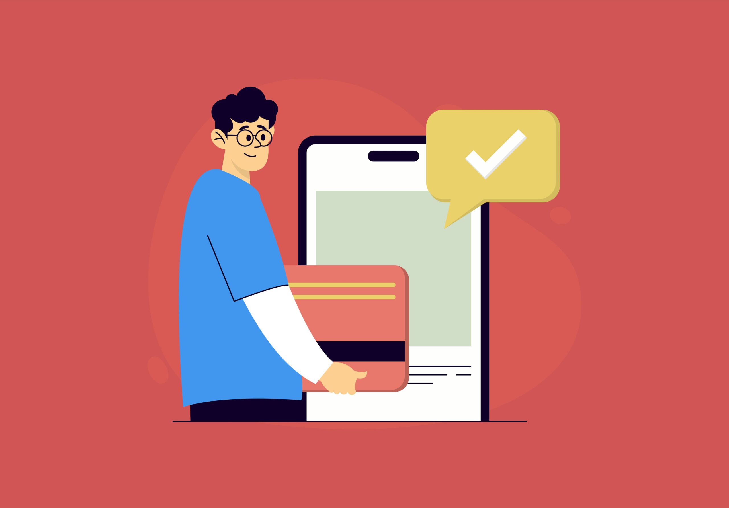
You did it. You got a shopper all the way from a search result or a social media post to your product page, and they clicked “Add to Cart.” This is the final step, the moment of truth. But this is also where so many sales fall apart. A clunky, confusing, or surprising checkout is the number one reason an almost-customer walks away empty-handed.
Fixing this last mile of the customer journey is one of the highest-impact things you can do for your store. It’s all about removing friction—every single obstacle that makes a customer pause and second-guess their decision. The goal? Make paying so seamless they don’t even have to think about it.
Cart abandonment is a huge deal. While things like high prices drive away 45% of Gen Z shoppers and 34% of Millennials, the pain points go deeper. More than half of all shoppers say fast, reliable shipping is their top priority, proving that the final cost and delivery promise are welded together in their minds.
Ditch the Forced Account Creation
Want to stop a sale in its tracks? Force someone to create an account before they can buy anything. It feels like a chore, a commitment they aren’t ready for. The fix is beautifully simple: offer a clear, easy-to-find guest checkout option.
This one change shows you respect your customer’s time and privacy. You can always ask them to create an account after the sale is complete, pitching it as a convenient way to track their order. It’s the same request, but the timing makes all the difference.
By making the path of least resistance the path to purchase, you align your store’s goals with the customer’s desire for a quick and easy transaction. Guest checkout isn’t just a feature; it’s a statement that you value their convenience above all else.
Be Crystal Clear and Guide Their Way
No one likes a surprise on their bill. Unexpected shipping costs, taxes, and hidden fees are famous for killing conversions right at the finish line. Your checkout needs to be an open book.
To build trust and keep shoppers moving forward, make sure you include:
- A Visual Progress Bar: Show people exactly where they are in the process (e.g., Shipping > Payment > Confirm). It manages expectations and makes the whole thing feel shorter.
- Multiple Payment Options: Let people pay how they want. Offer digital wallets like Apple Pay, Google Pay, and PayPal right alongside the usual credit card fields. These options often autofill addresses, saving precious time.
- A Clear Cost Breakdown: Show a running total that includes taxes and shipping before asking for a credit card. An honest, upfront summary prevents the sticker shock that sends people running.
Common Checkout Friction Points and Solutions
Even small bumps in the road can feel like major roadblocks to a customer who’s ready to buy. Here’s a quick look at the most common issues that cause people to abandon their carts and how you can smooth them out.
| Friction Point | Why It Hurts Conversions | Effective Solution |
|---|---|---|
| Forced Account Creation | Feels like a big commitment and a hassle. Shoppers just want to buy their item quickly. | Offer a prominent guest checkout option. Invite them to create an account after the purchase. |
| Surprise Shipping Costs | The number one reason for cart abandonment. It breaks trust and makes the total price feel deceptive. | Be upfront about shipping fees on product pages or use a shipping calculator in the cart. Offer free shipping thresholds. |
| Long, Complicated Forms | Asking for too much information is intimidating and time-consuming. It creates unnecessary work. | Only ask for essential information. Use tools that autofill address details from a zip code. |
| Limited Payment Options | Customers have their preferred, trusted payment methods. Not offering them can feel insecure or outdated. | Integrate popular digital wallets (Apple Pay, PayPal, etc.) and “Buy Now, Pay Later” services. |
| No Clear Progress Indicator | A checkout that feels endless makes shoppers anxious. They don’t know how many more steps are left. | Use a simple visual progress bar (e.g., “Step 1 of 3”) to manage expectations and show a clear finish line. |
By systematically identifying and removing these friction points, you pave a clear, inviting path from cart to confirmation, ensuring more shoppers complete their purchase.
You can also use on-site messaging to reinforce trust and set expectations early. With the right notification bar customization, you can display a message like “Free Shipping on All Orders Over $50” across your entire site. This kind of proactive communication means customers arrive at checkout already feeling confident and informed, making them far more likely to click “Buy Now.”
Applying Optimization in B2B E Commerce
Thinking e-commerce optimization is just for direct-to-consumer brands is a huge mistake. The world of business-to-business (B2B) sales is a massive, complex arena, and the game has completely changed. Clunky portals and manual order forms are relics of the past; today’s B2B buyers expect a purchasing experience just as smooth as the one they get shopping on Amazon.
This isn’t just a trend—it’s a fundamental shift driven by a new generation of decision-makers. These are people who grew up shopping online, and they’ve brought those consumer habits into their professional lives. They value speed, convenience, and the ability to do things themselves. If you can’t provide that, you’re not just falling behind; you’re giving your competitors an easy win.
The Modern B2B Buyer Demands More
The sheer scale of this market is hard to wrap your head around. By 2025, the global B2B eCommerce market is on track to hit an incredible $32.11 trillion. The millennial buyers driving this growth have made their preferences crystal clear: 83% would rather place orders online through a self-service channel, 80% use their phones for work-related research and purchasing, and a staggering 87% will actually pay more for a great user experience. You can dig into more of these eye-opening transformative B2B e-commerce statistics to see the full picture.
The data tells a simple story. To win in B2B, your platform has to meet these modern demands head-on. That means your optimization strategy needs to be laser-focused on efficiency, personalization, and a killer mobile experience.
Key Strategies for B2B E Commerce Optimization
While the core goal of e commerce optimization—making it easier for people to buy—is the same, how you get there in B2B is different. Business buyers have unique needs, so your tactics have to be tailored to them.
Here are the strategies that really move the needle:
- Self-Service Portals: Give your clients the power to manage their own accounts. A well-designed portal lets them reorder past purchases with a click, track shipments in real time, and grab invoices whenever they need them—all without having to call or email a sales rep. It’s a massive time-saver for everyone.
- Customized Catalogs and Pricing: In B2B, one size never fits all. Your platform has to be able to show specific product catalogs and pricing tiers to different customers. This kind of personalization isn’t just a nice-to-have; it shows you understand their business and their contract, which builds serious loyalty.
- Mobile-First Functionality: B2B buyers are always on the move. Think about a contractor on a job site needing to order materials or an executive reviewing a purchase order between flights. Your entire site, from browsing to placing a complex bulk order, has to work flawlessly on a smartphone.
At its heart, B2B optimization is about turning a simple transaction into an efficient partnership. When you make it incredibly easy for other businesses to buy from you, you become an essential part of how they operate.
Ultimately, investing in a sophisticated, user-friendly B2B platform isn’t a luxury anymore. It’s a direct investment in keeping your customers happy, increasing your average order values, and building a real competitive edge in a very high-stakes market.
Frequently Asked Questions About E-commerce Optimization
Diving into e-commerce optimization can feel like a huge undertaking. It’s easy to get bogged down by all the advice out there, so let’s clear up a few common questions that pop up when store owners start this journey. Knowing where to focus and how to track progress is half the battle.
Most people want to know how often they should be doing this stuff. While there’s no one-size-fits-all answer, a deep-dive audit of your entire site twice a year is a great rhythm to get into. This gives you a chance to step back and look at the big picture—from SEO health and site speed to the entire customer journey.
But don’t wait six months to act. Optimization is also a day-to-day thing. If you spot a broken link or see a way to clarify a product description, just do it.
My Budget is Tight. What Should I Prioritize?
When you can’t do everything, you have to do the right things. The trick is to find the changes that will give you the biggest bang for your buck—what we often call “low-hanging fruit.”
The best way to do this is to let your data be your guide. Find the biggest leaks in your sales funnel and start there.
- Seeing a high cart abandonment rate? Your checkout process is the first place to look. Making small tweaks, like adding a guest checkout option or showing shipping costs upfront, can make a massive difference almost overnight.
- Is a popular product not converting well? Zoom in on that specific product page. Try A/B testing new photos, rewriting the description to highlight the benefits (not just features), or making customer reviews more visible.
- Are mobile visitors bouncing immediately? Before you think about a full redesign, check your mobile page speed. Compressing images is a quick, cheap fix that can dramatically improve the experience for most of your audience.
The point isn’t to overhaul your entire site at once. It’s about making smart, targeted fixes on the most critical problems. This approach guarantees your limited budget is spent where it will actually move the needle on sales.
What Are the Best Tools for Measuring Success?
You can’t improve what you don’t measure. Luckily, you don’t need a huge budget for tools; some of the most powerful ones are free.
Here’s a great starter pack to get a clear picture of what’s happening on your site:
- Google Analytics: This is your command center for understanding user behavior. It shows you where people are coming from, what pages they love, and where they’re dropping off.
- Google Search Console: Absolutely essential for your SEO. It tells you what search terms people are using to find you, flags any technical glitches, and lets you monitor your rankings.
- PageSpeed Insights: This free Google tool is a lifesaver. It analyzes how fast your site loads on both desktop and mobile and gives you a concrete to-do list for making it faster.
- Heatmap Tools (like Hotjar or Microsoft Clarity): These tools are game-changers. They create visual maps showing exactly where people click, scroll, and linger, giving you an almost spooky insight into how they really use your site.
Using these tools together gives you a complete view of your store’s performance. You’ll be able to spot weaknesses, test new ideas, and actually see the impact of your e commerce optimization work over time.
Stop letting your important announcements get lost in the noise. LoudBar grabs your visitors’ attention with playful, conversion-focused notification bars that refuse to be ignored. Get started for free and see the difference at https://loudbar.co.