Before you can decrease your bounce rate, you have to get to the root of what it’s really telling you. At its core, a high bounce rate signals a disconnect. It means a visitor landed on your page, took one look, and decided “nope, not for me” before clicking anything else. The fix isn’t about gaming a metric; it’s about closing that gap between what they expected and what you delivered.
What a High Bounce Rate Really Tells You
That spike in your bounce rate can be jarring, but don’t panic. Think of it as direct, unfiltered feedback from your audience. It’s a story about their first impression, their intent, and whether your page delivered on its promise. Before you rush into a redesign, let’s decode what that number is actually saying.
A bounce is basically a one-and-done visit. Someone arrives, and they leave without a single click or interaction. Google Analytics 4 now calls this an “unengaged session,” which is a perfect description. The visit was short, and they didn’t explore, convert, or do anything meaningful. It’s a clear sign that the initial experience missed the mark.
Bounce Rate vs. Exit Rate: What’s the Difference?
It’s super common to mix these two up, but they measure very different behaviors. The exit rate tells you the percentage of people who left your site from a specific page, but it includes everyone—even those who visited ten other pages first.
On the other hand, the bounce rate only tracks visitors who left after viewing a single page.
Here’s an easy way to remember it: every bounce is an exit, but not every exit is a bounce. A high exit rate on your “thank you for your purchase” page is perfectly fine. A high bounce rate on your homepage? That’s a problem we need to fix.
Why Do People Bounce in the First Place?
Visitors don’t bounce for no reason. It’s a snap judgment. They’ve decided in a matter of seconds that your page isn’t worth their time. Figuring out the “why” is the first real step toward a solution.
Usually, it comes down to one of these culprits:
- You Didn’t Meet Expectations: The search result, ad, or social media post promised one thing, but the landing page delivered something else. It’s an unintentional bait-and-switch that instantly breaks trust.
- The User Experience (UX) is a Mess: Is the page cluttered? Is the navigation a puzzle? If people can’t find what they’re looking for immediately, they’re gone. They won’t stick around to solve your maze.
- Your Page is Too Slow: We’re all impatient. A delay of even one or two seconds is more than enough to send someone reaching for the back button. Page speed isn’t a “nice-to-have”—it’s a fundamental part of the user experience.
- Something is Broken: A 404 error, a layout that’s a mess on mobile, or an obnoxious pop-up that won’t close can send visitors running.
A high bounce rate isn’t just a number to lower; it’s a symptom of a deeper problem. It means people showed up, but you didn’t give them a good enough reason to stick around. The real goal is to fix the underlying experience that’s causing them to leave.
Is Your Bounce Rate Actually Too High?
Context is everything. A “high” bounce rate can mean very different things depending on the page and the industry. For example, a blog post that perfectly answers a specific question might have a high bounce rate, and that’s okay! The visitor found what they needed and left satisfied.
To know if you have a problem, you need to compare your numbers to relevant benchmarks.
Bounce Rate Benchmarks by Industry
This table gives you a quick look at what’s considered “average” across different industries, so you can see how your site stacks up.
| Website Type | Average Bounce Rate | Considered Excellent |
|---|---|---|
| E-commerce | 47% | Under 30% |
| SaaS | 50% | Under 35% |
| B2B | 55% | Under 40% |
| Content/Blog | 65% | Under 50% |
| Landing Pages | 70-90% | Under 60% |
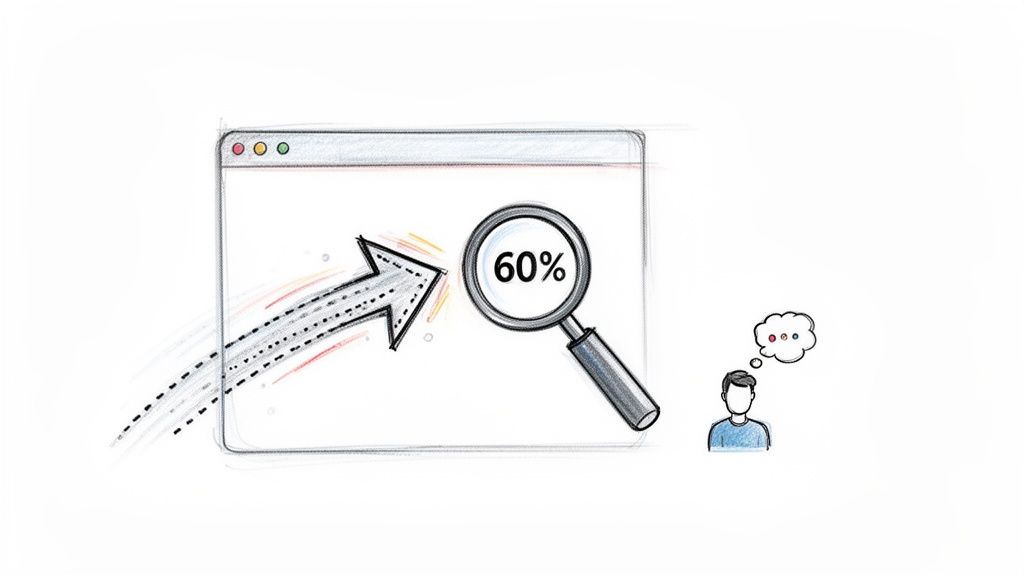
E-commerce sites, for instance, sit around 47% on average. But there’s good news: recent data shows that rate dropped to just 36.48% in April 2024, which is a 19.60% improvement from the year before. This tells us that online stores are getting much better at engaging shoppers right away.
Globally, the average bounce rate for most websites is somewhere between 41% and 55%, with a broad average of 49%. You can dig into more detailed average website bounce rate benchmarks to get a clearer picture of where you stand. Remember, these are just guidelines—your own historical data is your most important benchmark.
Pinpointing Why Your Visitors Are Bouncing
Jumping straight into solutions without knowing the root cause is a recipe for wasted effort. It’s like trying to fix a mysterious rattle in your car by randomly tightening bolts—you might get lucky, but you’ll probably just spin your wheels. To actually decrease your bounce rate, you need to put on your detective hat and find the real friction points sending visitors away.
This whole process starts with data, not guesswork. By pairing your analytics with user behavior tools, you can get a crystal-clear, evidence-based picture of what’s going wrong and, crucially, where it’s happening. This lets you focus your energy on the pages with the biggest problems, ensuring your fixes deliver the biggest impact.
Start with a High-Level Analytics Audit
Your first stop should always be your analytics platform, which for most of us is Google Analytics 4 (GA4). The goal here isn’t to get lost in every single metric, but to identify the pages that are bleeding the most visitors. Think of it as creating a “most wanted” list for your underperforming pages.
It’s a pretty straightforward process:
- Head to the “Pages and screens” Report in GA4 (you’ll find it under Reports > Engagement).
- GA4 focuses on engagement rate, so you’ll likely need to add the bounce rate metric yourself. Just customize the report by clicking the pencil icon, finding “Metrics,” and adding “Bounce rate” to your view.
- Click the “Bounce rate” column header to sort your pages from highest to lowest.
What you’ll have is a prioritized list of problem areas. The key is to look for pages with both a high bounce rate and significant traffic. A blog post with a 90% bounce rate and ten visitors isn’t your priority. A core landing page with a 75% bounce rate and thousands of visitors? That’s a five-alarm fire.
Your analytics platform tells you what is happening—which specific pages are failing. The next step is to figure out why.
Uncover the “Why” with Behavior Analytics Tools
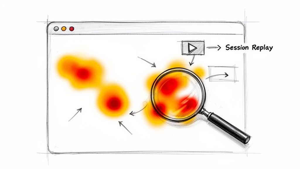
Once you’ve identified your problem pages in GA4, it’s time to zoom in for a closer look. This is where behavior analytics tools like Hotjar, Crazy Egg, or Microsoft Clarity become absolute game-changers. They give you visual data that lets you see your website through your visitors’ eyes.
Heatmaps Reveal What Users See and Ignore
Heatmaps are one of the most powerful tools in your diagnostic kit. They create a visual overlay on your page showing where people click, how they move their mouse, and—most importantly—how far they scroll.
- Click Maps: Are people furiously clicking on an image that isn’t a link? That’s a classic sign of a frustrating design flaw.
- Scroll Maps: Is your main call-to-action buried so far down the page that most people never see it? A scroll map will show a sharp color change from hot (red) to cold (blue) right at the point where visitors lose interest and bail.
I’ve seen scroll maps reveal that 85% of visitors on a high-traffic blog post never made it past the first two paragraphs. That’s an immediate, actionable insight: the intro just isn’t hooking the reader.
Session Replays Show the Full Story
If heatmaps are the X-ray, session replays are the full-motion video. These tools provide anonymized recordings of actual user sessions, letting you watch exactly how someone interacts with your site. It’s the closest you can get to sitting next to them as they browse.
Watching these can be eye-opening (and sometimes a little painful). You’ll see real people:
- “Rage clicking” a broken button.
- Wiggling their mouse in confusion because the navigation isn’t clear.
- Hitting a layout bug on a specific mobile device you never even tested for.
- Trying to fill out a form, getting stuck on a confusing field, and just giving up.
When you combine the “what” from GA4 with the “why” from heatmaps and session replays, you’re no longer working with abstract numbers. You’ve moved on to fixing the real, human problems that are hurting your site’s performance.
How Page Speed Directly Impacts Your Bounce Rate
We live in a world of instant gratification, and your website’s load time is the very first impression you make. If that first interaction is a slow, clunky experience, visitors are gone before you can even say hello. Every fraction of a second matters, and a sluggish page is one of the surest ways to send your bounce rate through the roof.
The connection between speed and abandonment is brutal and direct. Research has shown that when page load time climbs from 1 to 10 seconds, the chance of a visitor bouncing skyrockets by a massive 123%. Think about that—a ten-second load time more than doubles the abandonment rate of a one-second site.
And it gets worse. Over 83% of people expect a page to load in three seconds or less. This isn’t just about impatience; a slow site feels unprofessional and untrustworthy, killing a visitor’s confidence before they’ve even read your headline.
The Mobile Speed Imperative
This problem gets amplified on mobile devices. A user on the go might be dealing with a spotty connection and has even less patience for a delay. If your site isn’t built for a snappy mobile experience, you’re cutting off a huge chunk of your audience and practically inviting them to bounce.
Put yourself in their shoes: you tap a link looking for a quick answer, only to stare at a blank white screen. That immediate frustration makes the back button the most tempting thing on the screen. A fast mobile site isn’t just a nice-to-have; it’s a non-negotiable part of keeping your bounce rate down.
A Practical Checklist for Boosting Page Speed
Improving site speed doesn’t have to be some dark art. By focusing on a few high-impact fixes, you can see huge improvements. The first step is to get a baseline. Run your site through a tool like Google’s PageSpeed Insights to see where the biggest problems lie.
Once you have your report card, here’s a proven checklist to start with:
-
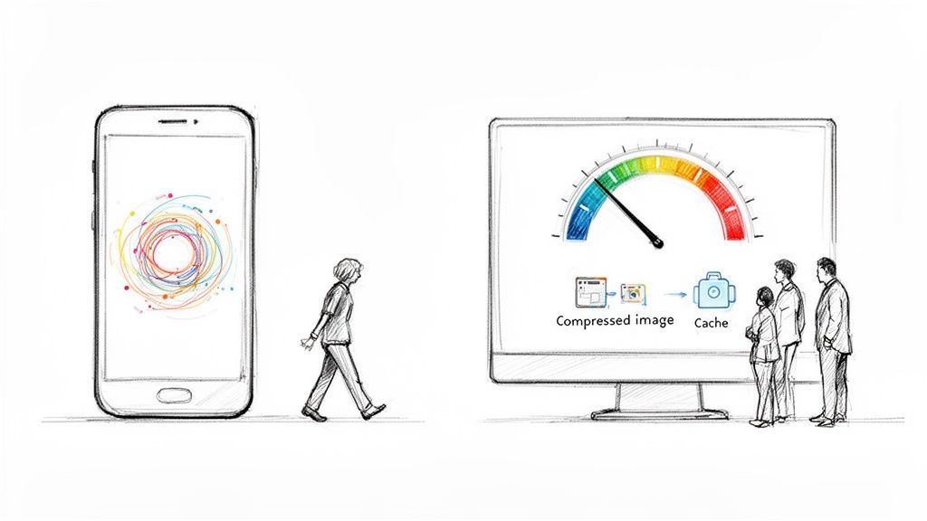
Compress Your Images: This is the low-hanging fruit. Huge, unoptimized image files are the number one cause of slow pages. Tools like TinyPNG can shrink file sizes dramatically without any noticeable drop in quality, often shaving seconds off your load time.
-
Leverage Browser Caching: Caching tells a visitor’s browser to save static parts of your site, like your logo, CSS, and certain scripts. When they come back or visit another page, their browser doesn’t have to download everything all over again. The result? A near-instant load for returning users.
-
Minify Your Code: Minification strips out unnecessary characters from your site’s code (HTML, CSS, JavaScript), like extra spaces and comments. These characters help developers read the code, but they’re just dead weight to a browser.
A fast website isn’t a luxury; it’s a fundamental part of a good user experience. Every optimization you make to improve speed is a direct investment in keeping visitors engaged and on your site.
Understanding Core Web Vitals
Google cares deeply about page experience, and you should too. The Core Web Vitals are specific metrics Google uses to measure a site’s real-world user experience, zeroing in on loading speed, interactivity, and visual stability. To really get a handle on what makes a great user experience and drives down bounce rates, check out this excellent Core Web Vitals & Page Experience Playbook.
These aren’t just abstract numbers; they are clear indicators of a quality experience that directly correlates with lower bounce rates. There’s a lot more to dive into on this, and you can learn more about site speed optimization to see just how big of an impact it can have.
Tuning Your Content and UX to Keep People Hooked
Even the most amazing content is dead on arrival if it’s wrapped in a frustrating user experience. Once you’ve wrestled with your page speed and won, the next battleground in the war against high bounce rates is the on-page experience itself. It’s all about creating an environment that pulls visitors in, makes your content easy to digest, and subtly guides them deeper into your site.
Think of it this way: your content is the star of the show, but your site’s design and UX are the theater. If the seats are broken and the sound is muffled, nobody’s sticking around for the second act, no matter how good the performance is.
Make Your Content Instantly Scannable
Let’s be honest—people don’t read online anymore. They scan. They’re hunting for a specific answer or piece of information, and if they can’t spot it in seconds, they’re gone. A giant, intimidating wall of text is the fastest way to get someone to hit the back button.
The trick is to structure your content so the key points practically leap off the screen. You can do this with a few simple formatting moves:
- Headings That Tell a Story: Use clear, descriptive H2s and H3s to break your content into logical chunks. This gives readers a mental map of the page.
- Super Short Paragraphs: Keep paragraphs to one to three sentences, max. This creates vital white space, making the whole page feel more approachable and less like a textbook.
- Strategic Bolding: Make key stats, terms, or takeaways bold. This helps scanners grab the essence of each section without reading every word.
- Lists for Clarity: Use bulleted or numbered lists to break down steps, features, or complex ideas into bite-sized, easy-to-follow points.
For a more holistic fix to user experience, it’s often worth the investment in professional web design. A well-designed site has these principles baked in from the start, making your content naturally more engaging.
Master the Art of Internal Linking
What is a bounce? A single-page session. The most direct way to stop a bounce is to give your visitors a compelling reason to click through to a second page. This is where a smart internal linking strategy becomes your secret weapon.
Don’t just drop links randomly. Think of them as helpful signposts guiding a traveler. You’re leading the reader from their entry point to other valuable, relevant content on your site. For example, if you mention a specific product feature in a blog post, link it directly to a case study showing that feature in action.
A great internal link does more than just offer another click. It anticipates the user’s next question and provides the answer before they even think to ask. This builds trust and keeps them in your orbit, not Google’s.
The link between engagement and bounce rate is undeniable. A 2023 analysis found a powerful correlation: sites with low bounce rates consistently see visitors clicking through to multiple pages. PayPal.com, for instance, had an incredible 19.5% bounce rate, with visitors averaging 3-4 pages per session—way more than other high-traffic sites.
Align Your Message from Ad to Landing Page
This is a simple but critical concept: message matching. It means the promise you make in your Google Ad, social media post, or search result snippet must be instantly fulfilled the moment someone lands on your page. If there’s a disconnect, you break trust, and they bounce.
Imagine someone clicks an ad promising a “50% Off Spring Sale.” If they land on your homepage and have to hunt around for that sale, they’re going to get annoyed and leave. The landing page needs to scream “50% off” right at the top. This immediately confirms they’re in the right place and that you’ve delivered on your promise.
Craft Calls-to-Action That Beg to Be Clicked
Finally, every page on your site needs a purpose. What is the one thing you want the visitor to do next? Your call-to-action (CTA) is the button that gets it done. A weak, generic CTA like “Submit” or “Click Here” isn’t going to inspire anyone to act.
Your CTA needs to be clear, compelling, and action-oriented. Use strong verbs that communicate the value behind the click. Instead of a vague “Learn More,” try something specific like “See Pricing Plans” or “Download My Free Checklist.” If you’re stuck, our guide on the best call-to-action examples has tons of ideas you can test. By tightening up these elements, you’re not just tweaking a page; you’re creating a seamless journey that turns bounces into engaged visitors.
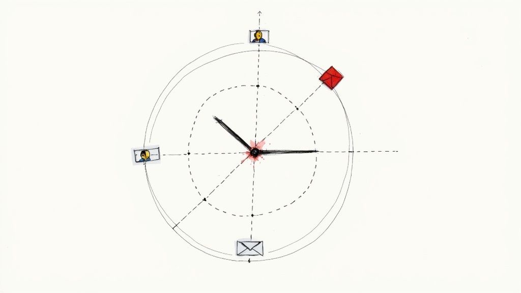
Using Attention Hooks to Re-Engage Visitors
What if you could catch a visitor just as their cursor drifts toward the back button? It’s a critical moment. Instead of passively letting them go, you can proactively re-engage them, turning a potential bounce into a second chance.
This isn’t about those annoying, full-screen pop-ups that ruin the experience. It’s about smart, timely interventions that grab attention for all the right reasons.
Imagine someone lands on your product page. They scroll a bit, maybe they’re not quite sold, and their mouse starts to move away. That behavior is a classic sign of exit intent. Just then, a sleek, dynamic notification bar slides into view at the top of the screen. It’s not a boring banner; it’s an attention hook. This one interaction can be the difference between a lost visitor and a new customer.
The Power of a Pattern Interrupt
When a visitor decides to leave your site, they’ve shifted into an “exit” mindset. It’s a mental pattern. The most effective way to stop it is with a pattern interrupt—a psychological technique that breaks a person’s current thought process.
A well-designed attention hook acts as a visual and cognitive jolt. It snaps them out of that “I’m leaving” mode and refocuses their attention on a new, potentially valuable offer.
This is exactly what tools like LoudBar are built for. Instead of a static banner that’s easy to ignore (a classic case of banner blindness), these notification bars use motion, color, and unique animations to command notice.
- An e-commerce store could launch a “Rainbow Rave” bar during a flash sale, using vibrant, shifting colors to announce a 20% discount that expires in an hour.
- A SaaS company might use a “Futuristic Terminal” theme with a cool typing animation to reveal a new feature, linking directly to the release notes.
The trick is to match the hook’s energy and message to what the user is doing right at that moment. You’re adding value at the precise point they were about to disengage.
Real-World Scenarios for Bounce Reduction
Let’s get practical. How can you actually use these hooks to tackle common reasons for bouncing? It all comes down to anticipating a user’s friction point and offering a solution before they give up and leave.
The goal is to provide a clear, valuable next step that pulls the visitor back in.
A visitor showing exit intent isn’t a lost cause. They’re often just unpersuaded or momentarily distracted. A timely, relevant attention hook gives you one last chance to make your case and turn a potential bounce into a conversion.
To see how this works across different industries, check out these examples. They show how a targeted notification bar can address a specific reason a visitor might be leaving.
LoudBar Use Cases for Reducing Bounce Rate
| Business Type | Bounce Scenario | LoudBar Solution |
|---|---|---|
| E-commerce | A visitor adds items to their cart but hesitates on the cart page, likely due to shipping costs. | Trigger a “Disco Fever” bar with an animated “Free Shipping Unlocked!” message to remove the final barrier to purchase. |
| SaaS | A potential customer stalls on the pricing page, unsure if they want to commit. | Display a “Fireworks” bar announcing a limited-time 14-day extended trial, giving them more time to evaluate without risk. |
| Blog/Publisher | A reader finishes an article and has nowhere to go next, preparing to close the tab. | Show an animated bar offering a related, high-value guide for download in exchange for their email. |
As you can see, these aren't just random pop-ups. They are strategic, behavior-driven responses designed to solve a problem for the user at a critical moment. If you want to explore this tactic further, you can learn more about how exit-intent technology can be used to capture leaving visitors.
By deploying attention-grabbing hooks at the right time, you give visitors a compelling reason to stick around. This proactive approach turns a passive browsing session into an interactive experience, directly chipping away at your bounce rate and building a more engaged audience.
Your Bounce Rate Questions Answered
When you start digging into bounce rate, a lot of questions pop up. It's one of those metrics that seems simple on the surface, but the deeper you go, the more you realize it’s not so black and white.
Let’s clear up some of the most common head-scratchers I hear from people trying to get this right.
Is a High Bounce Rate Always a Bad Thing?
Surprisingly, no. It all comes down to context. While a high bounce rate is usually a red flag, some pages are meant for quick, single-page visits. In those cases, a high bounce rate is actually a sign the page is doing its job perfectly.
Think about these real-world examples:
- Contact Pages: Someone lands on your "Contact Us" page, grabs your phone number, and calls you. They got what they needed and left. That’s a bounce, but it's also a win.
- Glossary or Definition Pages: A user Googles a term, your page gives them a clear definition, and they close the tab. Mission accomplished.
- Support & FAQ Articles: A customer is stuck, finds your article with the exact fix, and immediately heads off to solve their problem. That quick exit means your content was incredibly helpful, not that it failed.
The real test is measuring bounce rate against the page’s goal. If the page is there to provide a fast answer, a high bounce rate is fine. But if it's supposed to pull visitors deeper into your site, then you’ve got a problem to solve.
Does Bounce Rate Directly Affect SEO?
This is the big one, and the answer isn't a simple yes or no. Google has been clear that bounce rate itself isn't a direct ranking factor. They don't just look at a number and penalize you for it.
However—and this is a big "however"—the behaviors that lead to a high bounce rate absolutely send signals to Google.
Imagine a user clicks your link in the search results, takes one look at your page, and immediately hits the back button. This is called "pogo-sticking," and it tells Google that your page wasn't a good match for that search query. If that happens over and over, Google might think another page deserves that top spot.
So, while you aren't optimizing for a "bounce rate score," the work you do to decrease your bounce rate almost always improves things Google cares deeply about, like:
- Page speed and Core Web Vitals
- Mobile experience
- Content quality and relevance
- Overall user engagement
What Is a Good Bounce Rate to Aim For?
There’s no magic number here. What's "good" varies massively depending on your industry and the type of page we're talking about. But for a general ballpark, a bounce rate between 26% and 40% is fantastic. Anything from 41% to 55% is pretty average.
If you’re creeping over 56%, it's probably worth a look. And if you see a rate above 70% on a page that isn't just for quick info, you've definitely got some work to do.
Here’s a more specific breakdown to give you some context:
| Page or Site Type | Typical “Good” Bounce Rate |
|---|---|
| E-commerce Sites | 20% – 45% |
| Lead Generation Pages | 30% – 55% |
| SaaS Websites | 30% – 60% |
| Blogs & Content Sites | 65% – 90% |
My advice? Don't get too hung up on universal benchmarks. The most important metric is your own. Focus on improving your numbers over time. Shaving your bounce rate from 80% down to 70% on a key landing page is a huge victory.
Ready to stop visitors in their tracks and give them a reason to stick around? LoudBar offers attention-grabbing notification bars that turn potential bounces into engaged clicks. Start for free and see the difference.