Email marketing and lead generation are two sides of the same coin. Think of it as a conversation starter. You offer something genuinely useful—a free guide, a checklist, maybe a webinar—in exchange for an email address. From there, you use a series of well-timed, helpful emails to build trust and show how your product or service can solve their problems. It’s a process that carefully turns casual website visitors into people who are actually ready to buy.
Building Your Lead Generation Foundation
Great lead generation isn’t about tricking someone into handing over their email. It’s about starting a relationship based on real value. So, let’s forget about those generic, annoying pop-ups that everyone hates. The real goal is to build a system that naturally attracts your ideal customers by solving a problem for them right from the get-go. This foundation is what separates a list of disengaged subscribers from a community of loyal fans who actually want to hear from you.

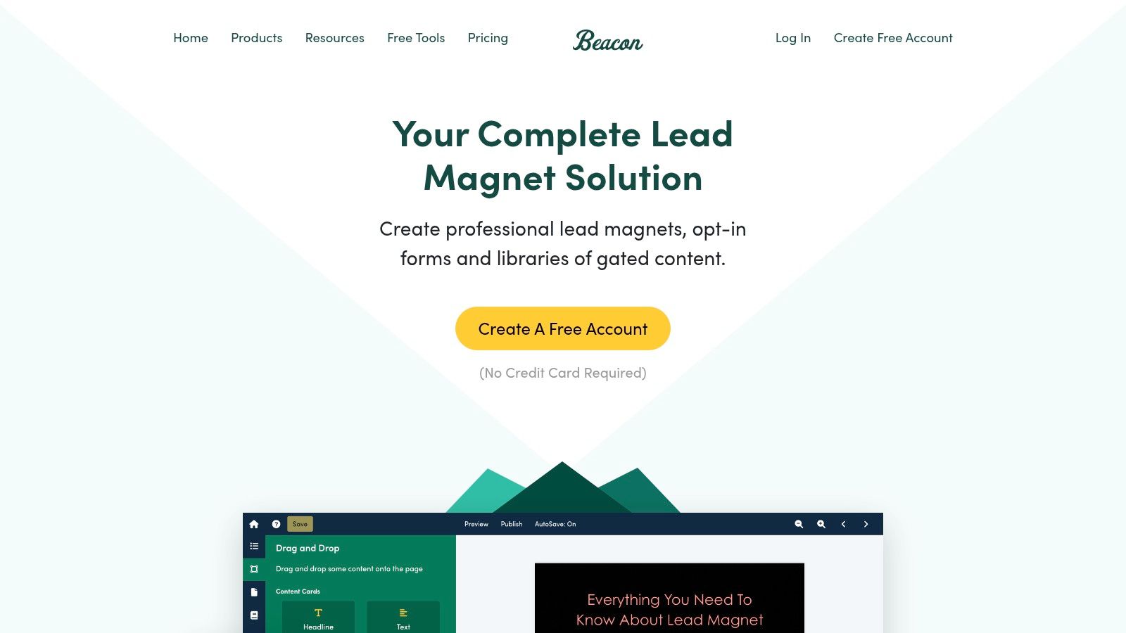
This whole process kicks off with what we call a lead magnet. This is that irresistible, valuable resource you give away for free in exchange for an email. The quality of your lead magnet directly dictates the quality of your leads. A flimsy offer brings in people who couldn’t care less, but a high-value, problem-solving resource attracts people who are actively looking for what you sell.
Designing Compelling Lead Magnets
A truly effective lead magnet delivers a quick, immediate win for your audience. It needs to be specific, easy to consume, and directly tied to the solutions your business provides.
We have to move beyond the tired “subscribe to our newsletter” plea. Instead, ask yourself: what tangible result can I deliver in just a few minutes?
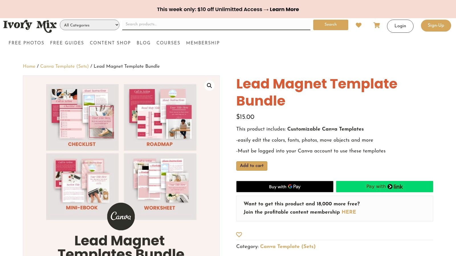
- Checklists and Worksheets: These are fantastic for breaking down a complex topic into simple, actionable steps. An SEO agency, for instance, could offer a “10-Point Website Audit Checklist.”
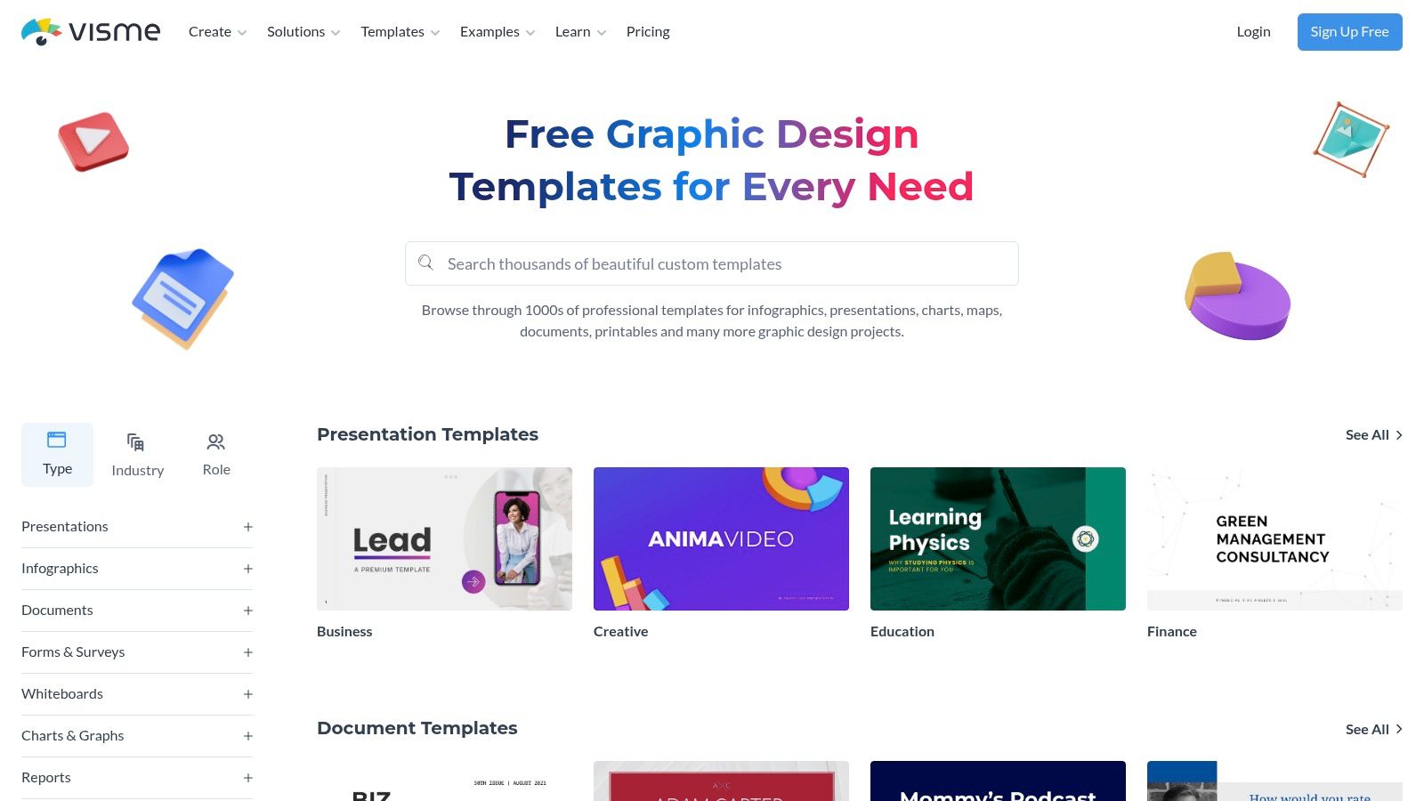
- Templates: People love resources that save them time. Think a “Social Media Content Calendar Template” for marketers or a “Project Budget Template” for freelancers.
- Exclusive Video Content: A short, punchy masterclass or a behind-the-scenes tutorial feels incredibly valuable and instantly positions you as a go-to expert.
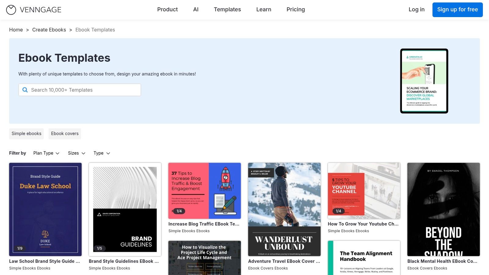
- Ebooks or Whitepapers: These are best for diving deep into a subject. They establish serious authority, but be warned—they must be packed with genuine insight to work.
The core principle is simple: if your lead magnet solves a small problem effectively, your audience will trust you to solve their bigger problems later. This initial interaction sets the tone for the entire customer relationship.
The trick is to match the lead magnet to your audience’s intent. Someone downloading a beginner’s guide is in a different mindset than someone requesting a pricing calculator. For a deeper dive into these strategies, check out a comprehensive guide to lead generation campaigns.
To help you brainstorm, here are a few ideas that consistently get great results.
High-Impact Lead Magnet Ideas
Choosing the right lead magnet is all about matching the format to your audience’s needs and where they are in their journey. This table breaks down some of the most effective options to help you decide.
| Lead Magnet Type | Best For | Example | Conversion Potential |
|---|---|---|---|
| Checklist | Breaking down complex tasks into simple, actionable steps. | A “Pre-Launch Website Checklist” for developers. | High |
| Template | Saving users time and effort with a pre-made structure. | A “Monthly Budget Template” for a personal finance blog. | Very High |
| Ebook/Guide | Establishing authority with an in-depth, comprehensive resource. | A “Complete Guide to SaaS Marketing” for a B2B agency. | Medium-High |
| Webinar | Engaging users who prefer visual learning and direct interaction. | A live Q&A session on “Mastering Google Ads.” | Very High |
| Free Tool/Calculator | Providing instant, personalized value and demonstrating utility. | An “ROI Calculator” for a marketing software company. | High |
| Case Study | Showcasing proven results and building social proof. | A detailed breakdown of a successful client campaign. | Medium |
Ultimately, the best lead magnet is one that gives your ideal customer a tangible win, making them eager to hear more from you.
Strategic On-Site Lead Capture
Once you’ve created a killer lead magnet, you need to present it on your site in a way that’s helpful, not disruptive. Where and when you ask for that email address is just as important as what you’re offering.
Plastering a generic pop-up on every single page is a surefire way to annoy visitors and send your bounce rate through the roof. A smarter email marketing and lead generation strategy is far more effective.
For instance, smart notification bars from a tool like LoudBar can announce a new resource without blocking the content a user is trying to read. Exit-intent pop-ups are another great option; they only appear when someone is about to leave your site, giving you one last chance to offer something valuable.
Even better are behavior-triggered offers. If someone spends five minutes reading a blog post about project management, you can trigger a pop-up offering a highly relevant “Project Kickoff Checklist.” This feels helpful, not intrusive. We cover more of these techniques in our guide on how to increase website conversion rate.
The data doesn’t lie. Email is a powerhouse for lead generation, with 89% of marketers citing it as their primary channel. For small and medium-sized businesses, 81% rely on email as their main customer acquisition method. It’s no wonder—building a quality email list can lead to a 760% increase in revenue. The proof is in the numbers.
Crafting Emails That Actually Get Opened
Building a huge email list is one thing, but it’s just a vanity metric if no one’s actually opening what you send. The real muscle in email marketing and lead generation comes from writing messages that your subscribers genuinely want to read. This isn’t about gimmicks; it’s about understanding the crowded inbox and earning that click, every single time.

This all starts the second someone signs up. That first touchpoint sets the precedent for the entire relationship. A killer welcome series is your chance to make a stellar first impression, showing them they made the right call and turning a new lead into an invested follower.
The Anatomy of an Irresistible Email
Before you can build a relationship, you have to get past the inbox preview. This is where the initial battle is won or lost, and it hinges on a few key pieces working together. Every element has to earn its keep.
- Compelling Subject Lines: This is your headline. It has to be intriguing, spark curiosity, or scream “benefit!” A subject line like “Our New Products” is a one-way ticket to the trash folder. “Your Weekend Project Just Got Easier”? Now that makes a promise.
- Intriguing Preview Text: This is the little snippet of text that follows the subject line. Don’t waste it! So many brands let it default to “View this email in your browser.” Instead, use it as a sub-headline to add more context and intrigue.
- A Natural Call-to-Action (CTA): Your CTA shouldn’t feel like a command. It should feel like the obvious next step in the conversation you’re having. Frame it around the value they’ll get from clicking.
Of course, even the most brilliant copy is worthless if it lands in spam. That’s why understanding email deliverability best practices is absolutely non-negotiable.
The Power of the Welcome Series
A welcome email isn’t just a formality; it’s your first real conversation. These emails consistently have the highest open rates—often topping 80%. Wasting that opportunity is a massive own-goal.
A great welcome series should deliver the lead magnet they signed up for instantly. It should also introduce your brand’s personality, set expectations for what’s coming, and offer an immediate, valuable tip to start building goodwill right away.
A great welcome series doesn’t just say “hello.” It says, “You made a smart choice, and here’s the immediate proof.” It’s the foundation of a long-term, trust-based relationship.
For example, a simple but effective three-part welcome flow could look like this:
- Email 1 (Immediately): Deliver the goods! Send the lead magnet with a warm, personal welcome.
- Email 2 (Day 2): Share your brand’s origin story or a “quick win” tip related to their interest.
- Email 3 (Day 4): Gently introduce your core products or services as the solution, maybe framed within a customer success story.
Mix Up Your Email Types to Keep People Hooked
Blasting the same type of email to everyone is a surefire way to get ignored. To keep your audience engaged, your content needs variety and relevance. This is where knowing your audience pays off. If you’ve been collecting data on their interests, you can send messages that feel like they were written just for them. It’s worth exploring different methods of target audience segmentation to make your emails land with more impact.
Try weaving these email types into your content calendar:
- Personal Stories: People connect with people, not logos. Sharing a behind-the-scenes story, a personal failure, or a hard-won lesson creates a real bond.
- Educational Content: Be their go-to expert. Send genuinely helpful how-to guides, industry deep dives, or curated resources. This proves you’re here to add value, not just to sell.
- Benefit-Focused Messages: When you do talk about a product, focus on the transformation, not just the features. Instead of “Our software has a new dashboard,” try “Manage your entire workflow in half the time.”
By rotating these approaches, you keep your content feeling fresh and give subscribers plenty of reasons to be excited when your name pops up in their inbox. This strategy is how you turn a lead generation tool into a thriving community.
Building Your Automated Lead Nurturing Engine
Okay, so you’ve got a steady stream of new subscribers coming in. Fantastic. But now the real work starts. This is where we move beyond simple lead capture and start building a sophisticated nurturing system that scales your efforts without chaining you to a desk 24/7.
Smart automation is the engine that drives this whole process. It’s your secret weapon for building relationships and guiding leads toward becoming customers, all while you sleep.

This isn’t about blasting out robotic, one-size-fits-all messages. The magic of automation lies in smart segmentation. You have to divide your audience based on who they are and what they do, ensuring every email feels personal, timely, and genuinely helpful.
The results speak for themselves. Proper automation in email marketing and lead generation can lead to a staggering 451% increase in qualified leads. It’s no wonder that 67% of marketers run automated drip campaigns. A huge 68.5% of them say the biggest benefit is better targeting, which is exactly how you turn a cold lead into a hot prospect. You can dig into more of these powerful email marketing statistics if you’re curious.
The Art of Smart Segmentation
Think of segmentation as breaking down your big email list into smaller, more focused groups. Instead of shouting the same message at everyone, you’re whispering the right message to the right people at the right time. This simple practice sends open rates, click-throughs, and conversions through the roof because the content is actually relevant.
Here are a few of my favorite ways to segment an audience:
- Behavioral Segmentation: This is all about grouping people based on their actions (or lack thereof). Did they visit your pricing page? Did they abandon their shopping cart? Are they a first-time buyer? Every one of these behaviors is a perfect opportunity for a targeted, automated follow-up.
- Demographic Segmentation: This is the classic stuff—location, age, job title. An e-commerce brand, for example, could send a promotion for winter coats only to subscribers living in colder climates. Simple, but incredibly effective.
- Stated Interests: Why guess when you can just ask? Use the information subscribers give you. If you run a food blog, ask new subscribers if they prefer vegan, gluten-free, or keto recipes, then send them exactly what they asked for.
Think of segmentation as creating personalized pathways for your subscribers. A brand new lead who downloaded a beginner’s guide needs a completely different journey than a loyal customer who has bought from you five times. Automation is what makes managing all these individual journeys possible.
Essential Automation Blueprints to Set Up Now
Once your segments are defined, you can build automated workflows—often called drip campaigns or sequences—that trigger based on specific actions. These sequences become your always-on sales and relationship-building team.
Here are three foundational workflows every single business should have in place.
1. The Indispensable Welcome Sequence
We touched on this earlier, but it’s worth repeating: this is your most important automation. It’s your one chance to make a great first impression, deliver that lead magnet they signed up for, and set the tone for your entire relationship.
- Goal: Build trust and deliver instant value.
- Trigger: A user subscribes to your list.
- Example Flow:
- Email 1 (Instant): Deliver the lead magnet and a warm, personal welcome.
- Email 2 (2 days later): Share your brand’s story or a link to your most popular blog post.
- Email 3 (4 days later): Talk about a common problem your audience has and gently introduce how your product or service helps solve it.
2. The Revenue-Saving Abandoned Cart Sequence
For any e-commerce or SaaS business, this is a goldmine. The stats are wild—roughly 70% of online shopping carts get abandoned. That’s a massive pile of potential revenue just sitting there. A simple, automated reminder can claw back a huge chunk of those sales.
- Goal: Remind users what they left behind and nudge them over the finish line.
- Trigger: A user adds an item to their cart but doesn’t complete the purchase.
- Example Flow:
- Email 1 (1 hour later): A simple, friendly reminder: “Did you forget something?”
- Email 2 (24 hours later): Amp up the value. Highlight the product’s benefits or include a glowing customer testimonial.
- Email 3 (48 hours later): Create a little urgency. A small, time-sensitive discount can work wonders. “Complete your order in the next 24 hours for 10% off.”
3. The Win-Back Re-Engagement Campaign
It’s natural. Over time, some subscribers will go cold. A re-engagement campaign is your strategy for waking them up. And if they don’t respond, it automatically cleans them from your list, which is crucial for keeping your email deliverability high.
- Goal: Re-engage inactive subscribers or politely remove them from your active list.
- Trigger: A subscriber hasn’t opened an email in, say, 90 days.
- Example Flow:
- Email 1: A direct, friendly subject line like, “Is this goodbye?” Ask if they still want to hear from you with a simple one-click poll.
- Email 2: If they didn’t click, try one last time. Offer a compelling, exclusive discount or a super valuable resource as a final incentive to stay.
- Final Action: Still no response? Automatically unsubscribe them. It keeps your list healthy and your engagement metrics accurate.
Putting these automated systems in place is how you build a scalable, effective email marketing program that truly nurtures leads—from that first flicker of curiosity all the way to becoming a loyal, paying customer.
Measuring What Matters to Drive Growth
An email marketing strategy isn’t something you can just set up and walk away from. Think of it as a living system that needs constant attention—you have to measure, test, and tweak it continuously. If you’re not looking at the right data, you’re just guessing. Let’s cut through the noise of email analytics and focus on the metrics that actually move the needle for your business.

It’s easy to get caught up in high open rates, but honestly, they don’t tell you the whole story. A good open rate means your subject lines are catchy, which is a great start. But on its own, it’s a vanity metric. It won’t tell you if your email actually convinced anyone to take the next step. To really understand what’s working, we have to dig deeper.
Focusing on Actionable KPIs
To see the real-world impact of your emails, you need to track Key Performance Indicators (KPIs) that are directly tied to your bottom line. These are the numbers that show you how people are really interacting with your content and progressing toward a sale.
Here are the big ones I always keep my eye on:
- Click-Through Rate (CTR): This is the percentage of people who clicked on at least one link in your email. A solid CTR tells you that your message and call-to-action were compelling enough to spark genuine interest.
- Conversion Rate: This is the gold standard. It measures the percentage of people who not only clicked but also completed the desired action—like filling out a form, downloading your guide, or making a purchase. This is the ultimate proof that your email did its job.
- List Growth Rate: This metric shows you how fast your email list is expanding. A healthy growth rate is a clear sign that your lead magnets and sign-up forms are hitting the mark with new prospects.
- Unsubscribe Rate: Nobody likes to see people leave, but a low, steady unsubscribe rate is actually a good sign of a healthy, engaged list. If you see a sudden spike, it’s a red flag that something might be off with your email frequency, content, or targeting.
Shifting your focus from open rates to conversion rates is the single most important mindset change you can make. It’s the difference between measuring attention and measuring results. One is interesting; the other builds your business.
This focus on results is absolutely critical because the potential return is massive. The ROI from email marketing is legendary, often averaging between $36 and $42 for every single dollar spent. When you consider that 99% of users check their email every day, the opportunity is right there for the taking. You can dive into more of these powerful email marketing statistics to see just how big the opportunity is.
Table: Essential Email Marketing KPIs To Track
To get a clear picture of your performance, you need to know which metrics matter most. This table breaks down the essential KPIs, explaining what they measure, why they’re important, and what a good benchmark looks like.
| Metric (KPI) | What It Measures | Why It Matters | Industry Benchmark |
|---|---|---|---|
| Open Rate | Percentage of recipients who opened your email. | Indicates subject line effectiveness and brand recognition. A good starting point, but not a final measure of success. | 15% – 25% |
| Click-Through Rate (CTR) | Percentage of recipients who clicked a link in your email. | Shows how compelling your email copy, offer, and call-to-action are. A strong indicator of engagement. | 2% – 5% |
| Conversion Rate | Percentage of recipients who completed a desired action (e.g., purchase, download). | Directly measures the email’s ability to achieve its primary business goal. This is your most important metric. | 1% – 3% |
| Unsubscribe Rate | Percentage of recipients who opted out of your email list. | A high rate can signal issues with content relevance, frequency, or list quality. | Below 0.5% |
| List Growth Rate | The rate at which your email list is growing over a period. | Shows the effectiveness of your lead generation efforts and the overall health of your marketing funnel. | Varies widely, but positive growth is key. |
These benchmarks can vary by industry, but they give you a solid starting point for evaluating your own campaigns.
The Power of Systematic A/B Testing
Data shows you what’s happening, but testing tells you why. A/B testing (or split testing) is your secret weapon for making consistent improvements. It’s a simple process: you send two slightly different versions of an email to small, random segments of your audience to see which one performs better. This is how you stop guessing and start making decisions based on real evidence.
The key is to not test everything at once. Isolate one variable at a time to get the clearest insights.
Key Elements to A/B Test
- Subject Lines: This is a classic. Try a question versus a statement. Pit a benefit-driven line against one that creates a little mystery.
- Call-to-Action (CTA): Experiment with the button text (“Get My Free Guide” vs. “Download Now”). Even changing the button color or its placement can make a surprising difference.
- Email Copy: Test the overall tone and length. Does a short, punchy email get more clicks than a more detailed, story-driven one? Your audience will tell you.
- Visuals: Send one version with a compelling image or GIF and another with just plain text. Sometimes, simplicity wins.
By running these kinds of tests consistently, you’ll build an invaluable library of insights about what your audience actually wants. You’ll learn exactly what they respond to, which will help you fine-tune your segmentation, personalize your messaging, and make smarter decisions that boost your ROI and drive real, sustainable growth.
Advanced Strategies To Scale Your Efforts
Once you’ve got your foundational email marketing and lead generation systems humming along nicely, it’s time to stop just maintaining and start amplifying. Moving past the basic “set it and forget it” automations is where things get really interesting. This is how you truly scale your results—by treating different slices of your audience with the personalized attention they deserve.
Mature email programs don’t just blast the same message to everyone. They’re built on advanced tactics that recognize and reward the people who matter most to the business. The goal is to create experiences that feel less like mass marketing and more like a helpful, one-on-one conversation.
Pinpoint Your Best Customers With RFM Analysis
Let’s be honest: not all subscribers are created equal. Some are just browsing, while others are loyal, repeat buyers who hang on your every word. RFM analysis is a brilliantly simple but powerful way to figure out who’s who. It helps you identify your best customers using just three data points:
- Recency: How recently did they buy something?
- Frequency: How often do they come back to buy more?
- Monetary: How much have they spent with you over time?
By scoring each customer on these three factors, you can group them into incredibly useful segments. For instance, your “Champions” are the folks who bought recently, buy often, and spend a lot. At the other end, you might have an “At-Risk” group—people who used to spend a lot but haven’t bought anything in a while.
This kind of insight is a total game-changer. You can now send an exclusive early-access offer to your Champions, a gentle “we miss you” campaign to your At-Risk segment, and a special introductory deal to brand-new customers. This targeted approach makes your emails dramatically more relevant, which almost always boosts your ROI.
Create Hyper-Personalized Emails With Dynamic Content
Imagine sending one email that automatically changes its content based on who’s opening it. That’s the magic of dynamic content. It lets you swap out specific blocks within your email—like images, product suggestions, or even the call-to-action button—based on what you know about the subscriber.
For an e-commerce brand, this is huge. Instead of a generic “New Arrivals” email, you could show men’s shoes to subscribers who have only ever bought men’s footwear and feature women’s dresses for those who have purchased them before. We’re talking way beyond just using a {{first_name}} tag; this is about tailoring the entire message to their known tastes and past behavior.
Dynamic content can turn a single email campaign into thousands of unique, personalized versions. It’s how you ensure every single subscriber sees the most relevant message possible—a key driver for higher engagement and, ultimately, more sales.
And this technique isn’t just for retail. A SaaS company could use dynamic content to show different case studies based on a lead’s industry. Or, they could display a CTA for an advanced webinar only to users who have been loyal customers for over a year. The possibilities for creating a genuinely tailored experience are pretty much endless.
Build Viral Loops And Referral Programs
Your most passionate customers are your single greatest marketing asset. A truly advanced email marketing and lead generation strategy doesn’t just talk to them; it empowers them to become your best source of new, high-quality leads. Building referral programs and viral loops directly into your campaigns is the fastest way to make this happen.
The classic “give $20, get $20” model is a perfect example. You can email your existing customers an offer that gives them a $20 credit for every friend they refer who makes a purchase. That friend also gets $20 off their first order. This creates a powerful, self-fueling cycle where your happiest customers are actually incentivized to spread the word for you.
To make this work, the process has to be completely seamless. Give them a unique referral link right in the email and a simple, one-click way to share it on social media. By turning your customers into advocates, you tap into a trusted, low-cost acquisition channel that can scale your growth exponentially.
Of course, constantly refining these advanced campaigns requires rigorous testing. For deeper insights, you can explore our resources on effective A/B testing.
Your Top Email and Lead Generation Questions, Answered
Even the most seasoned marketers have questions when they’re deep in the trenches of email and lead generation. It’s just part of the game. So, let’s tackle some of the most common hurdles you’ll face with straight-to-the-point answers you can use right away.
What’s a Good Email Open Rate, Really?
Trying to pin down a single “good” open rate is tough because it swings wildly depending on your industry, the health of your list, and the email’s purpose. But if you need a number to shoot for, a healthy benchmark is generally between 15% and 25%.
If you’re consistently dipping below that, your subject lines are the first place to look. Are they intriguing? Or do they scream “sales pitch”? Keep in mind, your welcome emails are an outlier—they often see massive open rates, sometimes north of 80%. That first email is your golden opportunity to make a great impression, so make it count.
How Often Should I Actually Email My List?
This is the million-dollar question, and the honest answer is “it depends.” But let’s get more specific. The key isn’t frequency, it’s consistency. Blasting your subscribers daily is a fast track to the unsubscribe button. On the other hand, showing up once a quarter is a great way to be forgotten.
For most brands, sending an email once or twice a week is the sweet spot. It keeps your name on their radar without becoming inbox clutter.
Ultimately, your audience will tell you what they want. The best way to find out is to test it. Try sending a few more emails one month and watch your engagement metrics. If they drop, you have your answer. If they hold steady, you’ve found a good cadence.
Remember, a single email packed with value will always outperform three emails filled with fluff. Quality over quantity, every time.
Is It Ever Okay to Buy an Email List?
Let me make this simple: No. Never. It might feel like a quick win or a clever shortcut, but buying an email list is one of the worst mistakes you can make in email marketing. It’s guaranteed to backfire.
Here’s exactly why this is a terrible move:
- You’ll Wreck Your Sender Reputation: These lists are notoriously low-quality. When people who never asked to hear from you start marking your emails as spam, inbox providers like Gmail notice. They’ll start flagging you as a spammer, and your deliverability will plummet across the board.
- You’ll Break Trust (and Maybe the Law): You’re emailing people without their permission. That’s a huge breach of trust. It can also put you in hot water with anti-spam laws like GDPR and CAN-SPAM, which come with some serious fines.
- Your ROI Will Be Zero: You’re shouting into a void. These people don’t know you, don’t care about your brand, and won’t buy from you. You’ll just be wasting your time and money on a strategy that was dead on arrival.
Building your email list the right way—organically, with valuable lead magnets—takes effort. But it pays off with an audience of real people who are genuinely interested in what you have to say. There’s no substitute for that.
Ready to make sure your important messages get seen? LoudBar helps you create attention-grabbing notification bars that cut through the noise and drive action. Stop letting your announcements go unnoticed and start converting more visitors today. Learn more and get started for free at LoudBar.co.
