So, you want to get more out of your landing page? The best way I’ve found to do that is through split testing. It’s a straightforward concept: you pit two versions of your page against each other—an ‘A’ and a ‘B’ version—to see which one actually gets more people to act.
This isn’t about guesswork or following the latest design trend. It’s the single most effective way to use real user data to improve your conversion rates.
Why You Can’t Afford to Skip Split Testing
Forget what generic marketing blogs tell you. The only way to truly figure out what makes your specific audience click is to test your ideas with cold, hard data. When you build a structured split testing program, you stop gambling with your marketing budget and start making predictable, scientific improvements.
This data-first mindset is essential for any business that’s serious about growth. Think about it: every visitor who hits your page and leaves without converting is a lost opportunity. If you aren’t testing, you’re just assuming your page is as good as it can be—and you’re almost certainly leaving money on the table.
From Hunches to Hard Evidence
I’ve seen tiny, almost insignificant tweaks produce massive results. A simple headline change, a different color on a call-to-action (CTA) button, or a new hero image can completely change how people behave on your page. Split testing is just the framework that lets you measure these changes accurately.
The data backs this up. The median conversion rate for a landing page is around 6.6%, but that number swings wildly depending on the industry. E-commerce often sees a lower rate of 4.2%, while something like events can pull in an average of 12.6%. This just goes to show there’s no magic formula; you have to test what resonates with your audience.
By constantly testing and refining, you turn your landing page from a static digital flyer into a dynamic, high-performance conversion engine. Every test gives you another piece of the puzzle, and those insights build on each other over time.
What It Really Costs You to Not Test
When you decide against split testing, you’re essentially running your marketing on gut feelings. That’s a risky and expensive way to operate, especially when you might be missing out on huge improvements in leads, sales, and ROI.
Embracing a testing culture brings some clear wins:
- More Conversions: You directly move the needle on the metrics that actually impact your bottom line.
- Deeper Customer Insights: You stop guessing and start understanding what your audience truly wants and what their pain points are.
- Lower Risk: You can make changes with confidence, knowing they’re backed by data, instead of rolling out expensive redesigns that might flop.
If you’re ready for a deeper dive, check out this excellent guide to Boost Conversions with Split Test Landing Pages. At the end of the day, learning https://blog.loudbar.co/how-to-increase-website-conversion-rate/ starts with a commitment to methodical testing.
How to Build a Powerful Testing Hypothesis
Every truly successful split test is won long before you ever launch a variant. Forget guesswork like “let’s change the button color” and hope for the best. The real wins come from a solid, data-backed hypothesis that gives your test purpose.

The best experiments are born from observation, not just a sudden spark of creativity. You need to dig into your existing data to find the real conversion roadblocks your visitors are hitting. This approach ensures every test you run is designed to teach you something valuable, whether it wins or loses.
Start By Finding The Problem In Your Data
Your first job is to play detective. Before you can propose a solution, you need to identify a specific, measurable problem in how users are interacting with your landing page. Don’t just glance at your overall conversion rate; you have to find the why behind the numbers.
Where should you look for clues? Here are a few of my go-to sources for finding testing gold:
- Website Analytics: Dive into your analytics platform. Look for pages with unusually high bounce rates or a steep drop-off at a particular stage in your conversion funnel. Is there one specific step where a huge chunk of your visitors just gives up?
- Heatmaps and Session Recordings: These tools are fantastic for seeing your page through your users’ eyes. Heatmaps can show you that everyone is clicking on a non-clickable element, while session recordings might reveal people scrolling frantically up and down, looking for information they can’t find.
- User Feedback and Support Tickets: Your customers are telling you what’s wrong—you just have to listen. Are you getting the same questions over and over? Those repetitive support tickets are often a direct signal that your landing page messaging is unclear or your user experience is confusing.
Let’s say your analytics show that 60% of visitors abandon your five-field signup form. That’s a clear problem. A potential solution could be to slash it down to just two fields: name and email. The prediction? You might aim to see your conversion rate jump from 3% to 5%. This is the kind of problem-solution-prediction thinking that leads to impactful tests. For a deeper dive, there’s a great breakdown on building strong test foundations on leadpages.com.
Frame Your Hypothesis With A “Because” Statement
Once you’ve pinpointed a problem, it’s time to frame it as a formal hypothesis. A simple but incredibly effective framework is what I call the “If-Then-Because” statement. It forces you to connect your proposed change to a measurable outcome and, crucially, to justify your reasoning.
If we make [this specific change], then [this key metric] will improve, because [this is the user behavior we are addressing].
This simple structure is what separates a random guess from a strategic experiment. Below is a quick comparison showing how to level up your ideas into something truly testable.
Hypothesis Framing Examples
| Weak Idea | Data Observation (The Why) | Strong Hypothesis |
|---|---|---|
| “Let’s make the CTA button bigger.” | Heatmaps show users scroll past the CTA without clicking it. The current button blends in with the background. | If we increase the CTA button size by 50% and change its color to high-contrast orange, then we’ll see a 10% lift in clicks, because it will be more visually prominent and draw user attention. |
| “We should add some testimonials.” | Session recordings show users hesitating on the pricing section and scrolling up and down before leaving the page. | If we add three customer testimonials directly below the hero section, then we predict a 15% increase in demo requests, because this provides immediate social proof to build trust before users evaluate the offer. |
| “The headline is too long.” | The bounce rate for this page is over 80%, and analytics show the average time on page is under 10 seconds. | If we replace the current 20-word headline with a 7-word, benefit-driven one, then the bounce rate will decrease by 20%, because visitors will be able to understand our core value proposition instantly. |
See the difference? The strong hypotheses are precise, measurable, and directly tied to an observed user behavior. This level of clarity turns your split test from a shot in the dark into a calculated experiment designed to drive real learning and growth.
Designing Landing Page Variants That Get Results
Once you have a solid, data-backed hypothesis, it’s time for the fun part: creating a “challenger” landing page that could genuinely outperform your current version. This is where you translate all those insights about user behavior into actual design changes that aim to move the needle on conversions.
The golden rule here is to isolate variables. It’s tempting to change the headline, tweak the button color, and swap the hero image all at once. But if you do that, you’ll have no idea which specific change caused the uplift (or the drop). Start with focused, high-impact changes that directly tackle the problem your hypothesis identified.
Focus on High-Impact Page Elements
While you can technically test almost anything, some parts of your landing page carry a lot more weight than others. To get the biggest bang for your buck, focus your first tests on the components that most directly influence a visitor’s decision.
Here are a few of the most powerful places to start:
- The Headline: This is your first impression. Test a benefit-driven headline (“Get More Leads in Less Time”) against one that’s more feature-focused (“Our Software Uses AI Automation”). See which one hooks them.
- Call-to-Action (CTA): This is the final step before conversion. Play with the button copy (“Get Started Free” vs. “Create Your Account”), its color (is it popping off the page?), and its placement.
- Hero Section Media: The main image or video immediately sets the tone. You could test a clean product screenshot against a photo of a happy customer, or see if a short explainer video beats a static image.
- Social Proof: Nothing builds trust like seeing that others have already found success. Pit a row of impressive client logos against a single, compelling video testimonial. Which one feels more authentic to your audience?
The image below is a fantastic example of testing two completely different hero section concepts to see what truly connects with visitors.
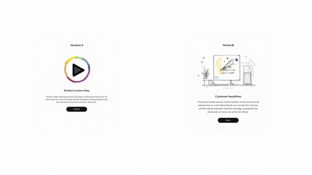
Here, a video-centric design is tested against a more traditional headline-and-illustration layout. They’re both chasing the same goal, but they’re using very different psychological triggers to get there.
Testing Page Layout and Form Design
Beyond tweaking individual elements, sometimes the entire structure of your page needs a shake-up. A more radical redesign can help you test a fundamentally different approach to the user’s journey.
For instance, you could test a long-form, single-column sales page against a more compact, multi-column layout for a B2B service. The question is, which format does a better job of guiding the user toward the conversion goal?
Form design is another area where layout is king. One study I’ve seen compared a horizontal form bar to a vertical one. The vertical layout pulled in a 0.32% conversion rate, while the horizontal one only managed 0.23%. That small tweak delivered a 52% improvement in performance—proof that layout is a powerful lever. You can check out more landing page testing results to see just how much these kinds of changes can matter.
Remember, the goal of designing a variant isn’t just to make something that looks different—it’s to create an experience that behaves differently in a way that helps the user achieve their goal more easily.
At the end of the day, your variant design should flow directly from your hypothesis. Every change needs a clear “why” behind it. For more ideas on how design choices influence conversions, feel free to explore our articles on improving user experience. By always tying your design decisions back to observed user behavior, you guarantee that every split test is a valuable learning opportunity, win or lose.
Running Your Split Test Without Technical Mishaps
A brilliant hypothesis is worthless if the test itself is technically flawed. I’ve seen it happen too many times: a sloppy setup corrupts the data, wastes weeks of traffic, and sends the team chasing phantom results. Getting the mechanics right from the get-go is the only way to ensure you can actually trust your findings.
Thankfully, you don’t have to be a developer to get this right. Most modern testing platforms handle the heavy lifting for you, especially the critical task of randomizing traffic. You need to be certain your tool is delivering a truly random 50/50 split. If it isn’t, you’re introducing a bias that invalidates everything before you even start.
First Things First: Calculate Your Sample Size
Before you even dream of launching your test, you have to know what your target is. How many people need to see your pages, and how many conversions do you need to count, before you can confidently call a winner?
Launching a test without this number is like flying blind. You might see one version pull ahead after a couple of days and be tempted to stop the test, but that’s a classic rookie mistake.
You’ll need an A/B test sample size calculator to figure this out. You’ll plug in a few numbers:
- Baseline Conversion Rate: This is just your current landing page’s conversion rate.
- Minimum Detectable Effect: What’s the smallest lift you care about? Are you looking for a 10% increase or something more dramatic?
- Statistical Significance: This is your confidence level. The industry standard is 95%, and you should stick to it.
This simple calculation is your defense against making decisions based on random chance. Early leads are often just statistical noise, not a real signal.
If you remember one thing, make it this: be patient. Ending a test prematurely because one variation is “winning” is the single biggest—and most destructive—mistake in A/B testing. You have to let the test run until it hits the sample size you calculated. No exceptions.
How Long Should You Run the Test?
While hitting your sample size is the primary goal, the duration of the test also matters. You need to run it long enough to account for the natural ebbs and flows of user behavior. Someone visiting your site on a Tuesday morning might behave very differently than someone browsing on a Saturday night.
As a general rule, aim to run your test for at least one full business cycle. For most businesses, this means one or two full weeks. This duration helps average out any weirdness from specific days of the week, giving you a much more realistic picture of performance.
Also, be aware of what else is going on in your business. Kicking off a split test right in the middle of a massive Black Friday sale or a viral social media campaign is a recipe for disaster. Those events will send unusual, highly-motivated traffic to your page and completely pollute your test data. Unless the promotion is what you’re testing, try to isolate your experiments from major marketing pushes. This way, you’ll know your results are from your changes, not a temporary traffic spike.
How to Analyze Your Results and Declare a Winner
The test is over, the data is in, and now comes the moment of truth. This is where you turn all that hard work into real, measurable improvements. But I’ve seen it time and again—this is also where a lot of well-intentioned efforts fall apart.
Picking a winner isn’t as simple as just pointing to the variant with the higher conversion rate. You need to make a statistically sound decision that you can count on to boost your landing page’s performance for the long haul.

It’s tempting to glance at the main numbers and call it a day, but the real gold is usually buried a little deeper. You have to understand the confidence behind your results.
Get a Handle on Statistical Significance
If there’s one concept you absolutely need to nail when you split test a landing page, it’s statistical significance. This is the metric that tells you how likely it is that your results happened because of the changes you made, not just random luck. It’s basically a confidence score for your entire experiment.
In the world of testing, the gold standard for declaring a winner is a 95% confidence level. What this means is you can be 95% sure that the difference you’re seeing between your control and your variant is the real deal and will happen again.
If your testing tool shows a confidence level below that magic number, you don’t have a true winner. It doesn’t matter if one version looks like it’s pulling ahead.
A test result with 80% confidence might feel promising, but think about it this way: there’s still a one-in-five chance it’s a total fluke. You wouldn’t want to build a business strategy on those odds. Stick to the 95% rule to make sure your changes are built on solid ground.
Dig Deeper: Segment Your Results
Just looking at the overall conversion rate is only scratching the surface. The real magic, the kind that leads to breakthroughs, happens when you start segmenting your results. You need to understand how different groups of people reacted to your changes. This is how you uncover those powerful, nuanced insights that a bird’s-eye view will always miss.
Start by slicing your data based on:
- Device Type: Did your new, slick design kill it with mobile users but fall flat on desktop?
- Traffic Source: How did visitors from your latest email campaign respond compared to people clicking your paid ads?
- New vs. Returning Visitors: Does your bold new messaging resonate more with first-timers or with your loyal followers?
This kind of granular analysis is where the game is won. For example, a test might show Version B winning by 10% overall. Good, but not great. But when you segment, you might discover it actually crushes it with mobile users by 25% while losing by 15% on desktop.
Now that’s an insight you can act on. You can deploy the winning design just for mobile while keeping the original for desktop, maximizing your gains across the board. You can learn more about how segmentation clarifies test results on leadpages.com.
Making the Final Call
Once you’ve got a winner with at least 95% statistical confidence, it’s go-time. Push the winning variation live as the new control for all the relevant traffic segments.
But don’t just pop the champagne and move on. The real power of testing is that your learnings fuel your next hypothesis. Your insights on conversion rate optimization are cumulative; every test you run should build on the knowledge you gained from the last one.
And if you’re ready to look beyond basic split tests, there are some great resources on enhanced incrementally testing and A/B experiments that can offer even deeper insights.
Common Landing Page Testing Mistakes to Avoid
Even the most experienced optimizers trip over common pitfalls that can completely tank their test results. Running a clean, reliable split test involves more than just a clever hypothesis; you have to be vigilant about avoiding critical errors that will corrupt your data and point you in the wrong direction.
These mistakes might seem minor on the surface, but they can easily waste weeks of valuable traffic and lead to disastrous business decisions. Knowing what they are ahead of time is the best way to protect your testing program from being built on a foundation of bad data.
Testing Too Many Variables at Once
It’s always tempting to try and fix everything at once. You want to change the headline, swap out the hero image, and rewrite the CTA button. While it might feel like you’re being efficient, you’re actually setting yourself up to learn absolutely nothing.
If your new Frankenstein-page wins, you’ll have no clue why. Was it the powerful new headline? Or was it just the brighter button color?
To run a meaningful A/B test, you have to isolate a single variable. This is the only way to know with certainty that your change was responsible for the change in performance. Real optimization is a game of inches—a series of small, proven gains, not a chaotic overhaul.
Calling a Test Too Early
This is probably the single most common—and most damaging—mistake I see. You launch a test, and two days in, your new variation is crushing it with a 20% higher conversion rate. The urge to declare victory, push the winner live, and pop the champagne is almost irresistible. But you have to fight it.
Early results are often just statistical noise. A test isn’t done until it reaches its predetermined sample size and hits a statistical significance of at least 95%. If you stop before that, you’re basically just flipping a coin and letting random chance dictate your strategy.
Patience is everything in good A/B testing. You have to let the test run its course, even when one variation is jumping ahead or falling behind. Trust the math, not your gut feeling.
Ignoring Technical Pitfalls
Your results are only as reliable as your technical setup. A few gremlins hiding behind the scenes can quietly sabotage your data without you ever knowing it. One of the most infamous culprits is the “flicker effect.”
This is when the original page flashes on screen for a split second before the testing tool swaps in the variant. That brief, jarring flash can annoy visitors and negatively influence their behavior, unfairly biasing the results against your new version.
A few other technical issues to keep an eye on:
- Improper Cookie Handling: Make sure your tool correctly remembers which version a returning visitor has seen. A consistent experience is crucial for clean data.
- Slow Page Load Speeds: If your variant takes longer to load than the control, you aren’t just testing a new design—you’re testing your visitors’ patience.
By sidestepping these common blunders, you can run clean split tests on your landing page, trust that your data is accurate, and be confident that the insights you’re gathering are the real deal.
Got Questions About Split Testing? We’ve Got Answers
Even with the best plan, you’re bound to run into a few head-scratchers once you start testing your landing pages. It happens to everyone. Let’s walk through some of the most common questions that pop up, so you can keep your experiments on track and trust the data you’re collecting.
How Long Should My Landing Page Test Run?
There’s no one-size-fits-all answer here, but there are a couple of hard-and-fast rules.
First, you need to run the test long enough to get a complete picture of your traffic patterns. Think in terms of a full business cycle, which for most companies is about one to two weeks. This helps average out the natural ups and downs you see in visitor behavior—after all, your B2B traffic on a Monday morning is probably a whole lot different than it is on a Friday afternoon.
Even more critical, however, is hitting statistical significance. Before you launch anything, plug your numbers into an A/B test duration calculator. It’ll give you a solid estimate based on your page’s current conversion rate and the improvement you’re hoping to see.
Whatever you do, never stop a test early. I can’t stress this enough. It’s tempting to call it when one variant shoots ahead, but those early results are often just statistical noise. Making a call based on a random fluke can send your whole strategy down the wrong path.
What if My Test Results Are Inconclusive?
Getting an “inconclusive” result feels like a letdown, but it’s not a failure. It’s actually a piece of valuable feedback. Most of the time, it simply means the change you tested wasn’t powerful enough to make a real difference to your visitors.
Another possibility is that different segments of your audience reacted in opposite ways, essentially canceling each other out. This is where you get to do some real detective work. Dive into your analytics and segment the results. Did the new version work better for mobile users but worse for desktop? Did it resonate with visitors from paid ads but fall flat with your organic traffic?
Use those insights to build a smarter, more targeted hypothesis for your next round of testing.
Should I Test a Radical Redesign or Just Tweak Small Details?
This is a classic debate, and the truth is, you need both in your optimization toolkit. The right approach really depends on your goals and how much risk you’re willing to take on.
- Iterative Changes: Small, focused tests—like changing your button copy or swapping out a headline—are the bread and butter of continuous optimization. They’re low-risk and perfect for dialing in the performance of a page that’s already doing pretty well.
- Radical Redesigns: If your current page is a serious underperformer, incremental tweaks might not be enough. Testing a completely different layout or value proposition is a high-risk, high-reward move designed to find a big breakthrough.
The most sophisticated teams I’ve worked with do both. They’ll run a radical redesign to establish a new, higher-performing baseline, and then they’ll immediately follow up with a series of iterative tests to fine-tune that new winner.
Ready to make sure your most important messages get seen? LoudBar helps you create unmissable, conversion-focused notification bars that break through banner blindness. Start grabbing your visitors’ attention today at https://loudbar.co.