Blog

  • How to Increase Ecommerce Conversion Rate: Quick Wins

    How to Increase Ecommerce Conversion Rate: Quick Wins

    Boosting your ecommerce conversion rate is all about making it easier and more appealing for people to buy from you. It comes down to a simple, powerful idea: find the friction points in your customer’s journey and smooth them out. When you do this systematically, you turn more of the traffic you already have into real revenue.

    Why Your Ecommerce Conversion Rate Is a Vital Sign

    A digital dashboard showing a rising graph with shopping cart icons, symbolizing an increasing ecommerce conversion rate.

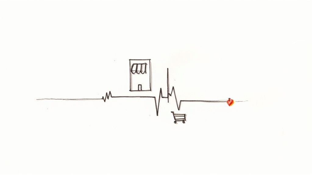
    Think of your conversion rate as the pulse of your online store. It’s not just another metric on a crowded dashboard; it’s a direct measure of how well your entire site—from the homepage to the checkout—is working to turn casual browsers into paying customers.

    A low rate is a clear warning that something’s off. Maybe your product pages aren’t compelling, or the checkout process is a maze. On the flip side, a healthy rate is proof that you’ve created an experience that clicks with your audience.

    So, what’s a “good” number to aim for? Across the board, the average ecommerce conversion rate hovers somewhere between 2% and 4%. But that’s just a starting point. Your industry plays a huge role.

    Average Ecommerce Conversion Rates By Industry

    This table provides a quick reference for average conversion rates across different ecommerce sectors, helping you benchmark your own performance.

    Industry Average Conversion Rate
    Fashion and Apparel 2.5%
    Health and Beauty 3.3%
    Home Goods 1.8%
    Electronics 1.9%
    Food and Beverage 4.6%
    Sports and Outdoors 2.1%

    As you can see, a 4.6% rate in the Food and Beverage industry is fantastic, while a 1.8% rate for a Home Goods store is actually quite solid, given the longer consideration times for bigger purchases. Context is everything.

    Moving Beyond the Basic Definition

    To really appreciate its power, you have to understand what a conversion rate truly is at its core. It’s the ultimate report card on how persuasive and user-friendly your store is. Nail this one metric, and the positive effects ripple through your entire business.

    A higher conversion rate means:

    • More Revenue, Same Traffic: You’re making more money from the visitors you’ve already attracted. This immediately boosts the ROI on every single marketing dollar you’ve spent.
    • Better Profitability: Since your customer acquisition cost doesn’t change, every new sale from conversion optimization is more pure profit.
    • Stronger Customer Loyalty: A shopping experience that is smooth, intuitive, and trustworthy doesn’t just create a sale; it creates a repeat customer.

    A rising conversion rate is proof that you’re not just selling products; you’re building a customer-centric experience that works. It shows you understand your audience’s needs and have successfully removed the barriers standing between them and a purchase.

    In the rest of this guide, we’ll walk through a practical playbook for diagnosing the real problems and implementing fixes that actually move the needle.

    Finding the Leaks in Your Sales Funnel

    A magnifying glass hovering over a digital sales funnel, highlighting areas where user icons are falling out, symbolizing customer drop-off points.

    Before you can fix anything, you have to know what’s broken. Trying to boost your conversion rate without knowing where you’re losing customers is like trying to fix a leaky pipe in the dark. You might get lucky, but you’ll probably just make a bigger mess.

    Your first job is to put on your detective hat and find the exact spots where your sales funnel is springing leaks. This isn’t about getting lost in endless spreadsheets; it’s about using a few powerful tools to get a clear picture of user behavior. The goal here is simple: move from guessing to knowing.

    See the Leaks with Funnel Reports

    The most direct way to spot trouble is by visualizing your conversion funnel in an analytics platform like Google Analytics 4. A funnel report shows you the step-by-step path a user takes on their way to making a purchase and, more importantly, where they drop off.

    A typical ecommerce funnel breaks down into a few key stages:

    • Viewed a Product Page: The user shows initial interest.
    • Added to Cart: Their interest turns into a real intent to buy.
    • Began Checkout: They’ve committed and are ready to pay.
    • Completed Purchase: You’ve made a sale.

    Once you build this report, the data will immediately tell you a story. You might find that 90% of users who add an item to their cart start the checkout process—fantastic. But maybe you’ll also discover a huge drop-off between viewing a product page and adding that item to the cart. That’s a critical clue. It tells you the problem isn’t your checkout flow; it’s something on your product pages that’s giving people pause.

    Your funnel report tells you what is happening and where. For instance, if you see a 70% drop-off rate between the “Add to Cart” and “Begin Checkout” steps, you’ve just found your biggest leak. Now you have to figure out why.

    Understand the “Why” Behind the Drop-Off

    Analytics tells you what, but qualitative tools like heatmaps and session recordings tell you why. These tools let you see your site through your customers’ eyes, revealing the friction points that numbers alone can’t.

    Heatmaps give you a visual aggregate of where users click, move their mouse, and scroll. If you noticed people aren’t adding items to their cart, a heatmap of your product page might show that your “Add to Cart” button is practically invisible because it’s below the fold on mobile or its color blends into the background.

    Session recordings are even more powerful. These are literal video playbacks of individual user journeys. I’ve had so many “aha!” moments just watching a handful of recordings. You might see someone repeatedly trying to click on something that isn’t a link, struggling to find shipping info, or getting stuck behind a pop-up that won’t close. It can be a humbling, eye-opening experience.

    Turn Your Data into an Action Plan

    Once you’ve paired the hard numbers from your funnel report with the human insights from heatmaps and recordings, you can finally build a smart, prioritized action plan. Don’t try to fix everything at once. Go after the leaks that are costing you the most customers first.

    If your funnel shows a massive drop-off during checkout and session recordings show users getting confused by the shipping address form, that’s your top priority.

    You might also find that behavior changes depending on where the traffic comes from. For example, maybe visitors from social media ads abandon carts far more often than visitors from organic search. This is where you can start thinking about target audience segmentation and tailoring the experience for different groups.

    This diagnostic approach shifts your entire strategy. Instead of randomly changing button colors and hoping for the best, you’re making data-informed hypotheses designed to fix real, documented problems. That’s the foundation for sustainably growing your conversion rate.

    Fine-Tuning the User Experience to Drive Sales

    An overhead view of a smartphone screen showing a well-designed ecommerce product page with high-quality images and clear calls to action.

    Now that you know where people are dropping off, it’s time to roll up your sleeves and fix the experience itself. A truly great user experience (UX) isn’t about fancy animations or cutting-edge design. It’s about making the journey from “ooh, what’s this?” to “purchase confirmed” completely seamless and intuitive.

    Every single element on your site—from your product photos to the navigation menu—has a job to do. That job is to answer questions, build confidence, and gently guide shoppers toward that “Add to Cart” button.

    Make Your Products Impossible to Resist

    Think of your product page as your digital showroom floor. This is where a casual browser becomes a serious potential buyer. Just listing features and specs won’t cut it; you have to make your products feel tangible and genuinely desirable.

    Start with your visuals. Since shoppers can’t physically touch your products, high-resolution images and videos are your most powerful sales tools.

    • Show Every Angle: Don’t leave anything to the imagination. Provide photos from the front, back, side, and even close-ups of important details.
    • Use Lifestyle Shots: Show your product in action. If you sell a backpack, show a photo of someone actually hiking with it. This helps customers visualize it in their own lives.
    • Bring it to Life with Video: A short demo or product tour can answer questions that static images just can’t. It’s often the final nudge someone needs.

    Next up, your product descriptions need to do some heavy lifting. Go beyond the what and explain the why. A great description doesn’t just list dimensions; it paints a picture of how this product will solve a problem or improve the customer’s life. Try to anticipate common questions and answer them right there in the copy—think materials, care instructions, or compatibility.

    Your product page should be your best salesperson. It needs to anticipate every question a customer might have and provide a clear, compelling answer that leaves no room for doubt.

    For a deeper dive, check out our other articles on creating an excellent user experience.

    Simplify How People Find Things

    This might sound obvious, but it’s a huge conversion killer: if customers can’t find what they’re looking for, they can’t buy it. Confusing navigation is one of the top reasons people bounce. Your goal is to get someone to their desired product in as few clicks as possible.

    A powerful on-site search function is your secret weapon here. I’ve consistently seen that customers who use site search are 2-3 times more likely to convert. Why? Because they already know what they want. Make sure your search bar is front and center and includes features like:

    1. Autocomplete: Suggests products as the user types, speeding up the process.
    2. Typo Tolerance: A simple typo shouldn’t lead to a “no results” page. The search should be smart enough to figure it out.
    3. Visual Search: For certain industries, allowing users to upload an image to find similar products is a game-changer.

    Of course, clear navigation menus and logical categories are just as critical. Use simple, straightforward labels—no one has time for clever jargon—and implement breadcrumbs so users always know where they are on your site.

    Put Your Mobile Experience First

    This isn’t a suggestion anymore; it’s a requirement. Optimizing for mobile is the single most important part of your UX strategy today. The data is clear: while mobile devices account for roughly 73% of all online shopping traffic, conversion rates on desktop are still higher.

    So, what’s with that gap? It exists because too many mobile sites are still a pain to use. But with mobile commerce sales set to explode, fixing this is your single biggest opportunity for growth. You can see more on these ecommerce benchmarks on speedcommerce.com.

    Think “thumb-friendly.” Buttons need to be big enough to tap easily. Forms should be a breeze to fill out on a small screen. The entire checkout flow has to be designed with a mobile user in mind. When you make the experience effortless on any device, you close that conversion gap and turn all that mobile traffic into actual revenue.

    Making Your Checkout Process Effortless

    A streamlined checkout interface on a mobile phone, showing clear steps and easy-to-tap payment options.

    You did it. You got a shopper to find your site, browse your products, and fall in love with something enough to hit “Add to Cart.” This is the home stretch, the final, crucial step. And yet, this is precisely where an incredible number of stores fumble the sale.

    Cart abandonment is the silent killer of conversions, and a complicated, clunky checkout is almost always the culprit.

    I like to think of the checkout as the last hundred meters of a marathon. If a runner sees a clear, flat path to the finish line, they’ll find that last burst of energy and sprint. But if they suddenly see a steep hill or a confusing detour, they’re far more likely to just give up. Your job is to make that final stretch a clear, flat path for your customers.

    The shopping cart abandonment rate is a massive challenge, sitting at 71.3% globally—and it gets even worse on mobile. The number one reason for this massive drop-off? Unexpected costs like shipping and taxes that pop up at the very end. To capture those sales you were so close to making, your entire focus has to be on making the checkout feel effortless. You can dive deeper into the data with these e-commerce benchmarks and abandonment rates on speedcommerce.com.

    Always, Always Offer a Guest Checkout

    Forcing someone to create an account before they can give you their money is probably the fastest way to lose a sale. It’s a huge point of friction at the worst possible moment. The fix is incredibly simple: always offer a guest checkout option.

    Giving shoppers the choice to check out as a guest removes a major barrier. They can complete their purchase quickly, and you can always ask them to create an account after the sale is locked in.

    It’s a win-win scenario. New customers get the speedy experience they demand, and you still get the chance to turn them into a registered user on the confirmation page. A simple “Want to save your info for next time?” prompt works wonders.

    Keep Your Forms Short and Sweet

    Every single field in your checkout form is a small hurdle. The more fields you add, the higher the chance of frustration and, ultimately, abandonment. The goal here is to ask for the absolute bare minimum you need to process the order.

    Here’s how you can trim the fat from your forms:

    • Single Name Field: Just use one field for “Full Name.” Don’t make them tab or click from “First Name” to “Last Name.”
    • Smart Address Lookups: Use a tool that automatically fills in the city and state once a user types in their zip code. It’s a small touch that makes a big difference.
    • Hide the “Company” Field: Unless you’re a B2B business, this field is usually optional. Tuck it away behind a link like “Add company name (optional).”
    • Default to a Single Address: Pre-check a box that says “My billing and shipping address are the same.” For most people, they are.

    These small adjustments drastically reduce the mental effort required from your customers, making the whole process feel faster and way less tedious.

    Be Radically Transparent About Costs

    Long forms and forced sign-ups are annoying, but the undisputed king of cart abandonment is surprise costs. Nothing kills the buying mood faster than a shopper seeing an unexpectedly high shipping fee or tax amount added at the very last second.

    The only way to solve this is to be completely upfront about all costs, as early as you possibly can.

    1. Add a Shipping Calculator: Put a shipping cost estimator right in the shopping cart. Let people enter their zip code to see their options before they even start the official checkout.
    2. Show Taxes Upfront: Don’t wait until the final payment screen to reveal the total. If you can, estimate taxes based on the user’s location early in the process.
    3. Offer Modern Payment Options: Make sure you’ve integrated digital wallets like Apple Pay and Google Pay, along with ‘Buy Now, Pay Later’ services like Klarna or Afterpay. These options offer speed and flexibility, which can be the final nudge a hesitant shopper needs to click “Buy.”

    When you build a checkout that’s simple, transparent, and flexible, you transform a common point of friction into a smooth final step that seals the deal.

    Earning Trust and Sparking Action

    So, a potential customer has landed on your site. They’ve browsed, they’ve clicked, and they’ve even added an item to their cart. They are this close to buying, but then… they hesitate. That single moment of doubt can derail the entire sale. In the impersonal world of e-commerce, trust isn’t just a nice-to-have; it’s the bedrock of every transaction.

    Your job is to get them over that final hurdle. It’s a careful dance between making them feel completely secure and giving them a compelling nudge to buy now.

    Show Them They’re in Good Hands

    First-time visitors are wired for skepticism. Their internal monologue is running wild: “Is this a real company? What if I hate the product? Is my credit card info safe here?” You have to proactively silence those fears.

    This is where trust signals come into play. They’re the visual cues and guarantees that instantly put a shopper’s mind at ease. Think of them as the digital version of a friendly, knowledgeable salesperson in a brick-and-mortar store.

    • Security Badges: Placing recognizable logos from Norton, McAfee, or your SSL provider right where they can see them—especially at checkout—is a powerful visual shorthand for “you’re safe here.”
    • A No-Nonsense Return Policy: Don’t bury your return policy in the footer labyrinth. A straightforward, fair, and easy-to-find policy demolishes the perceived risk of a bad purchase. A simple banner saying “30-Day Hassle-Free Returns” can be the final push a nervous buyer needs.
    • Customer Reviews and Ratings: This is your social proof superpower. Nothing convinces a new customer like seeing that other real people bought from you and were happy they did.

    You really can’t overdo it with reviews. The global ecommerce market is projected to reach a staggering $6.86 trillion in 2025, meaning shoppers are drowning in options. To cut through the noise, you have to lean on what other people are saying—an incredible 99% of customers read reviews before buying. Learn more about global ecommerce trends on sellerscommerce.com.

    Trust is built in tiny, critical moments. A single security badge or a transparent return policy can be the only thing standing between you and an abandoned cart. Make your commitment to their security impossible to ignore.

    Nudging Them Forward with Ethical Urgency

    Once a shopper feels safe, it’s time to create a little urgency. We’re not talking about cheesy, high-pressure sales tactics here. This is about giving customers a legitimate reason to stop overthinking and just make a decision. Done right, urgency helps people overcome their own indecision and feel smart for acting quickly.

    Here are a few tactics that work without feeling sleazy:

    1. Low-Stock Alerts: A simple message like “Only 3 left!” creates a natural fear of missing out. It’s most powerful when it’s true, as it also signals the product’s popularity.
    2. Time-Bound Offers: Nothing gets people moving like a ticking clock. A countdown timer for a sale or a discount that expires at midnight frames the choice as now or never.
    3. Shipping Cutoffs: “Order in the next 3 hours for same-day shipping” is a brilliant, service-oriented way to create urgency. The focus is on a benefit they want: getting their stuff faster.

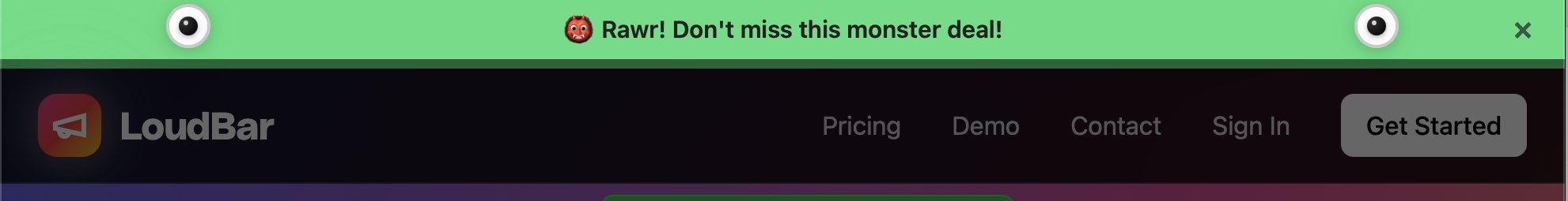
    One of the most effective ways to broadcast these messages is with an attention-grabbing notification bar. A clean top bar can announce a flash sale or a shipping deadline without being obnoxious like a pop-up. Understanding the benefits of a notification bar makes it clear how this simple tool can highlight your most important messages, turning casual browsing into decisive action.

    It’s Not a Project, It’s a Process

    You’ve patched the leaks, smoothed out the checkout flow, and earned your visitors’ trust. Fantastic. But boosting your conversion rate isn’t a one-and-done task you can cross off a list. The stores that consistently win are the ones that treat optimization as a core part of their operations—a continuous cycle of testing, learning, and refining.

    This mindset is what separates hopeful guesswork from systematic, data-driven growth. It’s all about structured experimentation, and the workhorse of experimentation is A/B testing. The idea is simple: you create two versions of a page element (Version A, the original, and Version B, the challenger) and show them to different groups of visitors to see which one performs better.

    Start With a Smart Hypothesis, Not a Random Guess

    Don’t fall into the trap of testing things just for the sake of it, like randomly changing button colors. A real testing program starts with a solid hypothesis rooted in the data you’ve already collected. Your analytics, heatmaps, and session recordings are your treasure map—they point directly to the problem areas.

    Let’s imagine your funnel report shows a huge drop-off on product pages. You pull up some heatmaps and notice that almost no one is scrolling far enough to see the detailed product specifications. That’s your clue.

    From there, you could form a hypothesis like this:

    “I believe that moving the key product specifications into a tabbed section right below the main product images will make that critical info easier to find. As a result, more people will get their questions answered and click ‘Add to Cart’.”

    See? That’s a specific, testable idea. It’s not a vague hope; it’s a direct response to an observed user behavior. Now you’re ready to build your “B” version and see if you’re right.

    Run Clean Tests and Trust the Data

    When you launch an A/B test, discipline is everything. You absolutely have to change only one thing at a time. If you change both the headline and the main product image, you’ll have no idea which element actually drove the results. It’s tempting to bundle changes, but you’ll muddy the waters and learn nothing. Be patient.

    Let the test run long enough to achieve statistical significance. This is a fancy way of saying you have enough data to be confident the outcome isn’t just a random fluke. Good testing tools, like Google Optimize or VWO, will tell you when you’ve reached this milestone, usually around a 95% confidence level.

    Once the test concludes, it’s time to look at the results. Did your change lift conversions? Awesome. Push that change live for everyone. Did it do nothing, or even make things worse? That’s still a win. Seriously. You just learned that your hypothesis was wrong, and you saved yourself from permanently implementing a change that would have cost you money.

    This cycle—hypothesize, test, analyze, learn—is the real engine of long-term growth. It transforms your website from a static brochure into a dynamic laboratory where every tweak gets you one step closer to understanding what truly makes your customers tick.

    Your Questions, Answered

    Got some lingering questions about how to actually move the needle on your conversion rates? It’s a common feeling. Let’s tackle some of the most frequent questions we get from founders and marketers who are serious about turning more visitors into customers.

    What’s a “Good” Ecommerce Conversion Rate, Really?

    The industry benchmark you’ll hear thrown around is usually between 2% and 4%. But honestly, that number can be misleading. A store selling $20 t-shirts is going to have a much different conversion rate than one selling $3,000 custom furniture.

    Instead of obsessing over a global average, focus on your own numbers. Your real goal should be to consistently beat your last month’s performance. That’s how you build real momentum.

    How Much Do Product Pages Actually Matter?

    Think of your product page as your digital salesperson. It’s where the final “yes” or “no” decision is made, so it’s absolutely critical. This is where a visitor decides if they trust you enough to pull out their credit card.

    To make sure your pages are closing the deal, you need a few non-negotiables:

    • Amazing Visuals: Don’t just show the product; show it being used. Multiple high-res photos, different angles, and maybe even a short video can make all the difference.
    • Compelling Copy: Ditch the jargon. Your descriptions should focus on the benefits for the customer, not just a list of features. How will this make their life better?
    • Visible Social Proof: Customer reviews and ratings need to be front and center. Shoppers actively look for them, so don’t make them hunt.

    Here’s something to keep in mind: over 60% of your traffic is likely on a phone. If your product pages aren’t perfect on mobile, you’re practically throwing sales away.

    I Need a Boost Now—What Are the Quickest Wins?

    If you’re looking for fast, high-impact changes, the game is all about reducing friction and building trust. These are the two levers you can pull right away.

    First, take a hard look at your checkout process. Is it as simple as it can possibly be? The famous story about Expedia earning an extra $12 million a year just by removing one optional form field is a powerful lesson. Every single field is a potential roadblock.

    Second, sprinkle trust signals all over your checkout and product pages. Things like security badges, clear return policies, and a bold “Free Shipping” reminder right next to the “Buy Now” button can be the final nudge a hesitant shopper needs to feel confident and complete their order.


    Ready to grab your visitors’ attention and drive more sales? LoudBar helps you create unmissable notification bars that turn fleeting interest into action. Ditch banner blindness and start converting more traffic today at https://loudbar.co.

  • How to Increase Website Conversion Rate: A Practical Guide

    How to Increase Website Conversion Rate: A Practical Guide

    Boosting your website’s conversion rate isn’t about guesswork or randomly changing button colors. It’s a methodical process that starts with a deep dive into your data to truly understand what your visitors are doing, where they’re getting stuck, and why. From there, it’s all about forming smart hypotheses, testing changes, and scaling what actually works.

    Your Starting Point: The Foundational CRO Audit

    A person analyzing charts and graphs on a computer screen, representing a website audit.

    Before you can fix anything, you have to know what’s broken. Jumping straight into A/B testing without a clear baseline is like trying to navigate a new city without a map—you’ll be moving, but probably not in the right direction. A proper CRO audit is about gathering objective data to see your website through your users’ eyes.

    This isn’t the time for assumptions. You need to become a digital detective. Your mission is to uncover precisely where potential customers get frustrated, confused, or just give up. By blending hard numbers with real human behavior, you can build a complete picture of your site’s performance and zero in on the biggest opportunities.

    Digging into the “What” with Quantitative Analytics

    Your first stop should always be your analytics platform, which for most of us is Google Analytics. This is where you find the “what” of user behavior. Forget vanity metrics like total traffic for a moment and focus on the data points that scream “friction!”

    Start by dissecting these key reports:

    • Funnel Visualization: This is your bread and butter. Map out the critical steps a user takes to convert, whether it’s an e-commerce checkout or a B2B lead form. This report will show you the exact pages where you’re losing the most people. A 90% drop-off between the cart and payment pages? That’s not just a leak; it’s a firehose.
    • Landing Page Performance: Take a hard look at your top landing pages. Sort them by bounce rate or, even better, by their abysmal conversion rates. A high-traffic page that isn’t converting is a goldmine for optimization. A blog post pulling in thousands of visitors with zero conversions likely has a weak call-to-action (CTA) or a design that hides the next step.
    • New vs. Returning Users: Segmenting your audience is crucial. How do first-timers behave compared to your loyal fans? If returning users convert at a much higher rate, it’s a strong signal that new visitors aren’t grasping your value proposition right away.

    A quantitative audit is fantastic for identifying the problem areas. It tells you where users are bouncing, but it can’t tell you why. For that, you need to see things from their perspective.

    Uncovering the “Why” with User Behavior Tools

    Once you know where the problems are, it’s time to figure out why they’re happening. This requires tools that show you how people actually interact with your pages. These insights are what separate good CRO from great CRO—they add the human story behind the numbers.

    Two types of tools are absolute game-changers here:

    Heatmaps: Tools like Hotjar or Crazy Egg create a visual overlay on your site showing where users click, move their mouse, and scroll. A heatmap might instantly reveal that dozens of users are clicking on a non-clickable image, signaling a major UX flaw. Or, it could show that your primary CTA is “below the fold,” where almost no one ever scrolls.

    Session Recordings: Think of these as a DVR for your user’s journey. Watching a few recordings of a problematic page can be one of the most humbling and eye-opening experiences in marketing. You’ll see users rage-clicking a broken button, struggling to find the right field in a form, or just looking completely lost. This firsthand evidence is invaluable for building empathy and generating powerful test ideas. You can dig deeper into interpreting these patterns by exploring other resources on improving conversion rates.

    By the end of this foundational audit, you shouldn’t be left with a list of random ideas. You should have a data-backed list of very specific problems: “Users are abandoning checkout on the shipping page,” or “Almost no one is clicking the ‘Request a Demo’ CTA on our features page.” This level of clarity is the bedrock of any successful optimization effort.

    Prioritizing Opportunities For Maximum Impact

    Photo by <a href="https://unsplash.com/@ch_pski?utm_source=unsplash&utm_medium=referral&utm_content=creditCopyText">Ch_pski</a> on <a href="https://unsplash.com/photos/a-street-sign-on-a-pole-bylXfUFJylU?utm_source=unsplash&utm_medium=referral&utm_content=creditCopyText">Unsplash</a>

    After a deep-dive audit, you’re probably looking at a massive, and frankly, intimidating list of potential fixes. The checkout flow is clunky. Mobile navigation is a total mess. And that one landing page has a bounce rate high enough to make any marketer break out in a cold sweat.

    The question shifts from “what’s broken?” to a much tougher one: “what do we fix first?”

    If you try to tackle everything at once, you’ll just spin your wheels, burn out your team, and see minimal results. To genuinely move the needle on your conversion rates, you need a system. You need a way to separate the quick wins from the game-changing projects.

    Introducing The Impact Versus Effort Model

    I’ve found the most practical way to build a CRO roadmap is to score every potential fix on two simple scales: Potential Impact and Required Effort. This framework forces you to be honest about both the potential upside of a change and the real-world resources needed to pull it off.

    Think of Potential Impact as the lift you expect to see in your key metric. Required Effort is the total cost—developer time, design hours, new copy, and sometimes even the political capital needed to get it approved.

    Here’s a simple scoring system I use:

    • Impact Score (1-5):
      • 5 (Massive): A change that directly affects the final conversion step. Think simplifying the checkout form or fixing a broken payment gateway.
      • 3 (Significant): An update on a key page that removes a known point of friction, like rewriting a confusing headline on a high-traffic product page.
      • 1 (Minor): A small cosmetic tweak with limited visibility, like changing a button color on a low-traffic “About Us” page.
    • Effort Score (1-5):
      • 5 (Very High): A huge undertaking. This is a complete page redesign or a new feature build that requires significant engineering and design resources.
      • 3 (Medium): Needs a few hours from a developer and maybe some copy updates.
      • 1 (Very Low): A quick fix you can handle yourself in the CMS in under an hour.

    Once you assign these two scores to every item on your list, you can plot them into four distinct quadrants. This is where your strategy truly comes to life.

    Your Four Strategic Quadrants

    With everything scored, you can categorize each task to build a clear, logical action plan. Visualizing your opportunities this way makes the next steps obvious.

    1. High-Impact, Low-Effort (Quick Wins): This is your goldmine. These are the no-brainers you should jump on immediately. Think updating CTA copy, adding trust badges, or removing a couple of unnecessary form fields.
    2. High-Impact, High-Effort (Major Projects): These are the big, meaty initiatives like overhauling the entire checkout process or redesigning the mobile experience. They have massive potential but need proper planning, so schedule these for future quarters.
    3. Low-Impact, Low-Effort (Fill-in Tasks): These are the minor tweaks that are nice to have but won’t fundamentally change your business. Do them when you have a bit of downtime, but don’t let them distract you from what really matters.
    4. Low-Impact, High-Effort (The Time Wasters): These are the projects that suck up resources with almost no return. Learn to politely say no to these and keep your team focused on impactful work.

    This framework is about more than just task management; it’s about building momentum. Knocking out a few quick wins gives your team a morale boost and generates the data you need to justify tackling those larger, more resource-intensive projects.

    Don’t forget to factor in your traffic sources when prioritizing. Data shows that in 2025, traffic from SEO has an average conversion rate of 2.3%, which is significantly better than paid social at 1.6%. At the same time, direct traffic converts at an impressive 3.3%, which tells us these visitors already know and trust you.

    These numbers suggest that focusing your optimization efforts on pages ranking well in organic search can deliver a fantastic return. You can see more on how conversion benchmarks vary by channel. And for those high-intent visitors coming directly to your site, check out our guide on personalized marketing to learn how to tailor their experience for an even bigger lift.

    Crafting And Implementing Winning Test Hypotheses

    Illustration by <a href="https://unsplash.com/@salmangfx?utm_source=unsplash&utm_medium=referral&utm_content=creditCopyText">Salman Ahmad</a> on <a href="https://unsplash.com/illustrations/man-with-laptop-gets-an-idea-symbolized-by-lightbulb-wu7DpEKTdAc?utm_source=unsplash&utm_medium=referral&utm_content=creditCopyText">Unsplash</a>

    Alright, you’ve done the hard work of digging through the data and now have a prioritized list of conversion roadblocks. This is where the real fun begins—turning those insights into action. We’re moving from what’s wrong to how we can fix it by crafting clear, testable hypotheses.

    A strong hypothesis isn’t just a random guess. It’s a structured prediction that connects a specific problem you found to a potential solution and, most importantly, a measurable outcome. It’s the difference between saying “let’s try a new button color” and having a real plan.

    Think of it as a simple but powerful formula: If we [implement this specific change], then [this measurable outcome] will happen, because [this is the user behavior we’re addressing]. This framework forces you to be crystal clear about what you’re changing, why you think it’ll work, and how you’ll know if you were right.

    The Anatomy Of A Strong Hypothesis

    Every solid hypothesis you write should have three core ingredients: the problem you identified in your audit, the specific solution you’re proposing, and the result you expect to see in your key metrics.

    Let’s walk through a common scenario. Say your audit revealed that a ton of mobile users are bouncing from your product pages. After watching a few session recordings, you see them endlessly scrolling and pinching, trying to find basic product specs.

    • The Problem: Mobile visitors are struggling to locate key product details.
    • The Proposed Solution: We’ll change the product specs from a clunky tabbed layout to an easy-to-use expandable accordion that’s visible on page load.
    • The Predicted Result: We expect to increase the “Add to Cart” rate on mobile by 15%.

    See the difference? We’ve turned a vague observation (“the mobile page is bad”) into a specific, measurable, and provable experiment.

    Turning Hypotheses Into Actionable Changes

    Now that you have your hypothesis, it’s time to build the actual change. Most of your tests will likely fall into a handful of key categories, all aimed at making the path to conversion smoother and more intuitive for your users.

    User Experience (UX) and Design

    Improving the fundamental user experience is often the lowest-hanging fruit. This could mean simplifying a confusing navigation menu, ensuring your layout is perfectly responsive, or redesigning a form that’s causing headaches. A friction-free journey almost always translates to better conversions.

    Copy and Calls-to-Action (CTAs)

    Your words matter. A lot. Vague headlines or generic benefit statements just don’t cut it. A great test might involve swapping a feature-focused headline like “Our Advanced Software” for a benefit-driven one like “Finish Your Work in Half the Time.”

    The same goes for your CTAs. They are the final gatekeepers to a conversion. Don’t be afraid to test everything about them. Changing the text from a passive “Submit” to an action-oriented “Get Your Free Quote” can make a world of difference. Experiment with button color, size, and even placement to see what truly captures your users’ attention.

    Your hypothesis is your North Star for the entire experiment. It keeps the team aligned on the goal and prevents ‘scope creep’ where a simple test balloons into a complex redesign.

    Forms and Trust Signals

    Forms are notorious conversion killers. Every single field you ask someone to fill out adds friction and increases the odds they’ll just give up. One of the highest-impact tests you can run is simply cutting out non-essential fields.

    For instance, you could hypothesize: “By removing the ‘Phone Number’ field from our demo request form, we will increase submissions by 25% because users are wary of giving out personal contact info.” It’s a simple change with a potentially massive upside.

    Beyond making things easier, you have to make users feel safe. They are constantly judging your site’s credibility. Hypotheses here usually focus on adding elements that build confidence and reduce anxiety.

    • Testimonials & Reviews: Placing a powerful customer quote right next to a CTA can provide the social proof needed to get someone over the finish line.
    • Security Badges: Displaying trust seals (like SSL certificates or logos from payment providers like Stripe or PayPal) in the checkout can calm security fears.
    • Clear Policies: Making your return policy or money-back guarantee impossible to miss can remove one of the biggest objections to buying.

    To help spark some ideas, here’s a quick-reference table of common conversion problems and the kinds of tests you could run to solve them.

    Common Conversion Blockers and Test Ideas

    Conversion Blocker Example Hypothesis Key Elements to Test
    Confusing Navigation If we simplify the main menu from 10 items to 5 core categories, then site engagement will increase, because users will find what they need faster. Menu labels, number of items, dropdown styles, mobile “hamburger” menu
    Weak Value Proposition If we change the homepage headline to focus on the primary benefit (e.g., “Save 10 Hours a Week”), then sign-ups will increase by 20%, because the value will be immediately clear. Headlines, subheadings, hero images/videos, intro copy
    High Cart Abandonment If we display security badges and a money-back guarantee on the cart page, then checkout completions will rise, because user trust and confidence will be higher. Trust seals (SSL, payment logos), guarantees, customer reviews, return policy link
    Low-Performing CTAs If we change the button copy from “Learn More” to “Get Your Free Trial,” then clicks will increase, because the CTA will be more specific and compelling. Button text, color, size, placement on the page, button shape

    This is just a starting point, of course. Use your own data to identify where the biggest leaks are in your funnel and build hypotheses that directly address those user pain points. Each test, whether it wins or loses, will teach you something valuable about your audience.

    Speed and Social Proof: The Unsung Heroes of Conversion

    You can have the clearest copy and the slickest design in the world, but two invisible forces are always at play: how fast your site feels and how much people trust you.

    A slow site is like making customers wait in a long, pointless line. A lack of social proof is like opening a restaurant with zero reviews. Both create instant friction and plant a seed of doubt that can kill a conversion before it even has a chance.

    Tackling these two areas is non-negotiable for anyone serious about CRO. One speaks to a user’s patience, the other to their herd mentality. Get them both right, and you’ll dismantle the psychological barriers that stop customers dead in their tracks.

    Speed Isn’t a Feature; It’s a Prerequisite

    Let’s be blunt: a slow website is a conversion killer. We live in a world of instant gratification, and every second a visitor has to wait is another chance for them to hit the back button and find a competitor who respects their time.

    The link between load time and conversions isn’t just a hunch; it’s a cold, hard fact. A page that loads in one second can have a conversion rate five times higher than one that takes ten seconds. The drop-off is that dramatic.

    A fast website feels professional and reliable. A slow one feels broken and untrustworthy. In the user’s mind, perception is reality, and a few seconds can make or break their entire impression of your brand.

    An Actionable Site Speed Checklist

    The good news? You don’t always need a full-blown technical overhaul to see a difference. Some of the biggest wins come from relatively simple fixes.

    Here’s a quick and dirty checklist to get you started:

    • Shrink Your Images: This is the low-hanging fruit. Huge, uncompressed images are the number one cause of page bloat. Use a tool like TinyPNG or ImageOptim to slash file sizes without sacrificing quality.
    • Turn On Browser Caching: Caching tells a visitor’s browser to save static files (like your logo and CSS). The next time they visit, the page loads almost instantly because those assets are already stored locally.
    • Minify Your Code: Every line of HTML, CSS, and JavaScript adds weight. Minification tools strip out unnecessary characters and spaces, making your code files smaller and faster to load.
    • Get a CDN: A Content Delivery Network (CDN) is a game-changer. It stores copies of your site on servers all over the globe, delivering content from the location closest to the user. This one move can dramatically cut down load times for a global audience.

    Let Your Customers Do the Selling with Social Proof

    Once your site is lightning-fast, you need to prove it’s the real deal. This is where social proof—especially User-Generated Content (UGC)—comes in. Today’s buyers are incredibly skeptical of marketing jargon; they want proof from people just like them.

    Sprinkling customer reviews, real-world testimonials, and user-submitted photos across your product and checkout pages can build more trust than any sales copy ever could. It validates their choice and calms those last-minute nerves.

    For some fantastic ideas on how to do this well, check out these 7 Powerful Social Proofing Examples. You’ll notice the best brands aren’t afraid to let their customers take center stage.

    When a potential buyer sees that others have already purchased and loved your product, it triggers a powerful sense of FOMO (Fear Of Missing Out). It gives them the validation they need to click “buy” with confidence. In the end, your happy customers can become your most convincing sales team.

    Time to Test: Setting Up and Analyzing Your A/B Tests

    Alright, you’ve done the hard work of auditing your funnels and you have a prioritized list of hypotheses. Now for the fun part: putting those ideas to the test with real users and real data. This is where we move from educated guesses to scientific proof, making sure every change we implement is a genuine improvement.

    Think of an A/B test as a simple, controlled experiment. You show half your audience the original page (the “control”) and the other half your new, improved version (the “variation”). Then, you just watch and measure which one gets you closer to your goal. This process takes the guesswork out of optimization and lets your customers’ actions dictate the best path forward.

    Get Your Experiment Set Up for Clean Data

    First things first, you need the right tool for the job. Platforms like Google Optimize (now part of Google Analytics 4), Optimizely, or VWO are designed for this and make the technical side of things much easier. Once you’re in, the precision of your setup is what separates a valuable test from a waste of time.

    Nail these details from the very beginning:

    • Define Your Goal: What, exactly, are you trying to move the needle on? A button click? A form submission? A completed purchase? Be specific. A fuzzy goal will always give you a fuzzy result.
    • Set Your Audience: Who gets to see this test? Is it for everyone, or just visitors on mobile? Maybe you only want to test on traffic coming from a specific ad campaign. Segmenting your audience can uncover some incredibly powerful insights.
    • Allocate Your Traffic: The standard is a 50/50 split. You want to send an equal number of people to the control and the variation to keep the playing field level. It’s the only way to get a fair comparison.

    Seriously, getting this stuff right is non-negotiable. A badly configured test is worse than running no test at all because it gives you the confidence to make bad decisions.

    Don’t Skip the Statistics (It’s Easier Than It Sounds)

    To run a test you can actually trust, there are a few core concepts you have to understand. It’s a common rookie mistake to ignore them, but doing so can completely invalidate your results, wasting traffic, time, and money.

    The big one is statistical significance. This is just a fancy way of saying how confident you can be that your results aren’t a fluke. The industry-standard goal is 95% significance. If you hit that number, it means there’s a 95% chance that the difference you’re seeing between the two versions is real and not just random noise.

    Next up is sample size. You simply need enough people to see your test for the results to be reliable. A test with only 100 visitors isn’t going to tell you much of anything. Most testing tools have calculators that will help you figure out how many visitors you need based on your current conversion rate and how big of an improvement you’re hoping to see.

    Finally, there’s test duration. This is a classic pitfall. It’s so tempting to call a winner after a day or two when one version is pulling ahead, but don’t do it! User behavior changes dramatically depending on the day of the week. To smooth out those peaks and valleys, you should always run a test for at least two full business weeks.

    A test that looks like a huge win after just 24 hours is often what we call a “false positive.” Patience is your best friend in CRO. Let the data mature over a full business cycle before you make a call.

    Digging for Gold in Your Test Results

    Once the test is done and you’ve hit that magical 95% significance level, the real analysis begins. Sure, it’s easy to pop the champagne and declare a winner, but the real value comes from understanding why it won. That’s the insight that will fuel your next great idea.

    Don’t just look at your main goal. Did the winning version impact any other metrics? For instance, maybe a new headline boosted sign-ups (your primary goal) but also tanked the average time on page. That could be a sign that while the headline was catchy, it didn’t set the right expectations for what came next.

    It’s also absolutely critical to segment your results. What if the variation crushed it for mobile users but actually performed a little worse on desktop? That’s not a failure; it’s a massive insight telling you to create different experiences for different devices.

    User context is everything. For example, we know that e-commerce conversion rates are typically much higher for desktop users (4.8%) than for mobile users (2.9%). Knowing benchmarks like these helps you frame your own results and spot your biggest opportunities. You can find more industry-specific conversion rates on SpeedCommerce.com. By slicing and dicing your data, you transform a simple win-or-lose result into a deep, strategic lesson that will make your entire CRO program smarter.

    Answering Your Top CRO Questions

    Even with the best playbook, you’re bound to have questions. Everyone does. Let’s tackle some of the most common ones that pop up when you’re deep in the trenches of conversion optimization. Getting these sorted will help you stay focused and make smarter decisions.

    What Is a Good Website Conversion Rate?

    This is the million-dollar question, isn’t it? And the honest-to-goodness answer is: it completely depends on your industry, product, and traffic.

    You’ll see people throw around averages like 2-4%, but that number is almost meaningless without context. A “good” rate for a B2B SaaS company selling a $50,000/year contract is worlds away from a Shopify store selling $20 t-shirts. They aren’t even playing the same sport.

    Instead of chasing a generic number, focus on what really matters:

    • Your Own History: The most important benchmark you have is your own data. A good conversion rate is one that’s trending up because of the smart changes you’re making. Are you better than you were last month? That’s the real win.
    • The Quality of Your Traffic: Not all visitors are created equal. Someone who clicked a branded Google Ad is much closer to buying than someone who stumbled on an old blog post from a social share. Segment your conversion rates by channel to get a far more accurate view of what’s actually happening.

    The goal isn’t to hit some magic industry number; it’s to create a system of continuous improvement. If you’re looking for a deeper dive, there are plenty of proven tips on how to improve website conversion rates that go beyond specific tests.

    How Long Should I Run an A/B Test?

    This is a classic balancing act. You need enough data to be confident, but you don’t want to run a test forever. The key is reaching statistical significance, which is the fancy way of saying you’re sure the results aren’t just a random fluke. The industry standard here is 95% confidence.

    Whatever you do, don’t stop a test early just because one version is pulling ahead. I’ve seen it happen a thousand times—early results are often misleading. Let the test run its course to avoid making a huge decision based on a false positive.

    As a rule of thumb, plan to run your test for at least two full business weeks. This helps smooth out any weirdness from weekend vs. weekday traffic. If your site doesn’t get a ton of visitors, you’ll simply need to run it longer to gather enough data for a reliable outcome.

    What Are The Most Important CRO Metrics To Track?

    Your main conversion goal—like a sale or a lead—is obviously the star of the show. But it never tells the full story. To really understand what’s going on, you need to watch a few key supporting metrics.

    Think of these as the diagnostic tools that tell you why your main conversion rate is what it is.

    • Bounce Rate: If people are hitting a key landing page and leaving immediately, you have a major disconnect. The ad or link promised one thing, and the page delivered something else.
    • Cart Abandonment Rate: For any e-commerce store, this is a massive health indicator. A high number here is a giant red flag pointing to friction in your checkout flow.
    • Form Completion Rate: This tells you the difference between people who start filling out a form and those who actually hit “submit.” It’s perfect for spotting forms that are too long, confusing, or just plain broken.
    • Average Session Duration: While it’s not a direct conversion metric, it’s a great proxy for engagement. Are people sticking around, or are they gone in a flash?

    Pro tip: Always segment these metrics by device, traffic source, and new vs. returning users. That’s where the richest insights are hiding.

    I’m On a Tight Budget. Where Should I Start Optimizing?

    Good news: you don’t need a huge budget or a suite of expensive tools to make a serious dent in your conversion rate. When you’re strapped for cash, focus on high-impact changes that cost you time, not money.

    Start with your copy. Reworking your headlines, body copy, and calls-to-action (CTAs) is completely free and can deliver incredible results. Make your language clearer and more focused on the customer’s benefit. Use a free tool like Google Analytics to find your worst-performing pages and start there.

    Another no-cost powerhouse? Simplify your forms. Every single field you can cut is a point of friction removed. And finally, get serious about your social proof. Hunt down your best customer testimonials and reviews and place them strategically near your CTAs. Building trust is free, and it’s one of the most powerful conversion drivers there is.


    Ready to grab your visitors’ attention and boost those conversions? LoudBar creates unmissable notification bars that turn passive scrollers into active customers. Start for free at https://loudbar.co.

  • LoudBar vs. Hello Bar: The Ultimate Showdown for Boosted Website Engagement! 🚀

    Hold onto your hats, folks! We’re about to embark on an electrifying showdown between two digital titans: LoudBar and Hello Bar! If you’re on the hunt for a way to supercharge your website engagement and give your conversion rates a serious boost, you’re in the right place. LoudBar is stepping into the ring as a fierce Hello Bar alternative, ready to wow with its unique customization options and dazzling notification styles. 🎉 With its knack for creating personalized, eye-popping bars that match your brand’s vibe, LoudBar is here to help you captivate and connect with your audience like never before. So sit tight, as we explore how LoudBar’s superior targeting capabilities can enhance your user experience and drive those conversions sky-high! 🚀

    Let’s get to know our digital heavyweights in this epic face-off for website engagement supremacy!

    LoudBar: The New Kid on the Block

    LoudBar bursts onto the scene with fresh energy and innovative features. This newcomer brings a modern twist to notification bars, offering a range of eye-catching styles and animations that demand attention.

    With its user-friendly interface, LoudBar makes it simple for businesses of all sizes to create stunning, customized notification bars. The platform’s strength lies in its ability to blend seamlessly with your brand’s aesthetic while still standing out.

    LoudBar’s arsenal includes a variety of notification types, from subtle slide-ins to bold full-screen takeovers. This flexibility allows users to tailor their messaging strategy to their specific audience and goals.

    Hello Bar: The Veteran Player

    Hello Bar, the seasoned pro in the notification game, has been a go-to choice for many businesses over the years. Its tried-and-true approach has helped countless websites boost their engagement rates.

    Known for its simplicity and straightforward implementation, Hello Bar offers a range of basic notification styles that have proven effective. The platform’s longevity in the market speaks to its reliability and consistent performance.

    Hello Bar’s strength lies in its familiarity and ease of use, making it a comfortable choice for those new to website notifications. Its track record of delivering results has earned it a loyal following among marketers and website owners.

    Customization Face-Off

    When it comes to making your notification bar truly your own, which contender takes the crown? Let’s dive into the customization capabilities of both platforms.

    LoudBar’s Unique Styling Options

    LoudBar shines in the customization arena with its vast array of styling options. The platform offers an intuitive drag-and-drop editor that makes creating eye-catching notification bars a breeze.

    Users can choose from a wide palette of colors, fonts, and animations to ensure their notifications align perfectly with their brand identity. LoudBar’s advanced CSS editing capabilities allow for even more granular control over the appearance of your notifications.

    One of LoudBar’s standout features is its library of pre-designed templates. These templates serve as excellent starting points, saving time while still allowing for extensive customization to match your specific needs.

    Hello Bar’s Traditional Approach

    Hello Bar takes a more conventional route when it comes to customization. While it may not offer the same level of flexibility as LoudBar, it still provides solid options for creating effective notification bars.

    The platform offers a selection of pre-set themes and color schemes that users can quickly implement. This approach can be beneficial for those who prefer a simpler, more streamlined customization process.

    Hello Bar’s strength lies in its simplicity. While it may not offer the same depth of customization as LoudBar, it allows users to create functional and visually appealing notification bars with minimal effort.

    Targeting That Hits the Mark

    Effective targeting

    can make or break your notification strategy. Let’s see how our contenders stack up in this crucial area.

    LoudBar’s Superior Audience Segmentation

    LoudBar takes targeting to the next level with its advanced audience segmentation capabilities. The platform allows users to create highly specific audience segments based on a wide range of criteria.

    This granular level of targeting ensures that your notifications reach the right people at the right time.

    Hello Bar’s Targeting Strategies

    Hello Bar offers a more straightforward approach to targeting. While it may not provide the same level of granularity as LoudBar, it still offers useful targeting options.

    Users can create different notification bars for different pages on their website, allowing for some level of content-based targeting. Hello Bar also offers basic geo-targeting capabilities, enabling users to display different messages based on a visitor’s location.

    While Hello Bar’s targeting options may be more limited, they can still be effective for businesses with simpler targeting needs. The platform’s ease of use makes it accessible for those new to audience segmentation.

    Boosting Conversions and Engagement

    The ultimate goal of any notification bar is to drive conversions and boost engagement. Let’s see how our contenders perform in this crucial area.

    LoudBar’s Personalized Marketing Magic

    LoudBar’s strategy for boosting conversions focuses on crafting notifications that are not only visually striking but also strategically positioned to capture immediate attention. By leveraging vibrant colors, dynamic animations, and bold calls-to-action, LoudBar ensures that your notifications stand out on any page. This attention to detail makes it nearly impossible for users to overlook important messages, allowing businesses to effectively guide visitors towards desired actions and significantly enhance conversion rates.

    Hello Bar’s Conversion Techniques

    Hello Bar focuses on tried-and-true conversion techniques. The platform offers a range of notification types designed to drive specific actions, such as email sign-ups, product purchases, or content downloads.

    Hello Bar’s strength lies in its simplicity and focus on clear calls-to-action. The platform encourages users to create concise, compelling messages that guide visitors towards desired actions.

    While Hello Bar may not offer the same level of personalization as LoudBar, its straightforward approach can be effective for businesses looking to implement a basic conversion strategy quickly.

    The Final Verdict

    As we wrap up our showdown, it’s time to consider which platform might be the best fit for your needs.

    Why LoudBar Might Be Your Perfect Match

    LoudBar stands out as a powerful choice for businesses looking to take their website engagement to the next level. Its advanced customization options and targeting capabilities make it a versatile tool for creating highly effective notification strategies.

    The platform’s focus on personalization and dynamic content aligns well with modern marketing trends. For businesses looking to create a truly tailored experience for their visitors, LoudBar offers the tools and flexibility to do so.

    LoudBar’s innovative features and continuous updates also make it a forward-thinking choice. If you’re looking for a platform that will grow with your business and adapt to changing marketing trends, LoudBar could be the perfect fit.

    Making the Choice: Try LoudBar Today! 🚀

    While both LoudBar and Hello Bar offer valuable features, LoudBar’s advanced capabilities make it a compelling choice for businesses serious about maximizing their website engagement.

    LoudBar’s combination of powerful customization, precise targeting, and personalized marketing features provides a comprehensive solution for boosting conversions and engagement.

    Ready to take your website engagement to new heights? Try LoudBar for free and experience the difference for yourself! 🚀