Tag: checkout optimization

  • How to Reduce Shopping Cart Abandonment for Good

    How to Reduce Shopping Cart Abandonment for Good

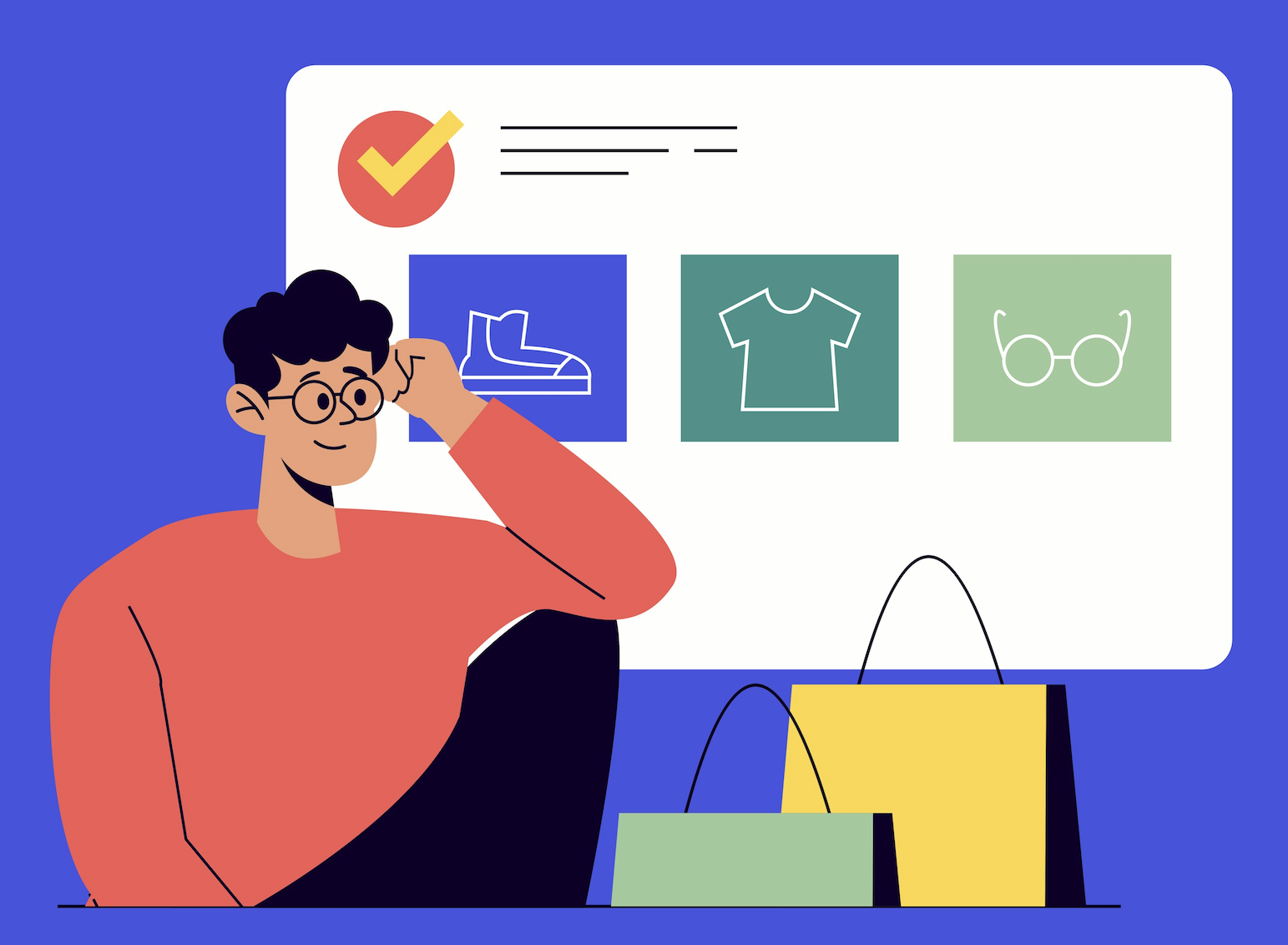
    Before you can start fixing your abandoned cart problem, you have to play detective. Simply knowing that around 70% of online shopping carts are abandoned isn’t enough—that’s just a statistic. To make a real difference, you need to dig into why your specific customers are leaving without buying.

    This process isn’t about guesswork; it’s about building a data-driven plan to smooth out the bumps in your buying journey. By pinpointing the exact moments of friction, you can create a checkout experience that feels seamless and trustworthy, which is the first step toward improving your https://blog.loudbar.co/tag/conversion-rates/.

    Pinpointing Why Your Customers Abandon Carts

    A customer thoughtfully looking at a laptop screen showing an online store's checkout page, representing the moment of decision before purchase.

    The real work starts when you stop looking at global averages and start analyzing your own checkout funnel. Your analytics are your best friend here. Where are people dropping off? Is there a mass exodus on the shipping page? Or maybe the payment step is where things go wrong? Knowing where the leak is gives you a huge clue as to why.

    Uncovering Hidden Costs and Friction

    Let’s be honest: nobody likes surprise fees. It’s one of the fastest ways to lose a sale. In fact, research shows that unexpected costs are the number one reason people bail.

    Globally, about 48% of shoppers walk away because of high shipping costs, and another 41% leave due to other unexpected fees. The lesson here is crystal clear: be upfront about all costs. When a customer gets sticker shock at the final step, you don’t just lose a sale—you lose their trust.

    It’s time to put on your customer hat and go through your own checkout. What seems simple to you might be a major headache for a first-time buyer.

    Keep an eye out for these common conversion killers:

    • Forced Account Creation: This is a huge one. Forcing someone to create an account before they can give you money adds unnecessary friction. Always offer a guest checkout option.
    • Complicated Forms: Are you asking for their life story? Every single form field you can cut makes the process easier and faster for the customer.
    • Missing Trust Signals: Shoppers are savvy. If they don’t see security badges, a clear return policy, or customer reviews, they might think twice before handing over their credit card information.

    Here’s a quick look at some of the most common friction points I’ve seen and how you can address them.

    Common Checkout Friction Points and Their Solutions

    Friction Point What It Looks Like to Customers Actionable Solution
    Unexpected Shipping Costs “Why is shipping so expensive?” or “I didn’t see this fee until the last second!” Display shipping costs upfront on the product or cart page. Offer a shipping calculator or free shipping thresholds.
    Forced Account Creation “I just want to buy this, not sign up for a newsletter and create a password.” Always provide a prominent “Guest Checkout” option. Allow account creation after the purchase is complete.
    Long & Confusing Checkout “How many more pages are there? This is taking forever.” Use a progress bar to show shoppers where they are. Condense the checkout into a single page or fewer steps.
    Lack of Payment Options “You don’t take Apple Pay? I’ll just buy it somewhere else.” Offer multiple payment methods, including digital wallets like PayPal, Apple Pay, and Google Pay.
    Security Concerns “Is this site safe? It looks a little sketchy.” Prominently display trust badges (SSL, McAfee), customer testimonials, and clear contact information.

    By systematically identifying and fixing these issues, you move from reacting to problems to proactively creating a better experience.

    Gathering Direct Customer Feedback

    Your analytics will tell you what people are doing, but they won’t tell you why. For that, you need to go straight to the source: your customers.

    Don’t be afraid to ask shoppers who abandoned their carts for a little feedback. A simple, well-timed survey can uncover insights you’d never find in a spreadsheet. You might learn your shipping options are confusing or that your return policy isn’t clear enough.

    A great way to collect this information is with a dedicated cart abandonment survey template. It helps you ask the right questions to get actionable, structured feedback.

    This kind of qualitative feedback gets to the heart of the customer’s experience. It helps you understand their hesitations and frustrations on a human level. Once you diagnose the real issues, you’re no longer just plugging leaks in your funnel—you’re building a stronger, more resilient business.

    Designing a Checkout That Feels Effortless and Trustworthy

    A minimalist and clean checkout page on a tablet, showing clear steps and trust badges, designed to feel secure and easy to navigate.

    Once a customer hits “checkout,” the hard part should be over. Your job now is to guide them across the finish line with as little friction as possible. Any hesitation or confusion at this point is a direct threat to your sale. In fact, a complicated checkout process is to blame for 17% of all abandoned carts, turning an almost-certain sale into just another statistic.

    The goal here is to make the entire process—from cart to confirmation—feel so intuitive that the customer never has a reason to second-guess their purchase. Every single element, from the form fields to the button copy, needs to work in harmony to build confidence and keep them moving forward.

    Simplify the Path to Purchase

    Think about it: a confusing checkout is like trying to navigate a maze without a map. If shoppers don’t know how many steps are left or what info they’ll need next, they get anxious. Anxiety leads to abandonment.

    A visual progress bar is a brilliantly simple fix for this. By clearly showing the stages—like “Shipping,” “Payment,” and “Review”—you set clear expectations and give the customer a feeling of control. They can see the light at the end of the tunnel, which makes them far more likely to stick with it.

    Next, you need to ruthlessly cut the fat from your forms. Only ask for the information that is absolutely essential to fulfill the order. Every extra field is another tiny obstacle.

    Here are a few ways to optimize your forms right now:

    • Use an Address Auto-filler: Integrate something like the Google Places API to suggest and complete addresses as people type. It’s faster and cuts down on typos that cause delivery headaches later.
    • Format Fields Intelligently: Automatically add spaces to credit card numbers as they’re entered. Use a single “Full Name” field instead of separate “First” and “Last” name boxes. These small tweaks make a big difference.
    • Put Labels Above the Fields: Don’t use placeholder text as your primary label. People naturally look above the input box, and placeholder text vanishes the second they start typing, forcing them to guess.

    Ditch the Forced Account Creation

    Forcing a first-time buyer to create an account before they can check out is one of the biggest conversion killers out there. It’s a huge point of friction. They don’t want another password to remember just to buy a single item from a store they’ve never used before.

    When you force registration, you’re basically saying, “Our marketing list is more important than your time.” That’s why a guest checkout option isn’t just nice to have—it’s non-negotiable.

    Make the guest checkout the most obvious, easiest path. You can always ask them to create an account after the sale is complete. A simple “Save my info for next time” checkbox on the confirmation page is a much friendlier approach that respects their time and builds goodwill.

    Build Rock-Solid Trust at the Final Step

    The payment page is where shopper anxiety is at its peak. They’re about to hand over their credit card details, and even the slightest doubt about your site’s security can stop the sale cold. This is where trust signals become your most powerful tool.

    Don’t just take my word for it—studies show that 60% of customers have bailed on a purchase because trust logos were missing. These little icons are mental shortcuts that instantly reassure shoppers their data is in safe hands.

    Essential Trust Signals for Your Checkout Page:

    • Security Badges: Display logos people recognize instantly: the padlock icon from your SSL certificate, Visa, Mastercard, PayPal, etc. These are universal symbols of a secure transaction.
    • A Clear Return Policy: Don’t make them hunt for it. A simple summary like “30-Day Free Returns” right on the checkout page removes a huge chunk of perceived risk from their decision.
    • Social Proof: A short, impactful customer quote or a star rating placed near the “Complete Purchase” button can be the final piece of reassurance a hesitant buyer needs.
    • Accessible Help: Show a customer service number or a link to live chat. Just knowing that a real person is available if something goes wrong is often enough to boost a shopper’s confidence to click “buy.”

    By designing a checkout that is both incredibly simple and visibly secure, you’re removing the final barriers between a shopper and a completed purchase. You’re not just processing an order; you’re delivering a great final experience that makes them want to come back.

    Getting Shipping and Payments Right

    A minimalist and clean checkout page on a tablet, showing clear steps and trust badges, designed to feel secure and easy to navigate.

    You’ve done all the hard work to get a customer to the checkout. The last thing you want is for them to hit the brakes over a surprise shipping fee. Yet, this exact scenario plays out every single day. Unexpected costs are the number one killer of conversions, with 48% of shoppers pointing the finger directly at high shipping fees for bailing on a purchase.

    It’s not just about the money. It’s about the psychology of the surprise. A fee that pops up out of nowhere feels like a penalty, instantly souring the experience and eroding the trust you’ve carefully built. The fix is simple but incredibly powerful: be completely transparent from the very beginning.

    Eliminate the Sticker Shock

    The smartest way to handle shipping costs is to make them a non-issue long before the final payment screen. When customers see shipping info early, it becomes just another part of their decision, not a last-minute dealbreaker.

    This means showing shipping estimates right on the product page or in the cart itself. A simple zip code field that calculates the cost in real-time is a fantastic tool for this. You’re giving customers the information they need, right when they need it, putting them back in the driver’s seat.

    Of course, the most effective strategy of all is leveraging the magnetic pull of free shipping. It’s a massive psychological win that can send conversion rates soaring.

    Practical Shipping Strategies to Test:

    • Set a Free Shipping Threshold: This is a classic for a reason. Offer free shipping on orders over a set amount, like $50 or $75. Not only does this remove the shipping pain point, but it also nudges customers to increase their average order value.
    • Offer Flat-Rate Shipping: If a threshold isn’t in the cards, a predictable flat rate (e.g., “$5 standard shipping on all orders”) is the next best thing. It’s simple, easy to understand, and gets rid of any guesswork.
    • Provide Multiple Options: Give your customers choices. Let them pick between standard, expedited, and—if you have a physical location—in-store pickup. This flexibility lets them choose what works best for their budget and timeline.

    Offer a Smorgasbord of Payment Options

    Just like hidden shipping costs can derail a sale, not having someone’s preferred payment method can be an equally abrupt dead end. Today’s shoppers simply expect to pay how they want to pay. If their favorite option isn’t there, they have no problem clicking over to a competitor who offers it.

    Limited payment options are a huge point of friction. Think about it: research shows that 45% of customers now use ‘Buy Now, Pay Later’ (BNPL) services to afford their purchases. That alone shows you how important flexible payment solutions have become.

    Your goal is to make paying for an item as thoughtless and easy as possible. The key is to embrace modern payment technologies that make the whole process disappear into the background.

    Building a Diverse Payment Mix:

    • Digital Wallets: Integrating one-click options like Apple Pay, Google Pay, and PayPal is basically mandatory now. They let customers fly past manual form entry, which is a lifesaver on mobile devices where typing is a pain.
    • Buy Now, Pay Later (BNPL): Services like Klarna, Afterpay, and Affirm are exploding in popularity. They break larger purchases into smaller, interest-free installments, making big-ticket items feel much more accessible and less intimidating.
    • Traditional Credit Cards: Of course, you still need to nail the basics. Make sure your credit card form is clean, auto-formats card numbers as they’re typed, and clearly displays the logos of the cards you accept.

    By getting your shipping and payment strategies right, you remove two of the biggest roadblocks in the entire customer journey. You can turn potential deal-breakers into tools that build trust, offer flexibility, and give customers every reason to finally hit that “Complete Purchase” button. This is a fundamental part of learning how to reduce shopping cart abandonment for good.

    Optimizing the Mobile Shopping Experience

    The journey from browsing to buying almost always happens on a phone these days. A huge chunk of your traffic is coming from smartphones, so if your checkout process is a clunky, frustrating mess on a small screen, you’re literally throwing money away. Designing for a desktop first means you’re building an experience that pushes away the majority of your potential customers.

    The data backs this up in a big way. The cart abandonment rate on mobile is way higher than on desktop, hitting a staggering 80.2% in 2024. Think about it: smaller screens, spotty connections, and the sheer annoyance of typing all add up. It’s a massive drop-off point, and you can see more of the hard numbers by reviewing the latest mobile commerce statistics on redstagfulfillment.com. The takeaway here is simple: if you want to slash your abandonment rate, you have to build for mobile first.

    Design for Thumbs, Not Cursors

    “Mobile-first” isn’t just a buzzword; it’s a mindset. You have to design for how people actually use their phones. A mouse cursor is precise, but a thumb is clumsy. Your mobile checkout needs big, tappable buttons, plenty of space around clickable elements, and form fields that don’t require pinpoint accuracy to tap.

    The most common mistake I see is sites that just shrink their desktop version for mobile. That’s a recipe for disaster. It results in microscopic text and links so close together you can’t help but hit the wrong one.

    Focus on a clean, single-column layout that scrolls vertically. Put your most important buttons—like “Continue to Payment” or “Complete Purchase”—right where thumbs naturally rest at the bottom of the screen. This is the “thumb zone,” and it’s prime real estate.

    When you nail this, the whole process feels intuitive, not like a chore. You’re reducing the friction that makes people bail. For more on creating these kinds of seamless customer journeys, take a look at our other guides on improving user experience.

    Simplify Forms and Kill the Keystrokes

    Let’s be honest: nobody likes typing on a phone. Every single form field you add is another reason for someone to give up and leave. Your goal should be to get them through checkout with the fewest keystrokes possible.

    Go through your checkout forms with a critical eye. Do you really need their phone number, or is an email enough? Can you get away with one “Full Name” field instead of splitting it into “First” and “Last”? Every little bit helps.

    Here’s how you can make your mobile forms less painful:

    • Use the Right Keyboard: When a field asks for a phone number or credit card, the numeric keypad should pop up automatically. It’s a small detail that makes a world of difference.
    • Lean on Address Autofill: Use tools like the Google Places API to suggest addresses as the user types. This is a double win: it saves them time and cuts down on typos that lead to delivery headaches.
    • Remember Your Customers: If someone has bought from you before, for heaven’s sake, pre-fill their info! Making a loyal customer re-enter their address and payment details is a great way to make them a former customer.

    Make Paying on Mobile Effortless

    The final hurdle is the payment itself. This is where you can seal the deal or lose the sale. One-click digital wallets are your secret weapon for converting mobile shoppers.

    Payment options like Apple Pay, Google Pay, and PayPal Express Checkout aren’t just perks anymore; they’re table stakes. These let customers pay with a fingerprint or a quick face scan, pulling their saved information automatically.

    This completely bypasses the dreaded task of manually punching in credit card numbers and shipping details. By offering these trusted, familiar payment methods, you remove the last major point of friction and give people a lightning-fast, secure way to buy before they get distracted.

    Crafting Effective Cart Recovery Campaigns

    shopping cart abandoned in a grocery store aisle

    Even with a perfectly tuned checkout process, people will still leave. Life just gets in the way. The kids need a snack, the boss calls, or maybe they just want to sleep on the decision. Abandonment is a natural part of e-commerce, but it doesn’t have to be the end of the line.

    A smart recovery strategy is your final line of defense to bring these high-intent shoppers back. This is where you pivot from passively optimizing their journey to actively persuading them to return. The best campaigns work both onsite—catching shoppers just as they’re about to leave—and offsite, reminding them of what they left behind.

    Intercepting Abandonment with Onsite Tactics

    That moment a shopper’s cursor drifts toward the back button is a golden opportunity. This is where an exit-intent popup can work wonders, but only if it provides genuine value. A generic “Don’t Go!” message is just a digital speed bump. A strategic, helpful offer, on the other hand, can be a game-changer.

    Think about why they might be leaving. Was it the unexpected shipping cost? Hit them with a last-minute free shipping code. Are they hesitating on the total price? A small, time-sensitive discount might be the final push they need. The trick is to address a likely pain point, turning the interruption into a welcome solution.

    Exit-intent offers are most powerful when they feel like a timely solution, not a desperate plea. For instance, a shopper who has been on the checkout page for a while might be debating the total cost. A popup that says, “Hesitating? Take 10% off to help with shipping” is far more effective than a generic one.

    Tools like LoudBar are brilliant for this. You could trigger a vibrant, animated notification bar with a discount code that appears only when a user shows signs of leaving the cart page. This keeps the offer in their line of sight without hijacking the entire screen, making it a much friendlier way to present that last-minute incentive.

    The Art of the Cart Recovery Email Sequence

    Once a shopper has left your site, email becomes your most powerful tool for reeling them back in. Cart recovery emails are incredibly effective, with open rates often hovering around a massive 50%. But a single, generic “you left something” email just won’t cut it anymore. A well-timed sequence that builds on itself is where the real magic happens.

    Your goal isn’t just to remind them; it’s to re-engage them and dismantle any lingering hesitation.

    A Proven Three-Part Email Sequence:

    1. The Gentle Nudge (1 Hour Later): This first email is a simple, helpful reminder. Keep the subject line low-pressure, like “Did you forget something?” or “Your items are waiting!” Show a picture of what’s in their cart and include a big, clear button to take them right back.
    2. The Value Reinforcement (24 Hours Later): This follow-up goes beyond a simple reminder. You need to remind them why they wanted these items in the first place. Highlight product benefits, include a killer customer testimonial, or show off the 5-star rating. Add that social proof!
    3. The Final Incentive (48-72 Hours Later): If they still haven’t come back, it’s time to create a little urgency. This is where you can introduce a compelling, limited-time offer. A small discount or a free gift can be the final push needed to overcome whatever was holding them back.

    The best emails feel personal, not automated. Digging into personalized marketing techniques will help you craft messages that genuinely connect with your customers based on their behavior.

    To help you decide which channels to focus on, here’s a quick comparison of the different recovery methods.

    Onsite vs. Offsite Recovery Tactic Comparison

    This table offers a practical look at different cart recovery methods, helping you choose the right approach for your store.

    Tactic Primary Goal Example Tools Best Used For
    Exit-Intent Popups/Bars Prevent abandonment before it happens LoudBar, OptinMonster Addressing immediate objections like shipping costs or offering a last-minute incentive to close the sale.
    Cart Recovery Emails Re-engage and persuade shoppers who have already left Klaviyo, Mailchimp Building a multi-touchpoint sequence to remind, provide social proof, and offer a final incentive.
    Retargeting Ads Maintain top-of-mind awareness on other platforms Meta Ads, Google Ads Reaching shoppers who don’t open emails by showing them the exact products they abandoned.
    SMS/Push Notifications Provide instant, high-visibility reminders Postscript, PushOwl Sending urgent, time-sensitive offers to shoppers who have opted-in to these channels.

    Each tactic has its place, and the most successful brands use a mix of onsite and offsite strategies to create a comprehensive safety net.

    Re-Engaging Shoppers with Smart Retargeting

    Not everyone opens their emails, which is why you can’t put all your eggs in one basket. Retargeting ads on platforms like Facebook and Instagram are perfect for keeping your products top-of-mind while your almost-customers are scrolling through their feeds.

    The best retargeting ads are hyper-specific. Don’t just show a generic ad for your brand; display the exact products the user left in their cart. Dynamic product ads are built for this.

    Tips for Effective Retargeting:

    • Segment Your Audience: Don’t treat every abandoner the same. You might create one campaign for high-value carts and another for first-time visitors.
    • Control Ad Frequency: Bombarding someone with the same ad is a fast track to annoyance. Set a frequency cap so you don’t burn out your audience.
    • Use Compelling Ad Copy: Your ad copy should echo the messaging from your email sequence. Remind them of the product’s benefits or highlight that new customer discount to lure them back.

    By combining intelligent onsite nudges with a strategic offsite follow-up, you create a powerful safety net. This system will catch a huge portion of would-be lost sales, turning those abandoned carts back into completed orders.

    Your Top Cart Abandonment Questions, Answered

    Even when you’ve done everything right, a few questions always pop up. This isn’t a textbook; it’s a quick-reference guide with straightforward answers to the real-world questions we hear from store owners every day. Let’s clear up the confusion so you can get back to winning sales.

    What Is a Good Shopping Cart Abandonment Rate?

    Everyone wants to know the magic number, but the truth is a bit more nuanced. While the global average sits around 70%, a truly “good” rate is one that’s consistently getting better. Chasing an industry-wide number is less important than outperforming yourself.

    Top-tier stores can sometimes dip into the 60-65% range, but that’s not the starting line. Your goal should be to benchmark your current rate and then set small, achievable goals to chip away at it. Your own data is your most powerful metric.

    The Real Goal: Stop worrying about a single industry average. A good cart abandonment rate is one you are actively and successfully lowering through smart, consistent testing.

    This mindset shift is huge. It moves you from chasing an arbitrary number to focusing on continuous improvement—and that’s what actually grows your business.

    How Soon Should I Send a Cart Recovery Email?

    Timing is everything. Your first email needs to land in their inbox within one hour of them leaving your site. Any later, and the buying intent starts to fade. That initial nudge is your best shot because the products are still fresh in their mind.

    But don’t stop there. A single email is rarely enough. A simple, well-timed sequence can work wonders.

    Here’s a proven cadence that just works:

    • The First Hour: Send a friendly reminder. The tone should be helpful, not pushy. Think “Did you forget something?” or “Your items are waiting for you.”
    • After 24 Hours: This is where you reinforce value. Remind them why they wanted those items. A customer review, a 5-star rating, or a snippet of user-generated content can rebuild that initial excitement.
    • After 48-72 Hours: If they still haven’t come back, it’s time to create a little urgency. A final email with a small, limited-time incentive like free shipping or a small discount can be the final push they need.

    Does Guest Checkout Hurt My Marketing Efforts?

    This is a classic concern, but the short answer is no—as long as you’re smart about it. Guest checkout is one of the most effective ways to reduce friction. Let’s be honest, nobody wants to create another account just to buy one thing.

    The trick is to capture their information after the sale is complete, when the pressure is off.

    Once they land on the order confirmation page, give them a simple, one-click option with a clear benefit. Something like:

    • “Save my info for faster checkout next time.”
    • “Create an account to track this order.”

    This gives the customer the fast, seamless experience they came for, while you get a friendly, low-pressure opportunity to bring them into your world. It’s truly the best of both worlds.

    Are Exit-Intent Popups Annoying to Users?

    They absolutely can be. A generic “Wait! Don’t Go!” popup is the digital equivalent of a desperate salesperson chasing you out the door. It’s intrusive because it offers zero value.

    But what if the popup offered a solution? A well-timed, strategic offer is often seen as helpful, not annoying. It all comes down to empathy.

    Think about why someone is leaving. If a shopper is on the checkout page and their mouse heads for the exit, there’s a good chance unexpected shipping costs are the culprit. An exit-intent offer that provides a 10% discount or a free shipping code instantly solves that problem.

    Suddenly, you’re not an annoyance; you’re providing great customer service and giving them the exact reason they need to finish their purchase.


    Ready to turn those frustrating exit-intent moments into conversions? LoudBar helps you create attention-grabbing notification bars with irresistible offers that appear just when shoppers need them most. Stop losing sales and start recovering them with style at https://loudbar.co.


  • How to Increase Ecommerce Conversion Rate: Quick Wins

    How to Increase Ecommerce Conversion Rate: Quick Wins

    Boosting your ecommerce conversion rate is all about making it easier and more appealing for people to buy from you. It comes down to a simple, powerful idea: find the friction points in your customer’s journey and smooth them out. When you do this systematically, you turn more of the traffic you already have into real revenue.

    Why Your Ecommerce Conversion Rate Is a Vital Sign

    A digital dashboard showing a rising graph with shopping cart icons, symbolizing an increasing ecommerce conversion rate.

    Think of your conversion rate as the pulse of your online store. It’s not just another metric on a crowded dashboard; it’s a direct measure of how well your entire site—from the homepage to the checkout—is working to turn casual browsers into paying customers.

    A low rate is a clear warning that something’s off. Maybe your product pages aren’t compelling, or the checkout process is a maze. On the flip side, a healthy rate is proof that you’ve created an experience that clicks with your audience.

    So, what’s a “good” number to aim for? Across the board, the average ecommerce conversion rate hovers somewhere between 2% and 4%. But that’s just a starting point. Your industry plays a huge role.

    Average Ecommerce Conversion Rates By Industry

    This table provides a quick reference for average conversion rates across different ecommerce sectors, helping you benchmark your own performance.

    Industry Average Conversion Rate
    Fashion and Apparel 2.5%
    Health and Beauty 3.3%
    Home Goods 1.8%
    Electronics 1.9%
    Food and Beverage 4.6%
    Sports and Outdoors 2.1%

    As you can see, a 4.6% rate in the Food and Beverage industry is fantastic, while a 1.8% rate for a Home Goods store is actually quite solid, given the longer consideration times for bigger purchases. Context is everything.

    Moving Beyond the Basic Definition

    To really appreciate its power, you have to understand what a conversion rate truly is at its core. It’s the ultimate report card on how persuasive and user-friendly your store is. Nail this one metric, and the positive effects ripple through your entire business.

    A higher conversion rate means:

    • More Revenue, Same Traffic: You’re making more money from the visitors you’ve already attracted. This immediately boosts the ROI on every single marketing dollar you’ve spent.
    • Better Profitability: Since your customer acquisition cost doesn’t change, every new sale from conversion optimization is more pure profit.
    • Stronger Customer Loyalty: A shopping experience that is smooth, intuitive, and trustworthy doesn’t just create a sale; it creates a repeat customer.

    A rising conversion rate is proof that you’re not just selling products; you’re building a customer-centric experience that works. It shows you understand your audience’s needs and have successfully removed the barriers standing between them and a purchase.

    In the rest of this guide, we’ll walk through a practical playbook for diagnosing the real problems and implementing fixes that actually move the needle.

    Finding the Leaks in Your Sales Funnel

    A magnifying glass hovering over a digital sales funnel, highlighting areas where user icons are falling out, symbolizing customer drop-off points.

    Before you can fix anything, you have to know what’s broken. Trying to boost your conversion rate without knowing where you’re losing customers is like trying to fix a leaky pipe in the dark. You might get lucky, but you’ll probably just make a bigger mess.

    Your first job is to put on your detective hat and find the exact spots where your sales funnel is springing leaks. This isn’t about getting lost in endless spreadsheets; it’s about using a few powerful tools to get a clear picture of user behavior. The goal here is simple: move from guessing to knowing.

    See the Leaks with Funnel Reports

    The most direct way to spot trouble is by visualizing your conversion funnel in an analytics platform like Google Analytics 4. A funnel report shows you the step-by-step path a user takes on their way to making a purchase and, more importantly, where they drop off.

    A typical ecommerce funnel breaks down into a few key stages:

    • Viewed a Product Page: The user shows initial interest.
    • Added to Cart: Their interest turns into a real intent to buy.
    • Began Checkout: They’ve committed and are ready to pay.
    • Completed Purchase: You’ve made a sale.

    Once you build this report, the data will immediately tell you a story. You might find that 90% of users who add an item to their cart start the checkout process—fantastic. But maybe you’ll also discover a huge drop-off between viewing a product page and adding that item to the cart. That’s a critical clue. It tells you the problem isn’t your checkout flow; it’s something on your product pages that’s giving people pause.

    Your funnel report tells you what is happening and where. For instance, if you see a 70% drop-off rate between the “Add to Cart” and “Begin Checkout” steps, you’ve just found your biggest leak. Now you have to figure out why.

    Understand the “Why” Behind the Drop-Off

    Analytics tells you what, but qualitative tools like heatmaps and session recordings tell you why. These tools let you see your site through your customers’ eyes, revealing the friction points that numbers alone can’t.

    Heatmaps give you a visual aggregate of where users click, move their mouse, and scroll. If you noticed people aren’t adding items to their cart, a heatmap of your product page might show that your “Add to Cart” button is practically invisible because it’s below the fold on mobile or its color blends into the background.

    Session recordings are even more powerful. These are literal video playbacks of individual user journeys. I’ve had so many “aha!” moments just watching a handful of recordings. You might see someone repeatedly trying to click on something that isn’t a link, struggling to find shipping info, or getting stuck behind a pop-up that won’t close. It can be a humbling, eye-opening experience.

    Turn Your Data into an Action Plan

    Once you’ve paired the hard numbers from your funnel report with the human insights from heatmaps and recordings, you can finally build a smart, prioritized action plan. Don’t try to fix everything at once. Go after the leaks that are costing you the most customers first.

    If your funnel shows a massive drop-off during checkout and session recordings show users getting confused by the shipping address form, that’s your top priority.

    You might also find that behavior changes depending on where the traffic comes from. For example, maybe visitors from social media ads abandon carts far more often than visitors from organic search. This is where you can start thinking about target audience segmentation and tailoring the experience for different groups.

    This diagnostic approach shifts your entire strategy. Instead of randomly changing button colors and hoping for the best, you’re making data-informed hypotheses designed to fix real, documented problems. That’s the foundation for sustainably growing your conversion rate.

    Fine-Tuning the User Experience to Drive Sales

    An overhead view of a smartphone screen showing a well-designed ecommerce product page with high-quality images and clear calls to action.

    Now that you know where people are dropping off, it’s time to roll up your sleeves and fix the experience itself. A truly great user experience (UX) isn’t about fancy animations or cutting-edge design. It’s about making the journey from “ooh, what’s this?” to “purchase confirmed” completely seamless and intuitive.

    Every single element on your site—from your product photos to the navigation menu—has a job to do. That job is to answer questions, build confidence, and gently guide shoppers toward that “Add to Cart” button.

    Make Your Products Impossible to Resist

    Think of your product page as your digital showroom floor. This is where a casual browser becomes a serious potential buyer. Just listing features and specs won’t cut it; you have to make your products feel tangible and genuinely desirable.

    Start with your visuals. Since shoppers can’t physically touch your products, high-resolution images and videos are your most powerful sales tools.

    • Show Every Angle: Don’t leave anything to the imagination. Provide photos from the front, back, side, and even close-ups of important details.
    • Use Lifestyle Shots: Show your product in action. If you sell a backpack, show a photo of someone actually hiking with it. This helps customers visualize it in their own lives.
    • Bring it to Life with Video: A short demo or product tour can answer questions that static images just can’t. It’s often the final nudge someone needs.

    Next up, your product descriptions need to do some heavy lifting. Go beyond the what and explain the why. A great description doesn’t just list dimensions; it paints a picture of how this product will solve a problem or improve the customer’s life. Try to anticipate common questions and answer them right there in the copy—think materials, care instructions, or compatibility.

    Your product page should be your best salesperson. It needs to anticipate every question a customer might have and provide a clear, compelling answer that leaves no room for doubt.

    For a deeper dive, check out our other articles on creating an excellent user experience.

    Simplify How People Find Things

    This might sound obvious, but it’s a huge conversion killer: if customers can’t find what they’re looking for, they can’t buy it. Confusing navigation is one of the top reasons people bounce. Your goal is to get someone to their desired product in as few clicks as possible.

    A powerful on-site search function is your secret weapon here. I’ve consistently seen that customers who use site search are 2-3 times more likely to convert. Why? Because they already know what they want. Make sure your search bar is front and center and includes features like:

    1. Autocomplete: Suggests products as the user types, speeding up the process.
    2. Typo Tolerance: A simple typo shouldn’t lead to a “no results” page. The search should be smart enough to figure it out.
    3. Visual Search: For certain industries, allowing users to upload an image to find similar products is a game-changer.

    Of course, clear navigation menus and logical categories are just as critical. Use simple, straightforward labels—no one has time for clever jargon—and implement breadcrumbs so users always know where they are on your site.

    Put Your Mobile Experience First

    This isn’t a suggestion anymore; it’s a requirement. Optimizing for mobile is the single most important part of your UX strategy today. The data is clear: while mobile devices account for roughly 73% of all online shopping traffic, conversion rates on desktop are still higher.

    So, what’s with that gap? It exists because too many mobile sites are still a pain to use. But with mobile commerce sales set to explode, fixing this is your single biggest opportunity for growth. You can see more on these ecommerce benchmarks on speedcommerce.com.

    Think “thumb-friendly.” Buttons need to be big enough to tap easily. Forms should be a breeze to fill out on a small screen. The entire checkout flow has to be designed with a mobile user in mind. When you make the experience effortless on any device, you close that conversion gap and turn all that mobile traffic into actual revenue.

    Making Your Checkout Process Effortless

    A streamlined checkout interface on a mobile phone, showing clear steps and easy-to-tap payment options.

    You did it. You got a shopper to find your site, browse your products, and fall in love with something enough to hit “Add to Cart.” This is the home stretch, the final, crucial step. And yet, this is precisely where an incredible number of stores fumble the sale.

    Cart abandonment is the silent killer of conversions, and a complicated, clunky checkout is almost always the culprit.

    I like to think of the checkout as the last hundred meters of a marathon. If a runner sees a clear, flat path to the finish line, they’ll find that last burst of energy and sprint. But if they suddenly see a steep hill or a confusing detour, they’re far more likely to just give up. Your job is to make that final stretch a clear, flat path for your customers.

    The shopping cart abandonment rate is a massive challenge, sitting at 71.3% globally—and it gets even worse on mobile. The number one reason for this massive drop-off? Unexpected costs like shipping and taxes that pop up at the very end. To capture those sales you were so close to making, your entire focus has to be on making the checkout feel effortless. You can dive deeper into the data with these e-commerce benchmarks and abandonment rates on speedcommerce.com.

    Always, Always Offer a Guest Checkout

    Forcing someone to create an account before they can give you their money is probably the fastest way to lose a sale. It’s a huge point of friction at the worst possible moment. The fix is incredibly simple: always offer a guest checkout option.

    Giving shoppers the choice to check out as a guest removes a major barrier. They can complete their purchase quickly, and you can always ask them to create an account after the sale is locked in.

    It’s a win-win scenario. New customers get the speedy experience they demand, and you still get the chance to turn them into a registered user on the confirmation page. A simple “Want to save your info for next time?” prompt works wonders.

    Keep Your Forms Short and Sweet

    Every single field in your checkout form is a small hurdle. The more fields you add, the higher the chance of frustration and, ultimately, abandonment. The goal here is to ask for the absolute bare minimum you need to process the order.

    Here’s how you can trim the fat from your forms:

    • Single Name Field: Just use one field for “Full Name.” Don’t make them tab or click from “First Name” to “Last Name.”
    • Smart Address Lookups: Use a tool that automatically fills in the city and state once a user types in their zip code. It’s a small touch that makes a big difference.
    • Hide the “Company” Field: Unless you’re a B2B business, this field is usually optional. Tuck it away behind a link like “Add company name (optional).”
    • Default to a Single Address: Pre-check a box that says “My billing and shipping address are the same.” For most people, they are.

    These small adjustments drastically reduce the mental effort required from your customers, making the whole process feel faster and way less tedious.

    Be Radically Transparent About Costs

    Long forms and forced sign-ups are annoying, but the undisputed king of cart abandonment is surprise costs. Nothing kills the buying mood faster than a shopper seeing an unexpectedly high shipping fee or tax amount added at the very last second.

    The only way to solve this is to be completely upfront about all costs, as early as you possibly can.

    1. Add a Shipping Calculator: Put a shipping cost estimator right in the shopping cart. Let people enter their zip code to see their options before they even start the official checkout.
    2. Show Taxes Upfront: Don’t wait until the final payment screen to reveal the total. If you can, estimate taxes based on the user’s location early in the process.
    3. Offer Modern Payment Options: Make sure you’ve integrated digital wallets like Apple Pay and Google Pay, along with ‘Buy Now, Pay Later’ services like Klarna or Afterpay. These options offer speed and flexibility, which can be the final nudge a hesitant shopper needs to click “Buy.”

    When you build a checkout that’s simple, transparent, and flexible, you transform a common point of friction into a smooth final step that seals the deal.

    Earning Trust and Sparking Action

    So, a potential customer has landed on your site. They’ve browsed, they’ve clicked, and they’ve even added an item to their cart. They are this close to buying, but then… they hesitate. That single moment of doubt can derail the entire sale. In the impersonal world of e-commerce, trust isn’t just a nice-to-have; it’s the bedrock of every transaction.

    Your job is to get them over that final hurdle. It’s a careful dance between making them feel completely secure and giving them a compelling nudge to buy now.

    Show Them They’re in Good Hands

    First-time visitors are wired for skepticism. Their internal monologue is running wild: “Is this a real company? What if I hate the product? Is my credit card info safe here?” You have to proactively silence those fears.

    This is where trust signals come into play. They’re the visual cues and guarantees that instantly put a shopper’s mind at ease. Think of them as the digital version of a friendly, knowledgeable salesperson in a brick-and-mortar store.

    • Security Badges: Placing recognizable logos from Norton, McAfee, or your SSL provider right where they can see them—especially at checkout—is a powerful visual shorthand for “you’re safe here.”
    • A No-Nonsense Return Policy: Don’t bury your return policy in the footer labyrinth. A straightforward, fair, and easy-to-find policy demolishes the perceived risk of a bad purchase. A simple banner saying “30-Day Hassle-Free Returns” can be the final push a nervous buyer needs.
    • Customer Reviews and Ratings: This is your social proof superpower. Nothing convinces a new customer like seeing that other real people bought from you and were happy they did.

    You really can’t overdo it with reviews. The global ecommerce market is projected to reach a staggering $6.86 trillion in 2025, meaning shoppers are drowning in options. To cut through the noise, you have to lean on what other people are saying—an incredible 99% of customers read reviews before buying. Learn more about global ecommerce trends on sellerscommerce.com.

    Trust is built in tiny, critical moments. A single security badge or a transparent return policy can be the only thing standing between you and an abandoned cart. Make your commitment to their security impossible to ignore.

    Nudging Them Forward with Ethical Urgency

    Once a shopper feels safe, it’s time to create a little urgency. We’re not talking about cheesy, high-pressure sales tactics here. This is about giving customers a legitimate reason to stop overthinking and just make a decision. Done right, urgency helps people overcome their own indecision and feel smart for acting quickly.

    Here are a few tactics that work without feeling sleazy:

    1. Low-Stock Alerts: A simple message like “Only 3 left!” creates a natural fear of missing out. It’s most powerful when it’s true, as it also signals the product’s popularity.
    2. Time-Bound Offers: Nothing gets people moving like a ticking clock. A countdown timer for a sale or a discount that expires at midnight frames the choice as now or never.
    3. Shipping Cutoffs: “Order in the next 3 hours for same-day shipping” is a brilliant, service-oriented way to create urgency. The focus is on a benefit they want: getting their stuff faster.

    One of the most effective ways to broadcast these messages is with an attention-grabbing notification bar. A clean top bar can announce a flash sale or a shipping deadline without being obnoxious like a pop-up. Understanding the benefits of a notification bar makes it clear how this simple tool can highlight your most important messages, turning casual browsing into decisive action.

    It’s Not a Project, It’s a Process

    You’ve patched the leaks, smoothed out the checkout flow, and earned your visitors’ trust. Fantastic. But boosting your conversion rate isn’t a one-and-done task you can cross off a list. The stores that consistently win are the ones that treat optimization as a core part of their operations—a continuous cycle of testing, learning, and refining.

    This mindset is what separates hopeful guesswork from systematic, data-driven growth. It’s all about structured experimentation, and the workhorse of experimentation is A/B testing. The idea is simple: you create two versions of a page element (Version A, the original, and Version B, the challenger) and show them to different groups of visitors to see which one performs better.

    Start With a Smart Hypothesis, Not a Random Guess

    Don’t fall into the trap of testing things just for the sake of it, like randomly changing button colors. A real testing program starts with a solid hypothesis rooted in the data you’ve already collected. Your analytics, heatmaps, and session recordings are your treasure map—they point directly to the problem areas.

    Let’s imagine your funnel report shows a huge drop-off on product pages. You pull up some heatmaps and notice that almost no one is scrolling far enough to see the detailed product specifications. That’s your clue.

    From there, you could form a hypothesis like this:

    “I believe that moving the key product specifications into a tabbed section right below the main product images will make that critical info easier to find. As a result, more people will get their questions answered and click ‘Add to Cart’.”

    See? That’s a specific, testable idea. It’s not a vague hope; it’s a direct response to an observed user behavior. Now you’re ready to build your “B” version and see if you’re right.

    Run Clean Tests and Trust the Data

    When you launch an A/B test, discipline is everything. You absolutely have to change only one thing at a time. If you change both the headline and the main product image, you’ll have no idea which element actually drove the results. It’s tempting to bundle changes, but you’ll muddy the waters and learn nothing. Be patient.

    Let the test run long enough to achieve statistical significance. This is a fancy way of saying you have enough data to be confident the outcome isn’t just a random fluke. Good testing tools, like Google Optimize or VWO, will tell you when you’ve reached this milestone, usually around a 95% confidence level.

    Once the test concludes, it’s time to look at the results. Did your change lift conversions? Awesome. Push that change live for everyone. Did it do nothing, or even make things worse? That’s still a win. Seriously. You just learned that your hypothesis was wrong, and you saved yourself from permanently implementing a change that would have cost you money.

    This cycle—hypothesize, test, analyze, learn—is the real engine of long-term growth. It transforms your website from a static brochure into a dynamic laboratory where every tweak gets you one step closer to understanding what truly makes your customers tick.

    Your Questions, Answered

    Got some lingering questions about how to actually move the needle on your conversion rates? It’s a common feeling. Let’s tackle some of the most frequent questions we get from founders and marketers who are serious about turning more visitors into customers.

    What’s a “Good” Ecommerce Conversion Rate, Really?

    The industry benchmark you’ll hear thrown around is usually between 2% and 4%. But honestly, that number can be misleading. A store selling $20 t-shirts is going to have a much different conversion rate than one selling $3,000 custom furniture.

    Instead of obsessing over a global average, focus on your own numbers. Your real goal should be to consistently beat your last month’s performance. That’s how you build real momentum.

    How Much Do Product Pages Actually Matter?

    Think of your product page as your digital salesperson. It’s where the final “yes” or “no” decision is made, so it’s absolutely critical. This is where a visitor decides if they trust you enough to pull out their credit card.

    To make sure your pages are closing the deal, you need a few non-negotiables:

    • Amazing Visuals: Don’t just show the product; show it being used. Multiple high-res photos, different angles, and maybe even a short video can make all the difference.
    • Compelling Copy: Ditch the jargon. Your descriptions should focus on the benefits for the customer, not just a list of features. How will this make their life better?
    • Visible Social Proof: Customer reviews and ratings need to be front and center. Shoppers actively look for them, so don’t make them hunt.

    Here’s something to keep in mind: over 60% of your traffic is likely on a phone. If your product pages aren’t perfect on mobile, you’re practically throwing sales away.

    I Need a Boost Now—What Are the Quickest Wins?

    If you’re looking for fast, high-impact changes, the game is all about reducing friction and building trust. These are the two levers you can pull right away.

    First, take a hard look at your checkout process. Is it as simple as it can possibly be? The famous story about Expedia earning an extra $12 million a year just by removing one optional form field is a powerful lesson. Every single field is a potential roadblock.

    Second, sprinkle trust signals all over your checkout and product pages. Things like security badges, clear return policies, and a bold “Free Shipping” reminder right next to the “Buy Now” button can be the final nudge a hesitant shopper needs to feel confident and complete their order.


    Ready to grab your visitors’ attention and drive more sales? LoudBar helps you create unmissable notification bars that turn fleeting interest into action. Ditch banner blindness and start converting more traffic today at https://loudbar.co.