
Your website’s contact form is more than just a few fields and a submit button; it’s the final, crucial handshake between a potential customer and your business. It’s the digital equivalent of an open door, inviting questions, inquiries, and sales. Yet, this critical conversion point is often treated as an afterthought, leading to abandoned submissions and lost revenue. A confusing layout, too many fields, or a lack of trust signals can stop a high-intent visitor dead in their tracks.
This article moves beyond generic advice to provide a strategic breakdown of high-performing contact form examples. We will deconstruct what makes a form truly effective, analyzing the psychology behind its design, the precision of its microcopy, and the seamlessness of its user experience. We aren’t just showing you pretty designs; we are dissecting the conversion-focused thinking that powers them.
Inside, you’ll find a curated list of powerful examples and platforms, complete with screenshots and direct links. For each example, we will analyze:
- Strategic Design: Why the layout and field choices work.
- Conversion Tactics: The specific elements that encourage completion.
- Actionable Takeaways: Replicable ideas you can implement immediately.
While a well-designed contact form is vital for capturing leads, sometimes customers require instant assistance. Exploring immediate communication channels like the best live chat software can prevent lead loss when a user has an urgent question. However, for structured inquiries and detailed requests, the contact form remains indispensable. Let’s dive into the examples that get it right.
1. Jotform
While many resources offer static images of great contact forms, Jotform provides a massive, interactive gallery of fully functional and clonable contact form examples. Instead of just showing you a design, it gives you a working template you can immediately customize and embed on your site, making it an excellent starting point for businesses that need to deploy a form quickly.
The platform is built around a powerful, no-code, drag-and-drop editor. This means you can select a template that closely matches your needs and then tailor it by adding or removing fields, changing colors, and connecting it to your existing tools without writing a single line of code.
Strategic Analysis: Why Jotform Stands Out
Jotform’s primary advantage is its focus on speed to implementation. For marketing agencies managing multiple clients or startups needing a quick lead capture solution, the ability to go from template to a live, embedded form in minutes is invaluable.
The platform’s strength lies in its extensive integration ecosystem. With over 130 native integrations, you can automatically send submission data to your CRM (like HubSpot or Salesforce), notify your team on Slack, or add new subscribers to your Mailchimp list. This automates workflows that would otherwise require manual data entry or complex API connections.
Key Features & Offerings
| Feature | Description |
|---|---|
| Template Gallery | Hundreds of pre-built, responsive contact form templates. |
| No-Code Editor | Drag-and-drop interface for easy customization. |
| Integrations | 130+ native connections to CRMs, payment gateways, and marketing tools. |
| Security & Compliance | Options for CAPTCHA, GDPR, and HIPAA compliance (on paid plans). |
| Embed Options | Easily embed forms on any website with a simple code snippet. |
Practical Takeaways & Pricing
- Pros: Extremely fast to publish a functional form, a wide range of integrations for automation, and robust compliance features for regulated industries.
- Cons: The free plan is limited to 5 forms and 100 monthly submissions. Removing Jotform branding and accessing higher quotas requires a paid subscription.
- Pricing: Jotform offers a free starter plan. Paid plans start at $34/month (billed annually) for increased limits and features. They also provide discounts for nonprofit organizations and educational institutions.
Actionable Tip: Use Jotform’s template gallery not just for ready-made solutions but also as a source of inspiration. Filter by industry to see common field patterns and microcopy used by others in your niche, then adapt those ideas for your own custom-built forms.
Jotform is the ideal tool for anyone who wants to move beyond design mockups and implement a high-performing contact form with advanced features like conditional logic, payment processing, and automated data routing.
Website: Jotform Contact Form Templates
2. Typeform
Where many form builders focus on traditional, top-down field layouts, Typeform offers a library of conversational, multi-step contact form examples designed for a more human-like interaction. Instead of presenting users with a long list of fields, Typeform engages them one question at a time, creating a dialogue that can significantly boost completion rates and improve the user experience.
The platform is known for its elegant design and fluid interface. Its templates provide a strong foundation for creating on-brand experiences, allowing for extensive customization of colors, fonts, and background media. This focus on aesthetic and interactive design makes it a favorite among marketing and growth teams aiming to capture leads without sacrificing brand identity.
Strategic Analysis: Why Typeform Stands Out
Typeform’s core advantage is its ability to transform data collection into a conversational experience. This one-question-at-a-time approach reduces the cognitive load on the user, making the form feel less like a chore and more like a guided conversation. For businesses focused on customer experience, this is a powerful way to make a strong first impression.
The platform excels at using conditional logic, or “Logic Jumps,” to create dynamic paths for users. This means you can ask more relevant questions based on previous answers, personalizing the journey and ensuring you only collect necessary information. For example, a user selecting “Sales Inquiry” can be routed to a different set of questions than someone selecting “Customer Support,” streamlining data segmentation from the point of capture.
Key Features & Offerings
| Feature | Description |
|---|---|
| Conversational Interface | One-question-at-a-time format designed to increase engagement. |
| Logic Jumps | Create custom paths and show relevant questions based on user answers. |
| Template Library | A wide range of stylish, mobile-first templates for various use cases. |
| Brand Customization | Extensive options for fonts, colors, and background images/videos. |
| 300+ Integrations | Connect seamlessly with tools like HubSpot, Slack, Zapier, and Salesforce. |
Practical Takeaways & Pricing
- Pros: Exceptional user experience that often leads to higher completion rates. Strong brand customization and easy embedding options. Great for creating interactive and personalized forms.
- Cons: Pricing is based on response volume, which can become costly for high-traffic sites. Removing Typeform branding and accessing advanced features requires higher-tier plans.
- Pricing: Typeform offers a limited free plan. Paid plans begin at $25/month (billed annually) for more responses, logic jumps, and features.
Actionable Tip: Use Typeform’s Logic Jumps to pre-qualify leads directly within your contact form. Ask a qualifying question early on (e.g., “What is your monthly budget?”) and route high-value prospects to a calendar booking link while sending others to a general inbox. Learn more about how this can improve website engagement on blog.loudbar.co.
Typeform is the ideal choice for businesses that prioritize user experience and want to create beautiful, interactive contact forms that feel more like a conversation and less like a static document.
Website: Typeform Contact Form Templates
3. Webflow
For designers and teams who prioritize pixel-perfect control and seamless integration into their website’s design system, Webflow offers a unique approach. Instead of a separate form builder, it provides native form components and a vast library of “cloneable” contact form examples created by its community. This allows you to copy fully styled, production-ready form sections directly into your project.
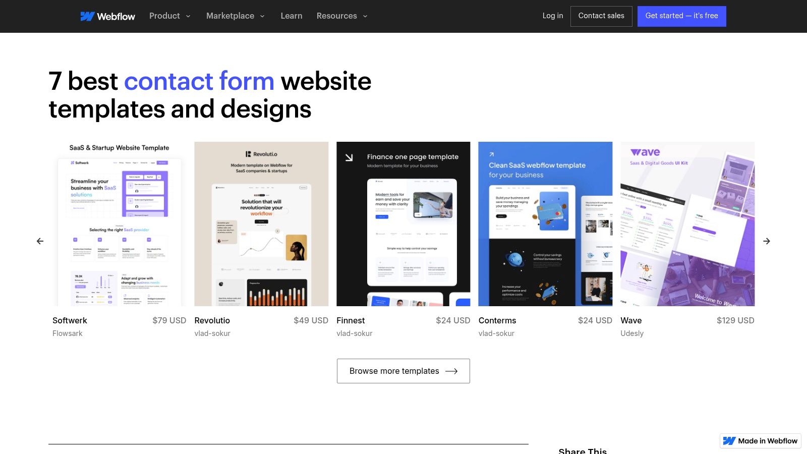
Webflow is a visual web development platform that lets you build professional websites without code. Its form element is a native component, meaning you have complete visual control over its layout, styling, and interactions using the same tools you use to build the rest of your site. This ensures your contact form perfectly matches your brand’s aesthetic.
Strategic Analysis: Why Webflow Stands Out
Webflow’s key advantage is its design-first integration. Unlike third-party tools that are embedded via code snippets, Webflow forms are built directly into the site structure. This eliminates issues with clashing styles or slow-loading scripts and gives designers unparalleled control over every element, from input field padding to custom success and error state animations.
The power of its cloneable library cannot be overstated. Designers can find inspiration and functional components for nearly any use case, copy them into their project with a click, and then customize them. This model is perfect for agencies and freelancers who need to deliver unique, high-quality designs quickly without starting from scratch. Webflow’s approach to form creation is a great case study in improving user experience by integrating essential tools natively.
Key Features & Offerings
| Feature | Description |
|---|---|
| Native Form Builder | Build forms directly within the Webflow Designer for full styling control. |
| Cloneable Library | Access hundreds of free, community-built forms and sections to copy/paste. |
| Custom Interactions | Animate success/error messages, field focus states, and submission buttons. |
| Built-in Submissions | Manage form submissions directly in the Webflow dashboard or forward to email. |
| Logic & Integrations | Connect to tools like Zapier and Make to route data to CRMs and other apps. |
Practical Takeaways & Pricing
- Pros: Complete design freedom to match brand identity, a rich library of free cloneable assets, and seamless integration with the host website.
- Cons: Has a steeper learning curve than simple drag-and-drop builders. Form submission quotas are tied to site hosting plans, which can be limiting on lower tiers.
- Pricing: You can build and use cloneables for free. To publish a site and accept form submissions on a custom domain, you need a paid Site Plan, starting at $14/month (billed annually).
Actionable Tip: Use Webflow’s “Made in Webflow” showcase and filter by “cloneable” to find advanced contact form examples with complex layouts and interactions. Clone one that fits your needs to deconstruct how it was built and learn new styling techniques you can apply to your own projects.
Webflow is the ideal solution for designers, agencies, and businesses that refuse to compromise on design and want their contact form to be a seamless, branded extension of their website experience.
Website: Webflow Contact Form Showcase
4. TemplateMonster
While other resources focus on standalone forms, TemplateMonster offers a marketplace approach where you can find contact form examples integrated within complete website themes. This is ideal for businesses that need not just a form, but a fully designed, cohesive website that includes a polished contact page from day one. Instead of building from scratch, you can preview and purchase a professional theme with a built-in contact section.
The platform functions as a vast digital store for website templates across various technologies like WordPress, HTML, and Elementor. You can filter thousands of designs to find one that aligns with your brand, see live demos of the contact pages, and purchase the entire package for immediate use. This approach is perfect for launching a new site or overhauling an existing one with minimal design work.
Strategic Analysis: Why TemplateMonster Stands Out
TemplateMonster’s unique advantage is its focus on holistic design integration. For entrepreneurs or agencies launching a new website, this model saves significant time by providing a professional, ready-to-deploy contact page that perfectly matches the rest of the site’s aesthetic. You are not just getting a form; you are getting the entire user journey context.
The platform’s strength lies in its sheer volume and variety. With thousands of templates from countless vendors, you can find niche-specific designs that already incorporate relevant fields and layouts for your industry. For example, a restaurant theme will likely have a contact form with a reservation field, while a consulting theme might include an appointment scheduler.
Key Features & Offerings
| Feature | Description |
|---|---|
| Integrated Designs | Contact forms are part of complete website themes for a cohesive look. |
| Vast Marketplace | Thousands of templates for WordPress, HTML, Shopify, and more. |
| Live Demos | Preview a template’s contact page and overall functionality before buying. |
| Vendor Ratings | Customer reviews and ratings help you choose reliable template authors. |
| One-Time Purchase | Buy a theme with a lifetime license, avoiding recurring subscription fees. |
Practical Takeaways & Pricing
- Pros: One purchase provides an entire website design, including a professional contact form. A wide price range and frequent sales make it accessible for various budgets.
- Cons: Quality and post-purchase support can vary significantly between different template vendors. You are responsible for your own hosting and configuring the form’s backend processing (e.g., email scripts or plugins).
- Pricing: Template prices vary widely, from as low as $5 for simple HTML templates to over $100 for feature-rich WordPress themes. Purchases are typically a one-time fee.
Actionable Tip: Use TemplateMonster’s live demos as an advanced research tool. Analyze how different high-selling themes structure their contact pages, what fields they include for specific industries, and what microcopy they use to encourage submissions. This provides real-world design intelligence you can apply to your project, even if you don’t purchase the theme.
TemplateMonster is the go-to solution for anyone who needs to see contact forms in the context of a full-site design, offering an efficient path to a professional and consistent online presence.
Website: TemplateMonster Contact Form Themes
5. CodeCanyon (Envato Market)
For developers or businesses that prefer to own their tools, CodeCanyon offers a different approach to contact forms. It’s a massive marketplace for downloadable scripts and plugins, providing the raw code for self-hosted contact form examples instead of a subscription-based service. This is ideal for those who want complete control over their data, functionality, and hosting environment without being tied to a third-party platform.
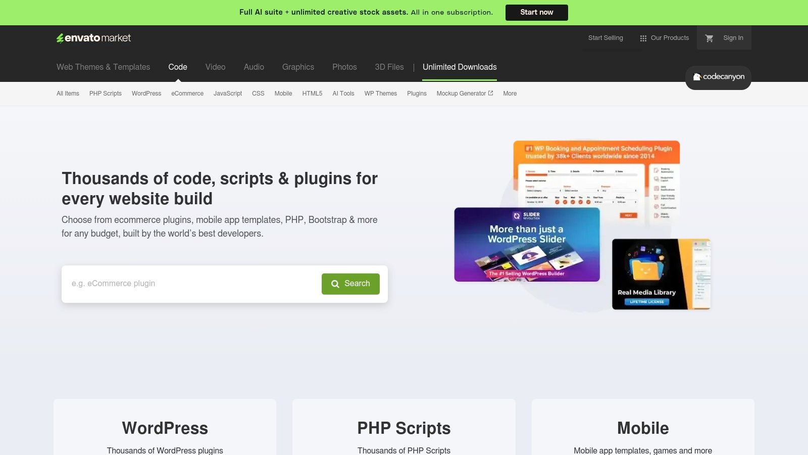
Unlike SaaS builders, you purchase a script or WordPress plugin once and can deploy it on your own server. The offerings range from simple PHP AJAX forms to complex, multi-step form builders with conditional logic and payment integrations. This model empowers users to customize the code directly, ensuring maximum flexibility for unique project requirements.
Strategic Analysis: Why CodeCanyon Stands Out
CodeCanyon’s key advantage is ownership and control. In an era where data privacy is paramount, hosting your own form logic means submission data never has to pass through a third-party service. This can be a critical requirement for organizations in regulated industries or for companies with strict internal data governance policies.
The platform’s strength lies in its diversity. You can find highly specialized scripts tailored for specific needs, such as forms with advanced file uploaders, integrated cost calculators, or unique spam prevention techniques. This one-time purchase model is also highly cost-effective for agencies and developers who can reuse a licensed script across multiple projects (depending on the license terms), avoiding recurring monthly fees.
Key Features & Offerings
| Feature | Description |
|---|---|
| Downloadable Scripts | Purchase and download PHP, JavaScript, and AJAX-powered form scripts. |
| WordPress Plugins | A large selection of form builder plugins for the WordPress ecosystem. |
| One-Time Licensing | Pay once for the script and receive future updates, often for a limited time. |
| Full Code Access | Users get the source code, allowing for deep customization and integration. |
| Community & Reviews | Each product has ratings, comments, and author support to help gauge quality. |
Practical Takeaways & Pricing
- Pros: Complete control over data and hosting, cost-effective one-time purchase model, and a wide variety of niche and powerful solutions.
- Cons: Quality and support vary significantly between authors. You are responsible for installation, server configuration, security, and maintenance.
- Pricing: Scripts are sold with a one-time license fee, typically ranging from $7 to $49. Extended support is often available for an additional fee.
Actionable Tip: Before purchasing, meticulously check an item’s “Last Update” date, version compatibility (e.g., PHP version), buyer ratings, and the author’s comment response history. This due diligence is crucial for avoiding abandoned or poorly supported scripts that could become a security risk.
CodeCanyon is the go-to resource for tech-savvy users, developers, and agencies who prioritize customization, data privacy, and long-term cost savings over the convenience of a managed, all-in-one platform.
Website: CodeCanyon Contact Form Scripts
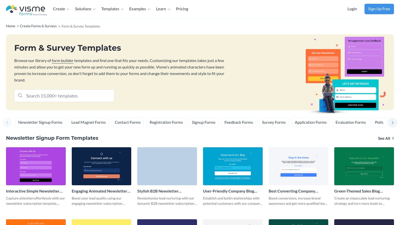
6. Visme
While many form builders focus purely on data collection, Visme positions its contact forms as an integrated part of a larger visual design ecosystem. Known for its presentation and infographic tools, Visme offers a library of polished, design-forward contact form examples that prioritize brand consistency and visual appeal. It’s an ideal choice for marketers who want their forms to look like a seamless, professionally designed extension of their website or landing page.
Instead of a utilitarian form builder, Visme provides stylized templates that can include animated elements and interactive components. The platform allows users to create a form within a broader design project, such as a sales proposal or an interactive infographic, and then embed it anywhere online.
Strategic Analysis: Why Visme Stands Out
Visme’s core advantage is its focus on visual cohesion and branding. For companies where design is paramount, a generic-looking embedded form can disrupt the user experience. Visme solves this by treating the contact form as a design asset, allowing for deep customization of fonts, colors, backgrounds, and layouts to perfectly match a brand’s aesthetic.
The platform’s strength is further amplified by its built-in analytics. When you embed a Visme form, you can track views, completions, and average completion time directly within the Visme dashboard. This provides immediate, accessible data for optimizing form performance without needing to configure complex third-party analytics tools, making it perfect for marketing campaigns where quick feedback is essential.
Key Features & Offerings
| Feature | Description |
|---|---|
| Stylized Templates | A curated gallery of visually-focused templates with interactive and animated options. |
| Design Integration | Forms are part of a unified design suite, working alongside presentations, charts, and graphics. |
| Embed Options | Generate a simple embed code to publish forms on any website, landing page, or project. |
| In-Platform Analytics | Track form views, submissions, and completion rates directly within the Visme dashboard. |
| Brand Kit | Apply your company’s official fonts, colors, and logos to forms for perfect brand alignment. |
Practical Takeaways & Pricing
- Pros: Exceptional visual customization for creating beautiful, on-brand forms. Integrated analytics provide easy-to-understand performance metrics. Part of a comprehensive design toolkit.
- Cons: Fewer advanced automation and integration options compared to dedicated form builders like Jotform. Submission limits and features are tied to subscription tiers.
- Pricing: Visme offers a free Basic plan with limited templates and a cap on projects. Paid plans start at $12.25/month (billed annually) for more features, storage, and premium assets.
Actionable Tip: Leverage Visme’s analytics to A/B test your form designs. Create two visually distinct versions of your contact form for the same landing page, run them for a set period, and use Visme’s built-in data to see which design achieves a higher completion rate.
Visme is the best fit for marketing teams and designers who need their contact forms to be as visually compelling as the rest of their brand assets and want straightforward analytics to measure engagement.
Website: Visme Form & Survey Templates
7. Instapage
Instapage is a premium landing page platform that treats the contact form not as a standalone component, but as an integral part of a high-performance conversion funnel. It provides hundreds of professionally designed, mobile-responsive page templates where the contact form is strategically placed and optimized for users arriving from paid ad campaigns.
The platform is engineered for marketers who need to maximize their return on ad spend. Its powerful drag-and-drop builder allows for precise customization of every element on the page, including multi-step forms that break down information requests into smaller, less intimidating steps. This approach is proven to reduce friction and increase submission rates.
Strategic Analysis: Why Instapage Stands Out
Instapage’s core advantage is its relentless focus on conversion rate optimization (CRO) for paid traffic. Unlike general-purpose form builders, every feature is designed to turn clicks into leads. Its server-side A/B testing capabilities let you experiment with different form layouts, field labels, or button copy to scientifically determine what works best for your audience.
The platform’s strength is amplified by its enterprise-grade performance features, like its proprietary Thor Render Engine for lightning-fast page loads. For marketers running campaigns where every second counts, this speed can significantly reduce bounce rates and improve lead quality. Heatmaps and collaboration tools further empower teams to analyze user behavior and iterate on their contact form examples with data-driven insights.
Key Features & Offerings
| Feature | Description |
|---|---|
| Landing Page Templates | Over 500 conversion-focused layouts with integrated forms. |
| Multi-Step Forms | Break down long forms into digestible steps to reduce user friction. |
| A/B Testing | Server-side split testing to optimize form performance and layout. |
| Performance Engine | Fast-loading pages with AMP support to maximize ad spend effectiveness. |
| Team Collaboration | Real-time visual feedback and heatmaps to analyze user interactions on higher-tier plans. |
Practical Takeaways & Pricing
- Pros: Elite performance and optimization tools specifically for paid campaigns, reusable Global Blocks to scale form deployment across multiple pages, and robust analytics.
- Cons: Premium pricing makes it less suitable for businesses not actively running paid traffic. It’s more of a landing page platform than a simple form builder.
- Pricing: Instapage’s pricing is geared toward professional teams. The “Build” plan starts at $199/month (billed annually), with custom pricing for advanced “Convert” plans.
Actionable Tip: Use Instapage’s multi-step form feature to ask for sensitive information like a phone number or budget in the second or third step. Once a user completes the first step (e.g., name and email), they are more psychologically committed to finishing the process, a principle known as the “foot-in-the-door” technique. For a deeper dive into CRO, you can learn more about how to boost conversions.
Instapage is the ideal solution for performance marketers and agencies who need to build, test, and scale high-converting contact funnels tied directly to their advertising efforts.
Website: Instapage Contact Us Page Templates
Contact Form Examples — 7-Tool Comparison
| Solution | Implementation complexity (🔄) | Resource requirements (⚡) | Expected outcomes (⭐ / 📊) | Ideal use cases (💡) | Key advantages |
|---|---|---|---|---|---|
| Jotform | Low 🔄 — no-code drag & drop; fast publish | Low ⚡ — minimal dev; paid tiers for higher quotas | ⭐⭐⭐⭐ — production-ready forms; strong automation 📊 | 💡 Quick embeddable forms with integrations; enterprises/nonprofits | Fast to launch; wide integrations; compliance options |
| Typeform | Medium 🔄🔄 — logic flows & multi-step setup | Medium ⚡ — subscription scales with responses | ⭐⭐⭐⭐ — high completion UX; conversational flows 📊 | 💡 Marketing/growth teams wanting engaging forms | Excellent UX; brand customization; conditional logic |
| Webflow | Medium-High 🔄🔄🔄 — visual builder learning curve | Medium ⚡⚡ — designer time; hosting costs when publishing | ⭐⭐⭐ — designer-controlled, production-ready layouts 📊 | 💡 Designers building branded sites with inline forms | Visual control; cloneable sections; strong docs |
| TemplateMonster | Low-Medium 🔄🔄 — purchase + theme setup | Medium-High ⚡ — hosting & form processing self-managed | ⭐⭐⭐ — full-site themes with contact pages; quality varies 📊 | 💡 Buy complete themes that include polished contact layouts | Large selection; instant downloads; price variety |
| CodeCanyon (Envato) | High 🔄🔄🔄 — dev installation & customization | High ⚡ — developer effort for hosting/security | ⭐⭐⭐⭐ — full control/ownership; flexible backend 📊 | 💡 Developers wanting self-hosted, privacy-focused forms | Own the code; one-time licenses; wide script variety |
| Visme | Low-Medium 🔄🔄 — design-focused editor | Low ⚡⚡ — easy styling; quotas on free plan | ⭐⭐⭐ — visually polished forms; basic analytics 📊 | 💡 Brand-forward forms integrated with design assets | Strong visual customization; built-in metrics |
| Instapage | Medium-High 🔄🔄🔄 — campaign & testing setup | High ⚡⚡⚡ — premium pricing; team collaboration costs | ⭐⭐⭐⭐⭐ — optimized for conversions; A/B and speed-first 📊 | 💡 Paid-traffic landing pages and conversion experiments | Enterprise optimization; fast rendering; testing tools |
From Examples to Execution: Build Your Conversion Engine
We’ve explored a wide range of powerful contact form examples, from the conversational flows of Typeform to the highly customizable builds from Webflow and the ready-to-deploy templates on TemplateMonster. Across every successful example, a few core principles emerge, transforming a simple web form from a passive data collector into a proactive conversion engine.
The most effective forms are not just a series of questions; they are the start of a meaningful conversation with your audience. They demonstrate that you respect the user’s time, understand their intent, and are genuinely committed to helping them. This is achieved by meticulously aligning every element with the user’s goal, whether they’re requesting a demo, seeking support, or providing feedback.
The key is to move beyond thinking of a contact form as a mere utility. Instead, view it as a critical touchpoint in the customer journey. It’s an opportunity to build trust, reinforce your brand’s personality, and make a stellar first impression. The difference between a form that gets ignored and one that generates a steady stream of qualified leads lies in the strategic details we’ve analyzed.
Your Final Checklist for a High-Converting Form
As you begin to implement these ideas, keep this consolidated checklist handy. These are the non-negotiable principles that underpinned all the best contact form examples we reviewed.
- Ruthless Simplicity is Key: Every single field creates friction. Before adding a field, ask yourself: “Is this information absolutely essential for the very next step of the conversation?” If not, remove it. You can always gather more details later.
- Make the Call-to-Action Unmistakable: Your CTA button should be a beacon. Use a contrasting color, action-oriented language (e.g., “Get My Free Quote” instead of “Submit”), and ensure it’s the most prominent element on the form.
- Surround the Form with Trust: Users are hesitant to share personal information. Mitigate this by adding trust signals directly beside your form. This includes privacy policy links, security badges (like SSL), customer testimonials, or a simple sentence explaining what you’ll do with their data.
- Prioritize the Mobile Experience: Assume over half of your users will find your form on a mobile device. Test it rigorously. Are the fields large enough to tap? Does the keyboard pop up correctly? Is there any horizontal scrolling required? A poor mobile experience is a guaranteed conversion killer.
- Provide Instant, Clear Feedback: Use inline validation to tell users immediately if there’s an error in a field, rather than waiting until they hit submit. Clear success messages after submission are equally important, letting the user know their entry was received and what to expect next.
Choosing the Right Tool for the Job
The tools we’ve covered, from Jotform to Instapage, each offer unique strengths. Your choice should depend on your technical resources, design needs, and integration requirements.
- For Speed and Simplicity: Tools like Typeform and Jotform are excellent for creating beautiful, functional forms in minutes without any code.
- For Total Design Control: Webflow is the champion if you need to build a form that is perfectly integrated into a custom website design.
- For Pre-Built Solutions: Marketplaces like TemplateMonster and CodeCanyon provide a massive library of templates if you’re looking for a quick, affordable, and often feature-rich starting point.
Ultimately, building the perfect form is an ongoing process of testing, learning, and refining. These contact form examples provide the blueprint, but your unique audience will dictate the final design. Pay attention to your analytics, gather user feedback, and never stop optimizing. The insights you gather from other high-performing designs, even outside your direct industry, can be incredibly valuable. If you want to expand your inspiration, you can explore various examples to see how different layouts and strategies are used across the web.
Ready to capture your visitors’ attention before they even reach your contact page? Add an unmissable call to action with a top notification bar from LoudBar. It’s the perfect way to guide users to your newly optimized forms and promotions. Create your free, eye-catching notification bar in seconds with LoudBar.